Appboard/old/widgets/tree map
The Tree Map Widget displays hierarchical data as a set of nested rectangles. The size and color of each rectangle is determined by data. The grouping and display of the rectangles can also be managed by using relationships in the data.
How To Create a Tree Map
For instructions on creating a Widget, see the general instructions in Adding Widgets. The Tree Map Widget type is located under the Maps category on the Widget selection screen.
How To Configure a Tree Map
- Follow the instructions above to create the basic "Tree Map" Widget.
- Enter the following information on the Data tab:
- Data collection: Select the name of the Data Collection that will provide the data to be displayed in the Advanced Status List.
- Note: For convenience, buttons are provided for Adding, Editing, or Previewing a Data Collection.
- Label Field: Select the field from the Data Collection to use for the label that appears inside each of the squares.
- Note: The labels will be hidden if squares become to small.
- Font Size: Controls the font size of the labels in each of the squares.
- Area Field: Select the field from the Data Collection that will determine the size of the squares displayed in the tree map.
- Area Roll Up: Toggle this option on to allow the parent area to be factored into the size calculation. If the parent row already contains a value equal to the sum of its children, then this should be set to "Ignore Parent Area" so that the size of the square is not doubled by adding the value twice. If the parent nodes have blank or zero values, then this can be set to "Include Parent Area"
- Color Filter: Enabling this option lets you set up rules that allow the data to determine the background color of each square.
- Default Color: Sets the default value to use for squares in which none of the Color Filter Rules apply.
- Data Tips: Launches a dialog that lets you choose which fields will appear in the datatip that appears when a user mouses over a square.
- Click Next and provide additional configuration, if needed, on the Options tab. For details on the available Options, see Options.
- Click Next to proceed to the Actions tab.
- Click Add Event Action to configure one or more Actions to be invoked when a user clicks on the Tree Map Widget. The action will apply to the current data record being displayed.
- Click Finish.
- In the Builder Modes panel, select Builder and navigate to the appropriate Board to observe the new Tree Map Widget.
Data Configuration
Because the display of the Tree Map Widget is driven by the data, it is important to understand how the associations in the data are used to manage the presentation of the Widget.
The Data Collection used by the Widget must have a 1-to-many association configured, with the name "children". This association defines the two fields (columns) that associate rows of the data with one another.
Below is a table illustrating the layout of a typical datset that would be used by the Tree Map Widget:
| Node ID | Node Name | Parent Node ID | Value |
|---|---|---|---|
| 01 | Root One | ||
| 02 | Root Two | ||
| 03 | SubOneA | 01 | 10 |
| 04 | SubOneB | 01 | 20 |
| 05 | SubTwoA | 02 | 5 |
| 06 | SubTwoB | 02 | 15 |
| 07 | SubTwoC | 02 | |
| 08 | SubTwoC-Child1 | 07 | 3 |
Note that the association called "children" in the above example would need to be defined between "Node ID" and "Node Parent ID". The "Node Name" would be used for the "Label Field" in the Widget, and the "Value" would be used for the "Area Field". The color coding is used to indicate rows that are associated to each other and the fields that establish these associations.
Note that in this example, rows which are referenced by other rows as parents do not contain values in the Area Field ("Value") column. If the parent nodes did include values to be counted towards the total for that node, then the "Area Rollup = Include Parent Area" flag should be enabled in the Widget configuration panel.
Sample Data
Perform the following steps to create a Tree Map Widget using sample data provided with Appboard:
Create a Data Source
- Log in to AppBoard Builder as an administrator.
- In the Builder Modes panel, select Data Sources.
- Click the "Add" button in the bottom toolbar. The "Create New Data Source" dialog is displayed.
- Type in the name "Sample.TreeMap".
- Select the "File" category for the adapter type, then choose "CSV File".
- Click the "Add Data Source" button in the bottom toolbar.
- The "CSV File" Data Source Wizard is displayed.
Configure the Data Source
- For the File Path, enter ${application.home}/data/pkg/appboard/tutorial/TreeMapData.csv.
- Click "Next" in the bottom toolbar.
- On the "Explore" step, click "Next".
- On the "Associate" step, click "Add Association".
- For "Add Field", enter "children". This is the name the Tree Map Widget uses to determine associations.
- Use the "Select Entity" drop-downs to set an association of "sample.TreeMap.TreeMapData.Network_ID" = "sample.TreeMap.TreeMapData.Parent_ID"
- Click "Finish".
Filter the Data Source
- Create a Data Collections called "sample.FilteredTreeMapData".
- For the Data Collection, select "sample.TreeMap.TreeMapData".
- Click "Next" to go to the Client Side Filter configuration panel.
- Click "Add Rule" to configure a Client Side Filter Rule.
- Configure the Property of the rule to be "Parent_ID" = "is empty". This will filter out all of the data elements with a parent_id from the top-level presentation in the Tree Map Widget.
- Preview the Data Collection to confirm that it only has 4 items (with 24 items filtered out).
Configure the Widget
- For the Data Collection, select "sample.FilteredTreeMap.TreeMapData"
- For the Label Field, select "Location"
- For the Area Field, select "Outages"
- Add a Color Filter called "Outages and Locations"
- Select "Add Color" six times to add six rows
- For the first rule, select the red color and set the rule to be "Color" "=" "Red"
- Repeat the same step for the colors green, gray, blue, white, and brown
- Click "X" to close the Color Filter editor
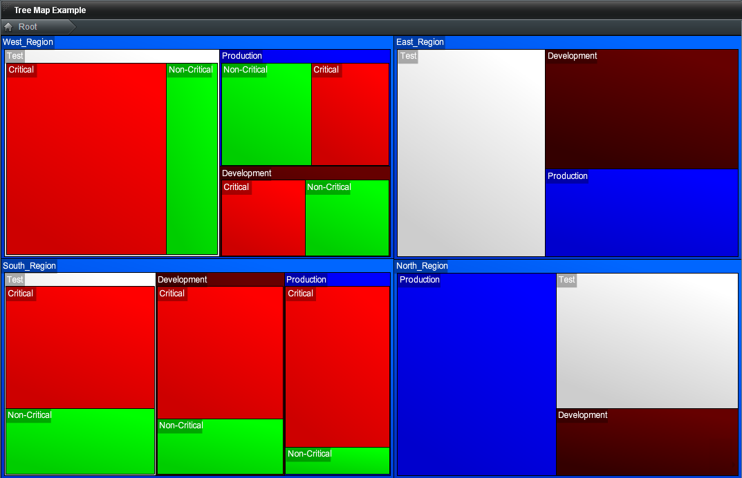
The completed Widget should provide a display similar to the following image:
Note that the data in the West and South regions provides a deeper branching of detail than the data in the East and North regions.
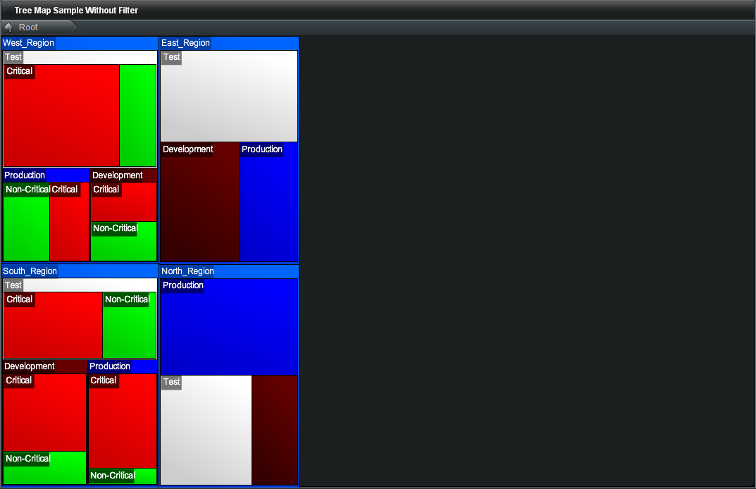
A common mistake would be to skip the "Filter the Data Source" step above. If that were done, the Widget would have empty space as shown in the following image:


