Appboard/2.4/builder/widgets/table
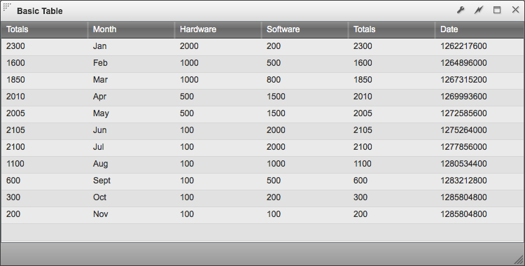
The Table Widget will show data from a Data Collection in a tabular format. The config for the table widget allows you to select the columns of data you want to see from the data collection, and lets you determine the order in which those columns appear. A simple client side sort operation is available by clicking on the table header.
Example of a plain table
If you're using Sample.Data.ChartData, then select columns you'd like to see by pressing the add button and selecting the appropriate column name from the "Data Field".
Renderers
The Table widget provides a number of customization options around how data inside the table is rendered and displayed.
Column Renderers
Column Renderers alter way data is rendered for a selected column. All renders allow you Change the header text for the column, the column width, and set whether or not the column can be resized. Column Renderers include:
- Text
- Default renderer designed to render text strings. Text will be left aligned.
- Status Shape
- The Status shape renderer allows you to convert textual data into a status shape via Status Rules.
- Date
- The Date renderer allows you to adjust how date information is displayed. (MM/DD/YYYY, YYYY/MM/DD, etc.). The system ships with a large list of formats but this can also be extended, see the Client Date Formats documentation.
- Icon
- The Icon renderer allows you to represent textual data as an icon.
- Number
- The Number renderer allows you to adjust the format of numbers.
- Sparkline
- Display an associated data collection as an inline micro-area or micro-line chart. See the Sparkline Renderer page for more details.
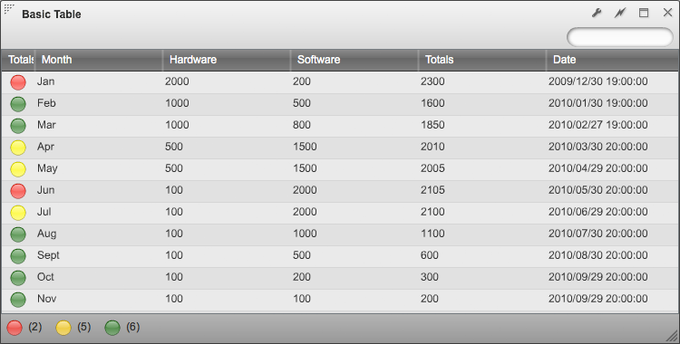
The example below shows a Status Shape applied to the "Totals" column, and a "Date" renderer applied to the "Date" column.
If you're using Sample.Data.ChartData, set the renderer for the "Totals" Data Field to be "Status Shape". Then set the following rules:
- Set the color to be "red" for "Totals" that are "Greater Than" the value "2100"
- Set the color to be "Yellow" for "Totals" that are "Greater Than" the value "2000"
- Set the color to be "Green" for "Totals" that are "Greater Than" the value "0"
Row Colors
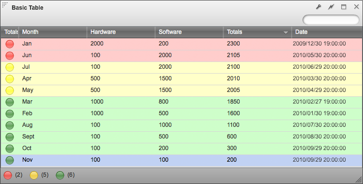
The Table widget can dynamically set the row color based on values contained within the data collection.
The example below shows row status colors based on rules for the "Totals" column. These are the same rules that were used for the Status Shape column renderer.
If you're using Sample.Data.ChartData, set the renderer for the "Totals" Data Field to be "Status Shape". Then set the following rules:
- Set the color to be "#FFCCCC" for "Totals" that are "Greater Than" the value "2100"
- Set the color to be "#FFFFCC" for "Totals" that are "Greater Than" the value "2000"
- Set the color to be "#CCFFCC" for "Totals" that are "Greater Than" the value "0"
Sorting
You can select which columns will determine the default sort order of the Widget. On the “Visualization” step of the widget wizard, there is a preview grid at the bottom. You can click one or more columns in this preview to set the default sorting of the Widget. The supported options are single column sorting (default click), multi-column sorting (CRTL+click), and un-sorting (CTRL+SHIFT+click). The User can then override this sort order by using these same options to click on columns in the AppBoard Viewer.
Filter Options
The "Options" tab provides several filter options that are particularly useful when combined with the Table widget.
Search
This option toggles a pill shaped text field in the header of the widget which allows you to quickly filter the data collection based on characters entered into this field. When you type characters into the field, AppBoard will search all rows of data for strings that match the characters that have been entered. Any rows that do not contain strings with matching characters are hidden from the view, leaving only the rows that have matching values visible. Combining this option with sort is a quick and easy way to find what your looking for.
Quick Filter
The "Quick Filter" option provides a set of toggle button controls in the bottom toolbar of the widget. These toggle buttons quickly filters data on the client based on associated rules. Only rows of data which match criteria defined by these rules will remain visible. Rows of data that do not match the rule are hidden from the view.


