Appboard/2.5/builder/widgets/html widget/example heat map widget
Overview
A Heat Map widget is a good way to visually cross reference two axis of data by using colored objects to represent intensity.
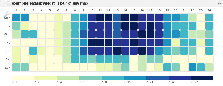
For example, the AppBoard Welcome archive includes a heat map with sample data showing the hour of the day (0-23) against the day of the week (Mon through Sun). It's easy to see a pattern of increased activity during the business hours and less activity outside these hours.
Configuration
To access the widget configuration you must be logged in with the portalAdministration role and in the Builder. Click on the wrench icon in the top-left of the widget.
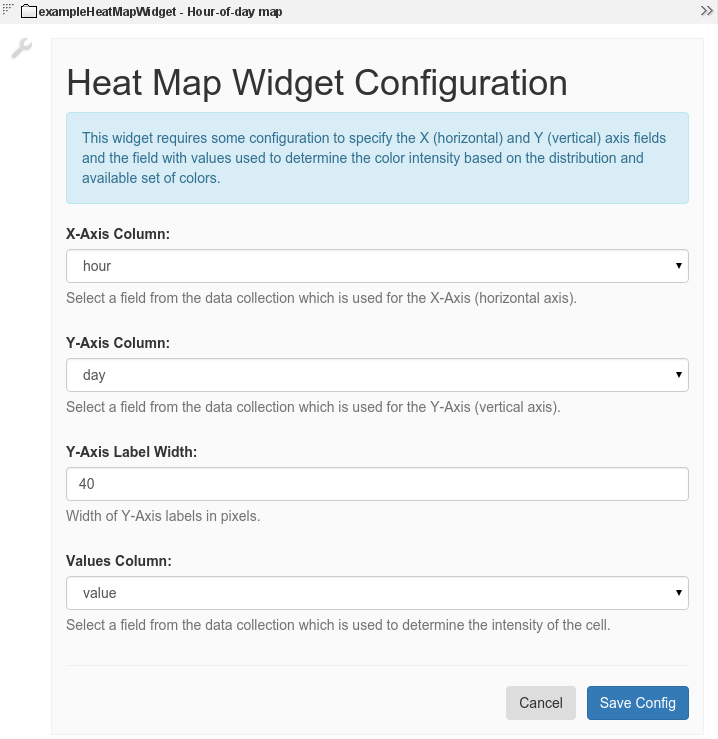
This widget expects a data collection where one column represents the X-Axis identifier, another columns represents the Y-Axis identifier, and another column has the actual values used to determine the intensity.
The configuration reflects the above and also allows the width of the Y-Axis labels to be set.
Actions are also supported by this widget by configuring normal AppBoard actions.


