Appboard/2.6/builder/colored shape filter
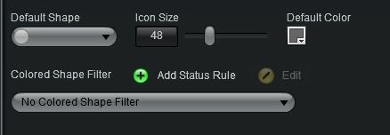
Many of AppBoard's Widgets incorporate the use of Status Shapes, which are shapes selected and customized during Widget configuration that are used to represent data in the Widgets. In the configuration of these Widgets, the user creates a Default Status Shape from an array of shapes, colors, and sizes. Without any extra configuration, that Default Status Shape would be displayed for all records shown in the Widget.
In order to further customize the Widget and give more meaning to Status Shapes, AppBoard provides the option to add Colored Shape Filters. These filters are sets of rules that use data attributes to determine the shape and color combinations that represent each data record in the Widget. For instance, by adding a Colored Shape Filter to a Map Widget, you could show different colors for nodes on the map based on the severity of alarms affecting each location. Colored Shape Filters can be defined once and applied across multiple Widgets that use the same Data Collection, as long as those Widgets have the Colored Shape Filter option available.
How To Create a Colored Shape Filter
To add a Colored Shape Filter click the Add button and a new window will appear where you can create the filter rules. To modify an existing Colored Shape Filter, click the Edit button and perform the same steps to make any changes to the filter.
How To Configure a Colored Shape Filter
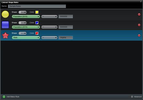
Create a new filter, as described above, to open the Colored Shape Rules editor. Perform the following steps to configure Colored Shape Filter Rules:
- Name: Provide a unique name for the set of rules so that it can be differentiated from other existing Colored Shape Filter Rules. This is important since rule sets are saved and listed as Colored Shape Filter options wherever the filters are applicable.
- Add: The Add button adds a new rule for the user to configure. Unless the Show Advanced Filter Options check box is selected, these rules will be configured in a Simple Property Comparison format.
- Remove Rule: In the far right side of the row of each rule is a red "X" button that can be used to remove a rule from the filter list.
- Shape: Click on the pull-down list to select from the various shape options.
- Color: Click on the color selector to choose from a variety of colors. Here users also have the option to enter a standard 6-digit color code.
- Property: In the first pull-down of the comparison, select the field that will be the subject of this rule. Note that if the chosen field changes due to a change in the widget's Data Collection, Property will have to be set to the new field.
- Comparator: In the next pull-down, select an operator to define the comparison.
- Value: In the text box, enter in the value that the data will be filtered by.
- Show Advanced Filter Options: When the box is checked, the comparison pull-down selectors will be replaced by an Advanced button. Click the button to enter advanced configuration.
- Note: Once Advanced filter rules have been created, they cannot be retained when unchecking the box to return to the basic mode. You will be prompted to delete any Advanced filter rules first before you can uncheck the box.
Advanced Configuration of a Colored Shape Filter
There are some key advantages that come with using the Advanced option. In addition to the Simple Property Comparison, the Advanced Filter provides to the user the Match Regular Expression comparison type. Advanced Filters also allow the user to add multiple comparisons to define one rule.
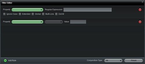
Once the Advanced box has been checked and the Advanced Filter button is clicked in the Colored Shape Filter window, a new Filter Editor window will appear. Perform the following steps to configure an Advanced Filter in the Filter Editor:
- Add Rule: Choose either Simple Property Comparison (the basic comparison used in the previous window) or Match Regular Expression. A new row will appear with fields that match the selected comparison. See the linked pages for options specific to each comparison.
- Conjunction Type: Allows the user to restrict or expand the items that make it through the filter.
- Remove Rule: In the far right side of the row of each rule is a red "X" button that can be used to remove a rule from the filter list.
- Close: Once all comparisons have been added, click Finish to return to the Colored Shape Filter page.


