Appboard/2.4/builder/widgets/bubble chart: Difference between revisions
imported>Jason.nicholls |
imported>Jason.nicholls No edit summary |
||
| Line 1: | Line 1: | ||
{{DISPLAYTITLE:Bubble Chart Widget}} | {{DISPLAYTITLE:Bubble Chart Widget}} | ||
[[Category:AppBoard 2.4]] | |||
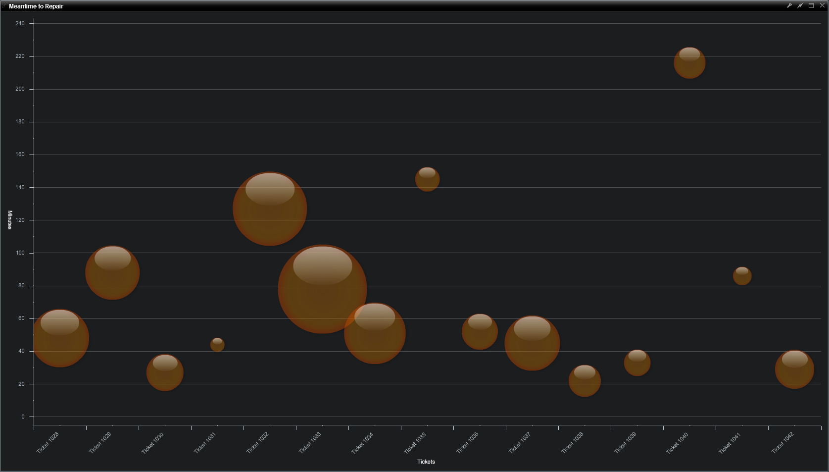
A Bubble Chart Widget displays circles or spheres in the charting area. The circles represent two aspects of the underlying data by their horizontal and vertical location along each axis, as well as the magnitude of a third element which is communicated by the size of the bubble. | A Bubble Chart Widget displays circles or spheres in the charting area. The circles represent two aspects of the underlying data by their horizontal and vertical location along each axis, as well as the magnitude of a third element which is communicated by the size of the bubble. | ||
Revision as of 08:19, 14 December 2013
A Bubble Chart Widget displays circles or spheres in the charting area. The circles represent two aspects of the underlying data by their horizontal and vertical location along each axis, as well as the magnitude of a third element which is communicated by the size of the bubble.
How To Create a Bubble Chart Widget
For instructions on creating a Widget, see the general instructions in Adding Widgets. The Bubble Widget type is located under the Charts category on the Widget selection screen.
How To Configure a Bubble Chart Widget
Follow the instructions above to create the basic "BubbleChart" Widget, and then perform the following steps to configure a Bubble Chart Widget:
Select a Data Collection
Select a Data Collection that contains the information you would like to use for this Widget.
- Click the "Data Collection" pulldown, then select from the list of available Data Collections.
- If you're using the sample CSV data, select "Sample.Data.ChartData".
- If there are no Data Collections available in the pulldown, then click here for instructions on how to bring in some Sample Chart Data, or refer to Add/Edit/Remove a Data Collection.
Configuring the X-Axis Field
Select the desired X-Axis Field to use for the X-Axis of the Chart.
- The "rows" of data from this column will make up the X-Axis.
If you're using Sample.Data.ChartData, then select "Month" to be the X-Field.
Configuring a Series (Y-Axis)
Click the "Add" button in the button toolbar of the Series DataGrid.
- Repeat for any additional series.
- Series may be removed with the "Remove" button next to the "Add" button.
- Series may be reordered in the Series DataGrid by clicking the upper-right corner of a row and dragging the Series up or down the grid.
Values contained within the "Y-field" will determine the position of the center of the bubble on the chart.
If you're using Sample.Data.ChartData, then select "Hardware" as the Y-field
Radius Field
Radius values will determine the the size of each bubble on the chart.
- The Bubble chart requires "Min Radius" and "Max Radius" settings to adjust how the bubbles will scale. Bubbles will not appear in the preview until the min/max values in chart options have been set.
If you're using Sample.Data.ChartData, then select "Software" as the Radius Field, enter a Min Radius of "5", and enter a Max Radius of "20"
Fill Style
Fill style is purely aesthetic, and sets the rendering style that will be used for the series.
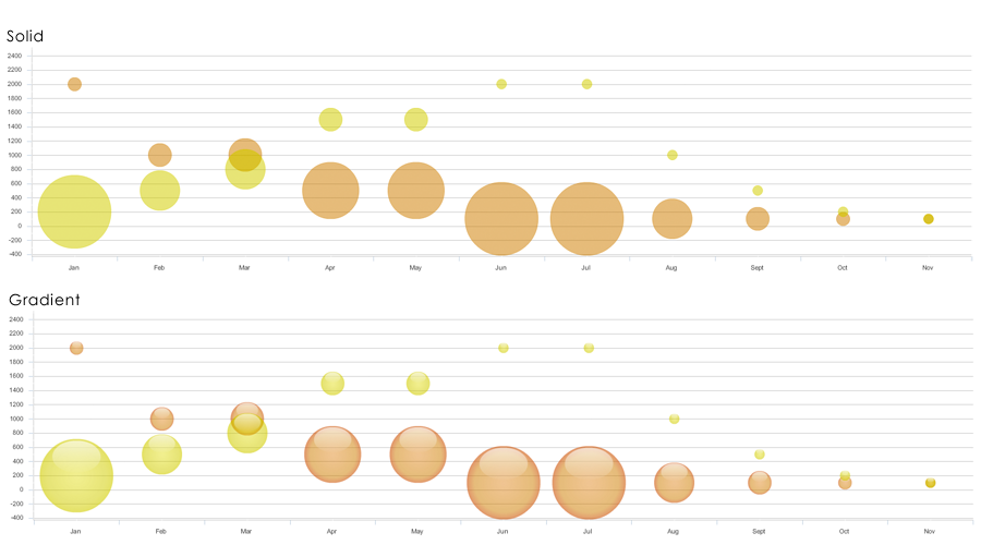
- The available rendering styles are Solid and Gradient
Color
- Color will work in conjunction with Fill Style to distinguish one series from another.
- You can select color by clicking on the color swatches in the color picker, or you can manually enter a hexadecimal color value.
Pattern
- In addition to Color, different Pattern options will help users distinguish one series from another
- Click on the Pattern button to view and select from numerous pattern options.
Alpha
- Alpha sets the opacity of the series and can be adjusted for both Color and Pattern.
- Reducing the Alpha lets you see grid lines show through the bars.
Additional Chart Options
- "Show Legend" toggles the legend on/off as desired.
- (Required) Min Radius: Sets the size of the smallest bubble on the chart.
- (Required) Max Radius: Sets the size of the largest bubble on the chart.
- Enable the X-Axis title and enter value as desired.
- Enable the X-Axis labels and rotate them as desired.
- Enable the Y-Axis title and enter value as desired.
- Enable the Y-Axis labels and rotate them as desired.
Additional Configuration Steps
- Provide additional configuration, if needed, on the Options tab. For details on the available Options, see Options.
- Enter the following information on the Actions tab:
- Click Add Event Action to configure one or more Actions to be invoked when a user clicks on the Bubble Chart Widget. The action will apply to the current data record being displayed.
Sample Data
Instructions for bringing sample chart data into AppBoard can be found here: Sample Chart Data


