Appboard/2.5/builder/system administration/themes: Difference between revisions
imported>Jason.nicholls No edit summary |
imported>Jason.nicholls No edit summary |
||
| (23 intermediate revisions by 3 users not shown) | |||
| Line 2: | Line 2: | ||
[[Category:AppBoard 2.5]] | [[Category:AppBoard 2.5]] | ||
== Overview == | == Overview == | ||
An AppBoard Theme is a collection of settings that manage the overall visual presentation of the application to the end-user in the web browser. | An AppBoard Theme is a collection of settings that manage the overall visual presentation of the application to the end-user in the web browser. Elements included in a Theme include colors, button styles, shadows, borders, backgrounds, and so on. | ||
The theme engine is extremely flexible and capable of a wide variety of styles as shown through the default themes shipped with the product. Custom themes can be created by extending the base themes to match the style and look for your organization or group. | |||
== Base Themes == | |||
[[File:appboard-2.4-all-themes.png|thumb|756px|center|AppBoard Themes]] | |||
AppBoard ships with a number of base themes as shown above (left-to-right): Dark, Flat, Frosted Glass, Light, Minimalist, and Smoked Glass. Please note the base themes are not editable and are shown with a lock icon in the Theme Manager. See the Managing Themes section for more information on how to build custom themes based on the base themes shipped with AppBoard. | |||
== Managing Themes == | == Managing Themes == | ||
[[File:appboard-2.4-theme-manager.png|frame|center|Theme Manager administration page]] | |||
Perform the following to manage Themes: | Perform the following to manage Themes: | ||
| Line 17: | Line 24: | ||
# In the <b>Builder Modes</b> panel, select <b>System Administration</b>, then select <b>Theme Manager</b>. This will launch the Theme Manager panel. | # In the <b>Builder Modes</b> panel, select <b>System Administration</b>, then select <b>Theme Manager</b>. This will launch the Theme Manager panel. | ||
To activate a theme, select a theme from the list of available themes, and click the "Activate Theme" option in the bottom toolbar. The checked theme indicates the currently active theme. | |||
{{Note|After changing or modifying themes, a browser refresh should be performed to ensure all theme changes are applied.}} | {{Note|After changing or modifying themes, a browser refresh should be performed to ensure all theme changes are applied.}} | ||
== Creating a New Custom Theme == | === Creating a New Custom Theme === | ||
Perform the following steps to create a new Theme: | Perform the following steps to create a new Theme: | ||
| Line 45: | Line 41: | ||
{{Note|If you manually set backgrounds to be dark while using the light theme, then some of the default dark text colors will become unreadable. The best practice is to switch to the "Dark" template if you want a dark look and feel. Doing so will ensure default text colors are readable.}} | {{Note|If you manually set backgrounds to be dark while using the light theme, then some of the default dark text colors will become unreadable. The best practice is to switch to the "Dark" template if you want a dark look and feel. Doing so will ensure default text colors are readable.}} | ||
== Deleting a Theme == | |||
=== Deleting a Theme === | |||
Perform the following steps to delete a Theme: | Perform the following steps to delete a Theme: | ||
# Select the Theme from the list of available Themes. | # Select the Theme from the list of available Themes. | ||
# Click "Delete" in the bottom toolbar. | # Click "Delete" in the bottom toolbar. | ||
{{Note|You can only delete custom themes. You can not delete the base themes that ship with AppBoard. You also can not delete a Theme while it is the currently active Theme. In such case, activate another Theme first, and then delete the Theme.}} | {{Note|You can only delete custom themes. You can not delete the base themes that ship with AppBoard. You also can not delete a Theme while it is the currently active Theme. In such case, activate another Theme first, and then delete the Theme.}} | ||
== Editing a Theme == | === Editing a Theme === | ||
Perform the following steps to edit the settings for a Theme: | Perform the following steps to edit the settings for a Theme: | ||
| Line 62: | Line 58: | ||
# Modify the Theme as desired, and then click "Save Changes" to save the changes to the Theme. | # Modify the Theme as desired, and then click "Save Changes" to save the changes to the Theme. | ||
# Apply the Theme to the system, if desired, by clicking "Activate Theme" in the bottom toolbar. | # Apply the Theme to the system, if desired, by clicking "Activate Theme" in the bottom toolbar. | ||
{{Note|You can only edit custom themes. You can not edit the base themes that ship with AppBoard.}} | {{Note|You can only edit custom themes. You can not edit the base themes that ship with AppBoard.}} | ||
=== Using the Theme Editor === | |||
An AppBoard theme is a collection of overrides for a default set of attributes. Rather than build up a Theme from scratch, AppBoard Themes start with default values pre-populated from a template. AppBoard ships with a number of base themes to provide a range of starting points. | |||
An AppBoard theme is a collection of overrides for a default set of attributes. Rather than build up a Theme from scratch, AppBoard Themes start with default values pre-populated from a template. AppBoard ships with | |||
To get started, select a <b>Theme Template </b> using the pull-down selector at the top of Theme Editor. The base template is all that is required for a Theme. A new Theme without any overrides is basically just a copy of the Theme Template. | To get started, select a <b>Theme Template </b> using the pull-down selector at the top of Theme Editor. The base template is all that is required for a Theme. A new Theme without any overrides is basically just a copy of the Theme Template. | ||
By selecting a different <b>Theme Template</b>, you will swap out the base values used by the current Theme. Any overrides configured as part of your new Theme will persist; however, the values used in your overrides may no longer make sense after you have switched from a "Dark" theme to a "Light" theme. | |||
Refer to the [[appboard/2.5/builder/system_administration/themes/editor_categories|Theme Editor Categories]] page to explain the grouping categories for configurable options. Also refer to the [[appboard/2.5/builder/system_administration/themes/editor_controls|Theme Editor Controls]] to describe the types of controls available for theme options. | |||
[[Image:appboard-2.4-theme-editor.png|frame|center|Theme Editor]] | |||
=== Theme Image Assets === | |||
{{Warning|Do not modify the shipped image assets as these are not backed up and may be replaced on upgrade}} | |||
Custom theme image assets should be placed into the <tt>[INSTALL_HOME]/server/enportal/visualizer/assets/custom/</tt> directory. This is to ensure the files are automatically included in backup archives. | |||
The following theme images are configurable by the theme editor: | |||
* "Global" -> "Background Image": By default there is no background image configured. If this setting is enabled then it will take precedence over the "Background Colors". The selected image will be stretched to fit the available background space - which will depend on the screen resolution and browser dimensions for each client. | |||
* "Banner" -> "Logo Path": By default this is the AppBoard logo, but can be changed. The default logo is 180 x 48 pixels and for convenience it is recommended to stick with 48 vertical pixels, however other Banner theme settings allow for changes to accommodate other sized logos. | |||
To enable a custom image asset: | |||
# Launch the Theme Editor | |||
# Edit an existing or create a new custom theme. | |||
# Check the appropriate theme option (one of the above) | |||
# Use the magnifying icon to bring up the file explorer. Browse to the <tt>custom</tt> directory, find and select an image. | |||
# Select "OK" to close the file explorer. | |||
# "Save Changes" in the theme editor. | |||
== Migrating Custom Themes == | == Migrating Custom Themes == | ||
Themes consist of two parts: | |||
# Theme Configuration | |||
# | # Theme Assets: logo graphics, background images, etc.. | ||
By default any theme configuration is automatically backed up when performing a full backup. Further, any theme assets located in <tt>[INSTALL_HOME]/server/webapps/enportal/visualizer/assets/custom/</tt> will also be included in any backup archive. Other theme assets existing elsewhere on the filesystem should be added to the custom export list to ensure the files are included in backup archives. See the [[appboard/2.5/admin/backup_and_recovery#Customizing_the_Export|Customizing the Export]] section of the Backup & Recovery page for more information. | |||
To migrate a custom theme to another AppBoard instance altogether then the Import/Export tool can be used, but please note this only includes theme configuration and the theme assets will have to be copied separately. Refer to the [[appboard/2.5/builder/system_administration/import_export|Import/Export]] documentation for more information. It's also important to include any themes which the exported theme may be dependent on, if not directly dependent on a base theme. | |||
Latest revision as of 07:38, 26 February 2015
Overview
An AppBoard Theme is a collection of settings that manage the overall visual presentation of the application to the end-user in the web browser. Elements included in a Theme include colors, button styles, shadows, borders, backgrounds, and so on.
The theme engine is extremely flexible and capable of a wide variety of styles as shown through the default themes shipped with the product. Custom themes can be created by extending the base themes to match the style and look for your organization or group.
Base Themes
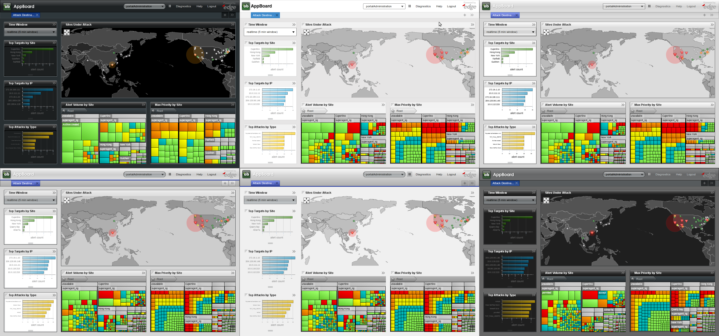
AppBoard ships with a number of base themes as shown above (left-to-right): Dark, Flat, Frosted Glass, Light, Minimalist, and Smoked Glass. Please note the base themes are not editable and are shown with a lock icon in the Theme Manager. See the Managing Themes section for more information on how to build custom themes based on the base themes shipped with AppBoard.
Managing Themes
Perform the following to manage Themes:
- Log in to AppBoard Builder as an administrator.
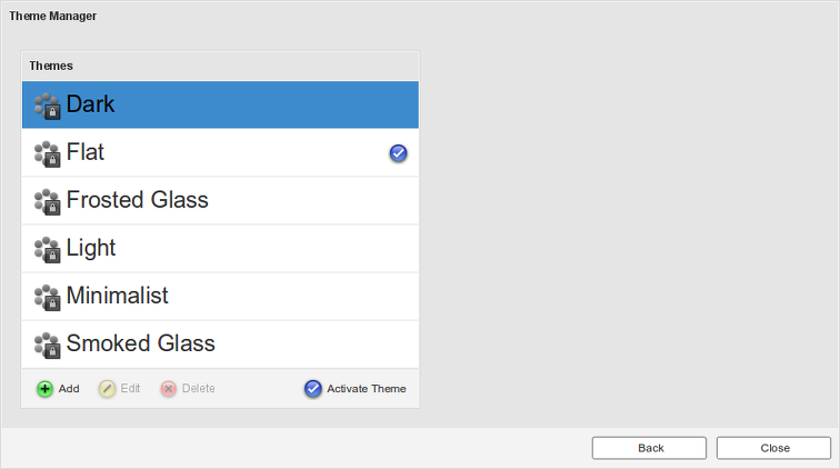
- In the Builder Modes panel, select System Administration, then select Theme Manager. This will launch the Theme Manager panel.
To activate a theme, select a theme from the list of available themes, and click the "Activate Theme" option in the bottom toolbar. The checked theme indicates the currently active theme.
Creating a New Custom Theme
Perform the following steps to create a new Theme:
- Click "Add" in the bottom toolbar. This will launch the "Theme Editor".
- Enter a name for the new Theme to be created.
- Click "Add Theme".
- The Theme is created with a set of default settings.
- Modify the Theme as desired, and then click "Save Changes" to save the changes to the Theme.
- Apply the theme to the system, if desired, by clicking "Activate Theme" in the bottom toolbar.
Deleting a Theme
Perform the following steps to delete a Theme:
- Select the Theme from the list of available Themes.
- Click "Delete" in the bottom toolbar.
Editing a Theme
Perform the following steps to edit the settings for a Theme:
- Select the Theme from the list of available Themes.
- Click "Edit" in the bottom toolbar. This will launch the "Theme Editor".
- Modify the Theme as desired, and then click "Save Changes" to save the changes to the Theme.
- Apply the Theme to the system, if desired, by clicking "Activate Theme" in the bottom toolbar.
Using the Theme Editor
An AppBoard theme is a collection of overrides for a default set of attributes. Rather than build up a Theme from scratch, AppBoard Themes start with default values pre-populated from a template. AppBoard ships with a number of base themes to provide a range of starting points.
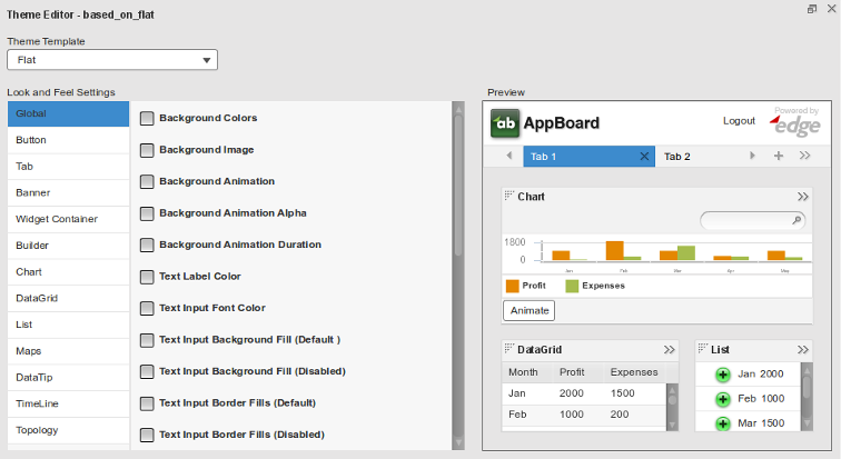
To get started, select a Theme Template using the pull-down selector at the top of Theme Editor. The base template is all that is required for a Theme. A new Theme without any overrides is basically just a copy of the Theme Template.
By selecting a different Theme Template, you will swap out the base values used by the current Theme. Any overrides configured as part of your new Theme will persist; however, the values used in your overrides may no longer make sense after you have switched from a "Dark" theme to a "Light" theme.
Refer to the Theme Editor Categories page to explain the grouping categories for configurable options. Also refer to the Theme Editor Controls to describe the types of controls available for theme options.
Theme Image Assets
Custom theme image assets should be placed into the [INSTALL_HOME]/server/enportal/visualizer/assets/custom/ directory. This is to ensure the files are automatically included in backup archives.
The following theme images are configurable by the theme editor:
- "Global" -> "Background Image": By default there is no background image configured. If this setting is enabled then it will take precedence over the "Background Colors". The selected image will be stretched to fit the available background space - which will depend on the screen resolution and browser dimensions for each client.
- "Banner" -> "Logo Path": By default this is the AppBoard logo, but can be changed. The default logo is 180 x 48 pixels and for convenience it is recommended to stick with 48 vertical pixels, however other Banner theme settings allow for changes to accommodate other sized logos.
To enable a custom image asset:
- Launch the Theme Editor
- Edit an existing or create a new custom theme.
- Check the appropriate theme option (one of the above)
- Use the magnifying icon to bring up the file explorer. Browse to the custom directory, find and select an image.
- Select "OK" to close the file explorer.
- "Save Changes" in the theme editor.
Migrating Custom Themes
Themes consist of two parts:
- Theme Configuration
- Theme Assets: logo graphics, background images, etc..
By default any theme configuration is automatically backed up when performing a full backup. Further, any theme assets located in [INSTALL_HOME]/server/webapps/enportal/visualizer/assets/custom/ will also be included in any backup archive. Other theme assets existing elsewhere on the filesystem should be added to the custom export list to ensure the files are included in backup archives. See the Customizing the Export section of the Backup & Recovery page for more information.
To migrate a custom theme to another AppBoard instance altogether then the Import/Export tool can be used, but please note this only includes theme configuration and the theme assets will have to be copied separately. Refer to the Import/Export documentation for more information. It's also important to include any themes which the exported theme may be dependent on, if not directly dependent on a base theme.


