Appboard/old/style guide: Difference between revisions
imported>Jason.nicholls |
imported>Jason.nicholls |
||
| (13 intermediate revisions by the same user not shown) | |||
| Line 1: | Line 1: | ||
{{DISPLAYTITLE:Style Guide}} | |||
[[Category:AppBoard old]] | |||
This page provides detailed instructions for modifying the styling of enPortal and AppBoard. | This page provides detailed instructions for modifying the styling of enPortal and AppBoard. | ||
For an introduction to the user experience design philosophy of AppBoard, see [[ | For an introduction to the user experience design philosophy of AppBoard, see [[appboard/old/user_experience_design|User Experience Design]]. | ||
| Line 52: | Line 54: | ||
For a detailed walkthrough of customizing the enPortal Look and Feel, see [[ | For a detailed walkthrough of customizing the enPortal Look and Feel, see [[enportal/old/laf_example|enPortal Look and Feel customization walkthrough]]. | ||
== enPortal Banner Logo == | == enPortal Banner Logo == | ||
| Line 91: | Line 93: | ||
=== Customizing the Login Page === | === Customizing the Login Page === | ||
For sample customizations to the system Login Page, see [[ | For sample customizations to the system Login Page, see [[appboard/old/login_page_customization|Login Page Customization]]. | ||
= Appboard Overview = | = Appboard Overview = | ||
| Line 118: | Line 120: | ||
== Compiling a Custom Skin == | == Compiling a Custom Skin == | ||
# Perform all of the instructions in the article [[ | # Perform all of the instructions in the article [[appboard/old/custom_flex_widgets#Setting_up_a_Development_Environment|Creating a Custom AppBoard Widget]], to configure your development environment. | ||
# Customize the CSS file [Appboard_VisualBuilder_SDK]/src/customStyle.css per the instructions detailed in this document. | # Customize the CSS file [Appboard_VisualBuilder_SDK]/src/customStyle.css per the instructions detailed in this document. | ||
# Click the "Debug" button and choose "Appboard_Builder". | # Click the "Debug" button and choose "Appboard_Builder". | ||
| Line 124: | Line 126: | ||
{{Note|The CustomStyle.swf file is automatically referenced and will be used as the Custom skin. You can see this reference in the file [AppBoard_Home]/webapps/enportal/visualizer/assets/config.xml}} | {{Note|The CustomStyle.swf file is automatically referenced and will be used as the Custom skin. You can see this reference in the file [AppBoard_Home]/webapps/enportal/visualizer/assets/config.xml}} | ||
== Replacing Logos and Background Image == | == Replacing Logos and Background Image == | ||
| Line 150: | Line 151: | ||
# Perform the following to configure the skin to reference the new background image: | # Perform the following to configure the skin to reference the new background image: | ||
## Log in to AppBoard as an administrator | ## Log in to AppBoard as an administrator | ||
## Launch the [[ | ## Launch the [[appboard/old/themes|Theme Editor]] | ||
## Make sure you have created a custom Theme, and are editing that Theme (system Themes are not editable) | ## Make sure you have created a custom Theme, and are editing that Theme (system Themes are not editable) | ||
## Under the "Global" section, check the "Background Image" box and edit the value to the location of your custom image, relative to [INSTALL_HOME]/server/webapps/enportal/visualizer/ | ## Under the "Global" section, check the "Background Image" box and edit the value to the location of your custom image, relative to [INSTALL_HOME]/server/webapps/enportal/visualizer/ | ||
##* Example: <tt>assets/images/backgrounds/myImage.gif</tt> | ##* Example: <tt>assets/images/backgrounds/myImage.gif</tt> | ||
= Custom Icons = | = Custom Icons = | ||
| Line 289: | Line 289: | ||
This class defines the standard text button you will see throughout the UI. Text buttons appear just about everywhere in the UI; toolbars, as form elements, inside datagrids, etc. | This class defines the standard text button you will see throughout the UI. Text buttons appear just about everywhere in the UI; toolbars, as form elements, inside datagrids, etc. | ||
[[Image: | [[Image:Button_states.png|thumb|center|700px|Sample states for text Buttons]] | ||
[[Image:Button_400x.png|thumb|center|700px|How CSS attributes map to a text button (magnified 400%)]] | [[Image:Button_400x.png|thumb|center|700px|How CSS attributes map to a text button (magnified 400%)]] | ||
=== s|DropDownList === | === s|DropDownList === | ||
| Line 301: | Line 300: | ||
.iconButton is an extension of the base Spark button skin that adds the drop down icon at the right. With the exception of the icon, the attributes are the same as what you find in the s|Button class. | .iconButton is an extension of the base Spark button skin that adds the drop down icon at the right. With the exception of the icon, the attributes are the same as what you find in the s|Button class. | ||
[[Image: | [[Image:ButtonPulldown_light.png|thumb|center|700px|Sample of EdgeLight s|DropDownList ]] | ||
=== .buttonLinkButton === | === .buttonLinkButton === | ||
| Line 311: | Line 309: | ||
[[Image: | [[Image:Breadcrumbs_dark.png|thumb|center|700px|Sample breadcrumbs from the EdgeDark skin]] | ||
=== .buttonLinkButtonBanner === | === .buttonLinkButtonBanner === | ||
This is identical to the other buttonLinkButtons, but it is tailored to look good in the banner. (see s|Button for a visual mapping of CSS attributes) | This is identical to the other buttonLinkButtons, but it is tailored to look good in the banner. (see s|Button for a visual mapping of CSS attributes) | ||
[[Image: | [[Image:BannerLinkButtons.png|thumb|center|700px|Sample banner linkButtons]] | ||
== .buttonLinkButtonWizard == | == .buttonLinkButtonWizard == | ||
This is identical to the other buttonLinkButtons, but it is tailored to look good in the wizard nav area. (see s|Button for a visual mapping of CSS attributes) | This is identical to the other buttonLinkButtons, but it is tailored to look good in the wizard nav area. (see s|Button for a visual mapping of CSS attributes) | ||
[[Image: | [[Image:WizardLinkButtons.png|thumb|center|700px|Sample wizard linkButtons]] | ||
== s|TextInput == | == s|TextInput == | ||
| Line 333: | Line 328: | ||
[[Image: | [[Image:TextInput.png|thumb|center|700px|Sample wizard linkButtons]] | ||
Latest revision as of 10:29, 17 July 2014
This page provides detailed instructions for modifying the styling of enPortal and AppBoard.
For an introduction to the user experience design philosophy of AppBoard, see User Experience Design.
enPortal Overview
enPortal Look and Feel
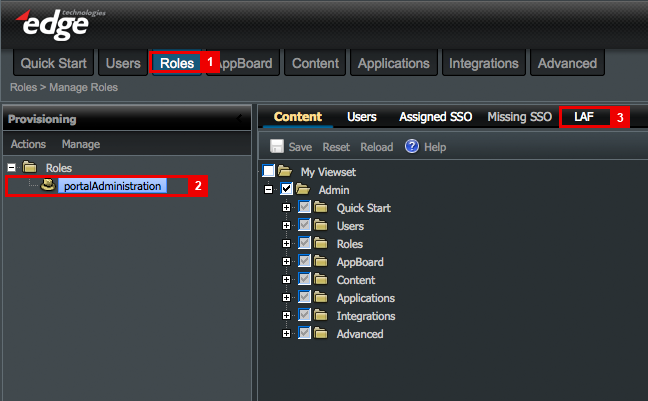
You can assign a Look and Feel at several different levels within enPortal. For the purpose of this walk-through, we will assign a Look and Feel to a "role".
- Step 1: Select the Roles tab in the enPortal UI.
- Step 2: Select the role to which you want to assign a Look and Feel.
- Step 3: Select the "L&F" option.
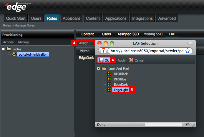
- Step 4: Click "Assign ..." in the L&F Toolbar.
- Step 5: Select a Look and Feel from the list.
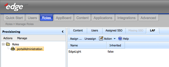
- Step 6: Click OK.
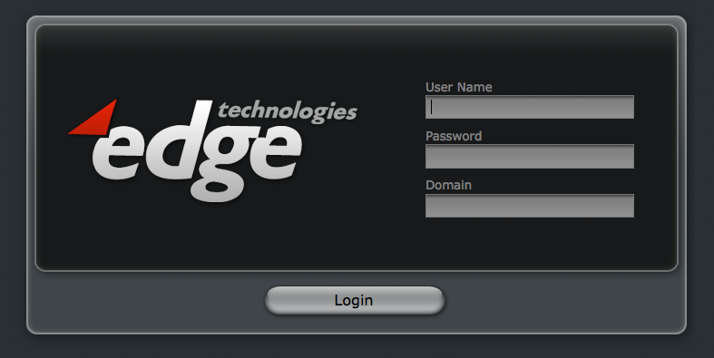
- Step 7: Log out.
- Step 8: Log in and you should see the new Look and Feel for that Role.
Assigning a Default Look and Feel for the enPortal System
In the above section, you assigned a Look and Feel to one or more Roles. This would apply to any users who have Roles defined in the system. It is also recommended to assign a "System LAF". This will apply as a backup to any user who does not have a Role assigned, and will also apply to the administrator.
Perform the following steps to assign a System LAF: 1. Log in to enPortal as administrator. 2. Select the "Advanced" tab. 3. Right-click on the "Explorer" folder and select "System LAF". 4. Select the desired system LAF from the pull-down menu.
Customizing an existing Look and Feel for enPortal
You can modify the Look and Feel of the banner area inside enPortal via the Portal.css file. Each skin has its own Portal.css, so make sure you modify the Portal.css for the appropriate skin.
- EdgeLight: /webapps/enportal/framework/laf/banner_edge_light/css/Portal.css
- EdgeDark: /webapps/enportal/framework/laf/banner_edge_dark/css/Portal.css
The CSS files reference images from their respective "images" directory. You can modify the Look and Feel of the top level tabs used by enPortal by replacing the images in these images directories.
- EdgeLight: /webapps/enportal/framework/laf/banner_edge_light/images
- EdgeDark: /webapps/enportal/framework/laf/banner_edge_dark/images
For a detailed walkthrough of customizing the enPortal Look and Feel, see enPortal Look and Feel customization walkthrough.
enPortal Banner Logo
Default Logo locations
- EdgeDark = ../webapps/enportal/framework/laf/banner_edge_dark/images/EdgeLogo_48x.png
- EdgeLight = ../webapps/enportal/framework/laf/banner_edge_light/images/EdgeLogo_48x.png
Replacing the enPortal logo
- Navigate to the appropriate image directory for the skin you are using.
- Open EdgeLogo_48x.png using an image editor.
- The dimensions of the image are 128x48 pixels, but the logo itself is only 32 pixels high.
- Note: The image height is the same height as the banner, so any desired padding should be added into the image.
- Paste desired logo into this file.
- Adjust padding to taste.
- Overwrite EdgeLogo_48x.png with the new image.
enPortal Login Page Image
Default Login Logo locations
- EdgeDark= /webapps/enportal/login_pages/images/logo.png
- EdgeLight= /webapps/enportal/login_pages/edgeLight/images/logo.png
Changing the Login Page Logo
- Navigate to the appropriate image directory for the skin you are using.
- Open logo.png using an image editor.
- The dimensions of the image are 340x200 pixels.
- Paste desired logo into this file.
- Save over logo.png with a new image.
Customizing the Login Page
For sample customizations to the system Login Page, see Login Page Customization.
Appboard Overview
Look and feel is inherently subjective, which makes creating a single look and feel such a challenge in user interfaces. In an attempt to satisfy a broad audience, AppBoard ships with two stock themes; EdgeLight and EdgeDark. However, no matter how nice the stock themes may look, we knew we had to enable our customers to put their own stamp on the User Interface.
This guide provides an overview of the main CSS classes used inside AppBoard. It provides some basic illustrations to show how various CSS attributes affect what you see on the screen. There is always some trial and error associated with CSS alterations, but this guide should help point you in the right direction, and make incorporating your own brand identity easier.
Architecture
What do we mean by a "skin"? For those familiar with Flex, AppBoard takes advantage of the Spark architecture. From a technical standpoint, we have a single collection of .MXML files that define the presentation layer of our application. We allow you to pass different colors into that pre-defined .MXML via the attributes we expose through CSS files.
The CSS file we expose resembles a traditional HTML CSS file, but upon further inspection you will find that it is not your standard CSS markup. We go well beyond what is currently possible though standard browser markup inside AppBoard, and as such, the CSS classes we use are tailored to the needs of specific components within our UI. That said, if you are familiar with CSS, you should be able to follow what is going on.
In order to switch between different skins at run time, the CSS files must be converted into a .SWF format. For more details, see the Compiling a Custom Skin section below. The good news is that once compiled, you will not have to worry about variations between browser platforms.
Creating a New Skin
Appboard ships with two stock themes, EdgeLight and EdgeDark. You can select either of these themes through the standard AppBoard Builder design interface, by clicking the "Styles" button under the Global Options configuration section. Selecting the desired theme from the style chooser will apply that theme throughout the current dashboard. You can overlay any of the values in these skins by editing and compiling the "CustomStyle.css" in the Appboard Visual Builder SDK. Below are the instructions for obtaining, editing, and deploying a custom skin.
Compiling a Custom Skin
- Perform all of the instructions in the article Creating a Custom AppBoard Widget, to configure your development environment.
- Customize the CSS file [Appboard_VisualBuilder_SDK]/src/customStyle.css per the instructions detailed in this document.
- Click the "Debug" button and choose "Appboard_Builder".
Replacing Logos and Background Image
Appboard Banner
Default Logo locations /webapps/enportal/visualizer/assets/images/logo_banner.png
- Navigate to /webapps/enportal/visualizer/assets/images.
- Open logo_banner.png in an image editor.
- The dimensions of the image are 128x48 pixels, but the logo itself is only 32 pixels high.
- Note: The image height is the same height as the banner, so any desired padding should be added into the image.
- Paste desired logo into this file.
- Adjust padding to taste.
- Overwrite logo_banner.png with the new image.
Background Image
Background Image file location /webapps/enportal/visualizer/assets/images/backgrounds/
Perform the following steps to change the background image
- Create the new background image in an image editor
- Save the background image to /webapps/enportal/visualizer/assets/images/backgrounds/.
- Perform the following to configure the skin to reference the new background image:
- Log in to AppBoard as an administrator
- Launch the Theme Editor
- Make sure you have created a custom Theme, and are editing that Theme (system Themes are not editable)
- Under the "Global" section, check the "Background Image" box and edit the value to the location of your custom image, relative to [INSTALL_HOME]/server/webapps/enportal/visualizer/
- Example: assets/images/backgrounds/myImage.gif
Custom Icons
AppBoard's base icons are contained within CSV files in the following directory on AppBoard's server: /server/webapps/enportal/WEB-INF/xmlroot/appboard/config/iconregistry/
If you would like to add custom icons to AppBoard, you must add a new CSV file to the directory above. AppBoard's CSV Aggregation Adapter will read in content from all the CSVs contained within this directory, and will create a single internal Data Collection from it.
The quickest way to to create a new CSV is to copy one of those existing files in the /appboard/config/iconregistry/ directory, and rename that file to custom-XXXXXXXX.csv.
Note: The upgrade process will overwrite the base CSVs in this directory, so any changes you make to those base files will get overwritten and lost. If you want your custom icons to persist, you should create new CSVs. Custom CSVs in this directory will not be overwritten during an upgrade.
You may then add as many icons to your new custom CSV file as you want. To add a new icon, just create a new row in that CSV file.
Note: It is important you do not make any modifications to the columns in your custom CSV file. The columns across all of these files need to match, so the content can be aggregated. If you modify the column names, or add new columns, the aggregation adapter wont know what to do with that information.
When you are finished adding icons to your custom-XXXXXXXXX.csv file, you will need to restart your server so AppBoard's CSV Aggregation Adapter can bring in the new content. Your new icons will be merged in with AppBoard's default icons, and will be accessible via the pulldowns that you would normally use to select AppBoard icons.
Appboard Styles
Global Styles
The "global" css class sets up some default font values that should look similar to standard CSS values. The global class also contains some specialized settings for modality.
Modal Settings
- modal-transparency:
- Alpha value used for the fade effect on modal dialogs
- modal-transparency-color:
- Color of fade effect on modal dialogs
- modal-transparency-duration:
- Transition Length of Fade Effect on modal dialogs
- modal-transparency-blur:
- Amount of blur to apply to background elements behind a modal dialog
s|Application
The s|Application class defines the background for the entire application. It also defies the default charting colors used across all charts.
backgroundColors
The background color is defined as a gradient, so you will need to set colors using an Array. The array accepts two color values:
- The first color defines the top color of the gradient
- The second color defines the bottom color of the gradient
Note: If you prefer a solid background, then use the same Hex value for both numbers.
defaultColorPalette
This attribute defines the default color values used by all charting widgets. If you do not like the default charting colors, then you can modify the Hex colors in this array.
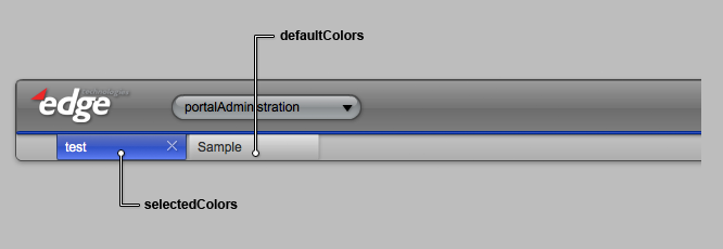
Banner
The banner is a composite of several different skins:
- The look and feel of the banner container itself is defined by .skinnableContainerBanner.
- The Banner contains a tab bar used to navigate between different stacks, which is defined by the tabBarButtonSkin.
- The Banner area has several linkButtons, which are defined by .buttonLinkButtonBanner
.skinnableContainerBanner
The banner is broken up into two visual elements:
- An outer group that acts as a visual container for Navigation Tabs.
- An inner group that acts as a visual container for logo and actions.
.tabBarButtonSkin
The tab bar component used in the banner is overlayed on top of .skinnableContainerBanner, and positioned so that it looks like a single, uniform component. The look and feel of the tabs is defined in .tabBarButtonSkin. The attributes used in the .tabBarButtonSkin class are very similar to attributes you will find in s|button. This is because the tabs are actually a s|ButtonBar skinned to look like tabs.
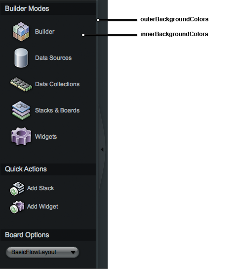
Tool Palette
.skinnableContainerToolPalette
The Tool Palette is a simple Spark skinnableContainer with two skinnable elements:
- outercontainer
- innercontainer
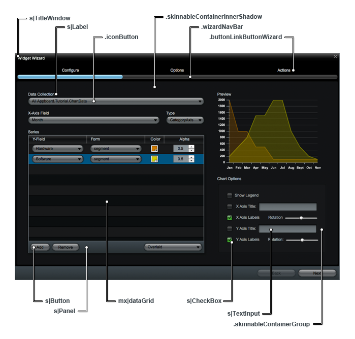
Wizards
Wizards are comprised of many different sub-components, so the look and feel of a wizard is defined by the sum of all its parts. The diagram below shows all of the component level CSS classes that fit together to make a wizard.
Dialogs
Dialogs refer to any screens in the UI that "pop up".
s|TitleWindow
This is the default container used for most of the modal dialogs in the UI (the exception is the mx|Alert).
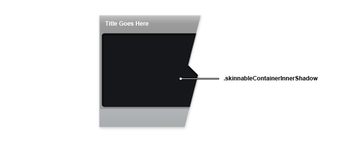
Note: Content inside of a s|titleWindow is usually wrapped with a skinnableContainer which has a styleName=".skinnableContainerInnerShadow". You will have to update the both s|TitleWindow and .skinnableContainerInnerShadow to get a uniform look and feel.
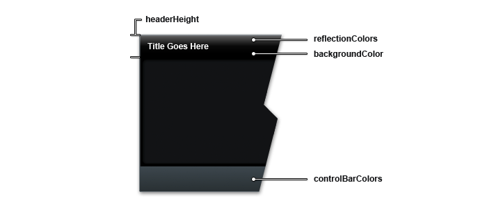
view|WidgetContainer (componentDark.css)
The WidgetContainer is a custom component that wraps all widgets in the UI. WidgetContainer extends s|TitleWindow, and looks very much like a title window, but it has several functional enhancements.
WidgetContainer contains icons for Appboard specific functions. These icons can be modified using the following CSS styles:
- .titleWindowCloseButton
- .titleWindowCustomizeButton
- .titleWindowActionButton
- .titleWindowMaximizeButton
Buttons
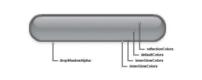
Buttons are one of the most CSS intensive elements in the UI. Button CSS is complex due to button states. Each button has several visual elements, as well as 4 primary states: default, over, down, and disabled. AppBoard uses gradients on most of the visual elements inside the button. Since each state can have its own unique color gradient defined, the number of CSS attributes grows rapidly. We streamlined the button .MXML to keep from ballooning the CSS too much.
All buttons used in the UI are variants of the same underlying .MXML skin. So, once you understand CSS classes for one button, you understand them all.
s|Button
This class defines the standard text button you will see throughout the UI. Text buttons appear just about everywhere in the UI; toolbars, as form elements, inside datagrids, etc.
s|DropDownList
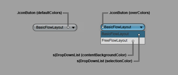
This class defines the look and feel of the dropdown list itself, not the button. The ".iconButton" class (below) defines the look and feel of the button element of the S|DropDownList.
.iconButton
.iconButton is an extension of the base Spark button skin that adds the drop down icon at the right. With the exception of the icon, the attributes are the same as what you find in the s|Button class.
.buttonLinkButton
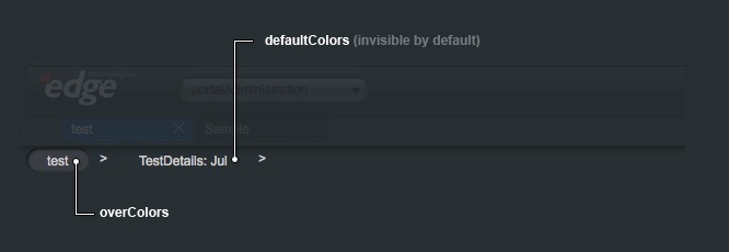
These buttons are used for breadcrumbs.
Link buttons share the same class names as the standard s|Button. Link buttons are fairly simple, so most of the visual styles are turned off. (see s|Button for a visual mapping of CSS attributes)
.buttonLinkButtonBanner
This is identical to the other buttonLinkButtons, but it is tailored to look good in the banner. (see s|Button for a visual mapping of CSS attributes)
.buttonLinkButtonWizard
This is identical to the other buttonLinkButtons, but it is tailored to look good in the wizard nav area. (see s|Button for a visual mapping of CSS attributes)
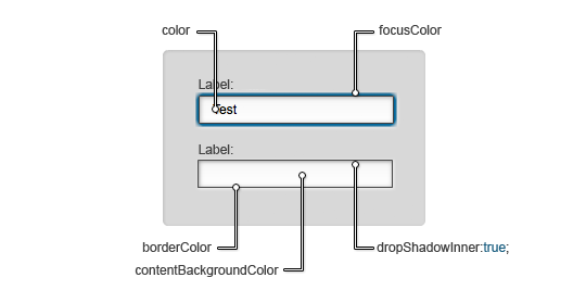
s|TextInput
Text Input fields are used in a variety of configuration screens.
The "dropShadowInner" attribute defines a property of the dropShadow filter inside of Flex.
- dropShadowInner: true; --> results in an inner shadow.
- dropShadowInner: false; --> results in a traditional drop shadow.
