Appboard/old/actions/show data tip: Difference between revisions
imported>Jason.nicholls m (moved Action Show Data Tip to appboard/old/actions/show data tip) |
imported>Jason.nicholls No edit summary |
||
| Line 1: | Line 1: | ||
{{DISPLAYTITLE:Show Data Tip Action}} | |||
[[Category:AppBoard old]] | |||
The '''Show Data Tip''' Action displays a pop-up box that lists selected fields and values for records in a Widget's Data Collection. This Action is available under both "Mouse Click" and "Mouse Hover" types and allows for the display of additional information about a node in a Widget without having to drill down to another Widget. | The '''Show Data Tip''' Action displays a pop-up box that lists selected fields and values for records in a Widget's Data Collection. This Action is available under both "Mouse Click" and "Mouse Hover" types and allows for the display of additional information about a node in a Widget without having to drill down to another Widget. | ||
Latest revision as of 15:07, 17 July 2014
The Show Data Tip Action displays a pop-up box that lists selected fields and values for records in a Widget's Data Collection. This Action is available under both "Mouse Click" and "Mouse Hover" types and allows for the display of additional information about a node in a Widget without having to drill down to another Widget.
How To Create a Show Data Tip Action
For instructions on adding an Action to a Widget, see the general instructions in How To Create an Action in a Widget.
How To Configure a Show Data Tip Action
- Follow the instructions above to create the basic Show Data Tip Action. Note: this Action can be created as either a "Mouse Click" or "Mouse Hover" Action type.
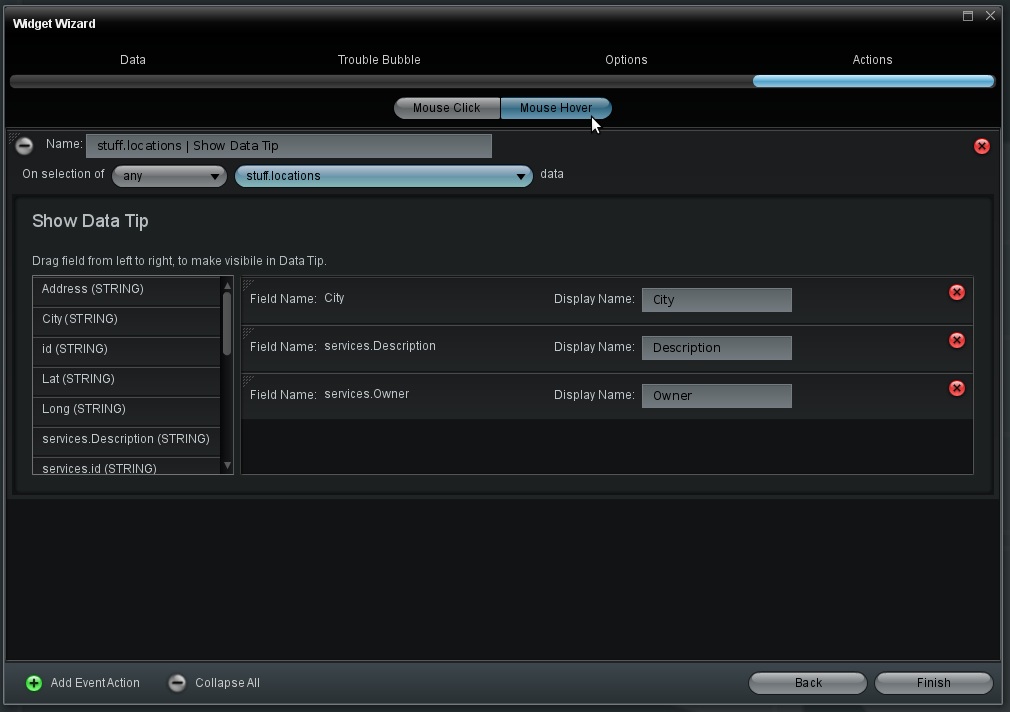
- Enter the following information on the Actions configuration panel in the Widget Wizard:
- Name: The label for this Action. For convenience, a default label is provided.
- On selection of:
- Select "any" or "specific" for the type of data selection by the User that will trigger the Action. If you select "specific", you must do the following:
- Click the Filter button. The Filter Editor is displayed.
- Click Add Rule to create one or more rules that indicate what data should trigger the Action, when selected.
- Click Finish to save the Filter settings.
- Select the Data Collection name. When the Widget is run, selection of data in this Data Collection will trigger the Action.
- Select "any" or "specific" for the type of data selection by the User that will trigger the Action. If you select "specific", you must do the following:
- Show Data Tip: Drag and drop the fields from the list on the left to the area to the right. Once the fields are in the right section they can be rearranged by dragging from the upper left corner of the row and dropping once the bold white line is displayed in the desired area.
- Display Name: The default display name will be set as the "Field Name", but you can enter a different name to be displayed for the field in the Data Tip.
- Click Finish, go to the Builder, and select an item that will initiate the Show Data Tip Action and display the selected data.
Sample Use Case
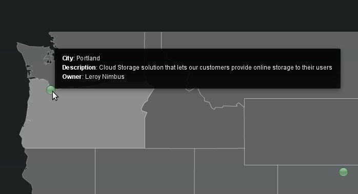
In many instances, it is useful to be able to access more extensive details on records without having them displayed in the body of the Widget. For example, in a map displaying each of the offices for a company it would be useful to be able to access information about how many employees work in each office, how much money each office has produced in sales, what jobs are in demand at each office, etc. However, it would not be possible or visually appropriate to have these details listed in the map. Instead, a Show Data Tip Action can be set to show these details when the user moves the pointer over the node for an office, or the user clicks on a node.


