Appboard/2.5/builder/system administration/themes/editor controls: Difference between revisions
imported>Jason.nicholls No edit summary |
imported>Jason.nicholls |
||
| (9 intermediate revisions by the same user not shown) | |||
| Line 1: | Line 1: | ||
{{DISPLAYTITLE:Theme | {{DISPLAYTITLE:Theme Editor Controls}} | ||
[[Category:AppBoard 2.5]] | [[Category:AppBoard 2.5]] | ||
== Overview == | |||
The AppBoard Theme Editor provides a variety of controls for configurable theme options. These options are grouped into different categories for convenience (see the [[appboard/2.5/builder/system_administration/themes/editor_categories|Theme Editor Categories]] for more information). | |||
This page details | This page details the types of controls and the effects of the controls on themes. | ||
== Layered Gradients == | |||
AppBoard's look and feel distills down to a series of layered gradients. AppBoard's Theme Editor allows you to adjust the color of those gradients, and in many cases, the alpha values as well. The combination of color and alpha gives you a wide range of options when building your own theme. | AppBoard's look and feel distills down to a series of layered gradients. AppBoard's Theme Editor allows you to adjust the color of those gradients, and in many cases, the alpha values as well. The combination of color and alpha gives you a wide range of options when building your own theme. | ||
| Line 13: | Line 14: | ||
== Theme Controls == | == Theme Controls == | ||
Theme Editor uses several different types of inputs when customizing a theme. | Theme Editor uses several different types of inputs when customizing a theme. | ||
=== Alpha === | === Alpha === | ||
| Line 21: | Line 22: | ||
* 1.0 - Completely opaque | * 1.0 - Completely opaque | ||
[[Image:ThemeAlpha01.png|frame|none|320px|Alpha Range]] | [[Image:ThemeAlpha01.png|frame|none|320px|Alpha Range]] | ||
=== Color === | === Color === | ||
| Line 33: | Line 33: | ||
=== File === | === File === | ||
AppBoard uses a special text entry field with a file browser for selecting background images. The file picker points to the following directory on the Appboard Server | AppBoard uses a special text entry field with a file browser for selecting background images. The file picker points to the following directory on the Appboard Server: <tt>[INSTALL_HOME]/server/webapps/enportal/visualizer/assets/</tt> | ||
[[Image:ThemeFile01.png|frame|none|640px|File Chooser Example]] | [[Image:ThemeFile01.png|frame|none|640px|File Chooser Example]] | ||
=== Fill & Gradient Fill=== | === Fill & Gradient Fill=== | ||
| Line 61: | Line 58: | ||
# Animation Duration: This determines the length of chart animations in milliseconds. It's values are constrained between 0 and 3000, and it's increment/decrement is set to 100. | # Animation Duration: This determines the length of chart animations in milliseconds. It's values are constrained between 0 and 3000, and it's increment/decrement is set to 100. | ||
# Panel Outer Radius: This setting determines whether panels have rounded corners. It's values are constrained between 0 and 20, and it's increment/decrement is set to 1. | # Panel Outer Radius: This setting determines whether panels have rounded corners. It's values are constrained between 0 and 20, and it's increment/decrement is set to 1. | ||
=== Stroke === | === Stroke === | ||
Latest revision as of 11:58, 30 July 2014
Overview
The AppBoard Theme Editor provides a variety of controls for configurable theme options. These options are grouped into different categories for convenience (see the Theme Editor Categories for more information).
This page details the types of controls and the effects of the controls on themes.
Layered Gradients
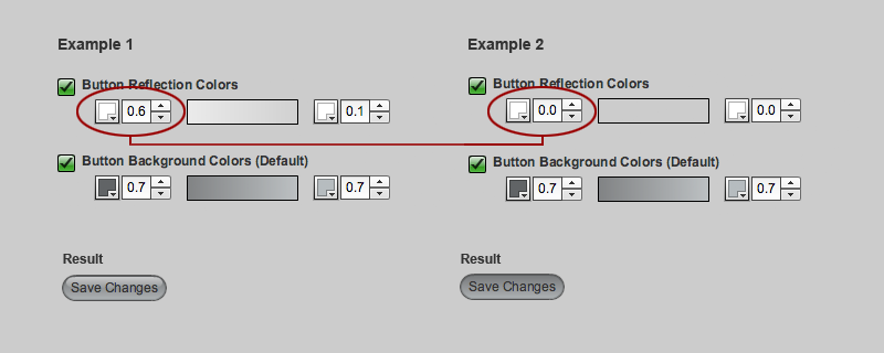
AppBoard's look and feel distills down to a series of layered gradients. AppBoard's Theme Editor allows you to adjust the color of those gradients, and in many cases, the alpha values as well. The combination of color and alpha gives you a wide range of options when building your own theme.
Theme Controls
Theme Editor uses several different types of inputs when customizing a theme.
Alpha
AppBoard uses a specialized spinner control for entering Alpha values. The Alpha control differs from a Number in that it increments/decrements by 0.1, and its values are constrained between:
- 0.0 - Completely transparent
- 1.0 - Completely opaque
Color
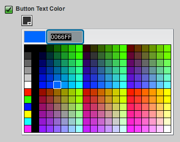
AppBoard uses a color picker control for selecting colors. Colors values can appear as the following:
- Flat Color - A single color picker
- Gradient Color - Two color pickers side by side, which represent top and bottom colors of the gradient
- Color States - An array of color pickers representing specific states (Default, Hovered, Pressed, etc)
File
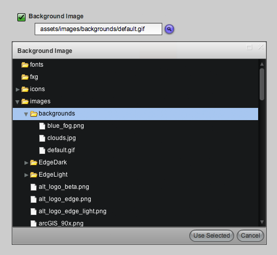
AppBoard uses a special text entry field with a file browser for selecting background images. The file picker points to the following directory on the Appboard Server: [INSTALL_HOME]/server/webapps/enportal/visualizer/assets/
Fill & Gradient Fill
Fill is the primary input control AppBoard uses inside of Theme Editor. A Fill combines a color picker with an alpha control to conserve real estate. Fills can appear as:
- Flat Fill - A single fill control
- Gradient Fill - Two fill controls side by side, which represent top and bottom colors of the gradient
- Fill States - An array of fill controls representing specific states
Number
AppBoard uses a spinner control for entering numbers.
- The increment/decrement value will vary based on the attribute.
- The min/max constraints also vary between attributes.
Examples
- Animation Duration: This determines the length of chart animations in milliseconds. It's values are constrained between 0 and 3000, and it's increment/decrement is set to 100.
- Panel Outer Radius: This setting determines whether panels have rounded corners. It's values are constrained between 0 and 20, and it's increment/decrement is set to 1.
Stroke
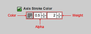
AppBoard occasionally uses the stroke control for borders. A stroke combines the standard fill, with an additional control for line weight. You end up with the following block of inputs (Color, Alpha, Weight).


