Appboard/2.4/builder/widgets/tile map: Difference between revisions
imported>Jason.nicholls No edit summary |
imported>Jason.nicholls No edit summary |
||
| Line 9: | Line 9: | ||
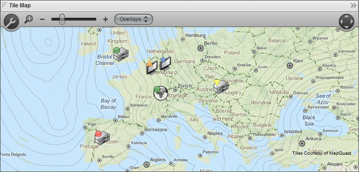
[[File:appboard-2.4-tilemap.png|frame|center|link=|Tile Map widget using MapQuest tiles with atmospheric pressure overlay from OpenWeatherMap and icon markers with status indicators.]] | [[File:appboard-2.4-tilemap.png|frame|center|link=|Tile Map widget using MapQuest tiles with atmospheric pressure overlay from OpenWeatherMap and icon markers with status indicators. The toolbar is also shown (hidden by default).]] | ||
== How To Create a Tile Map Widget == | == How To Create a Tile Map Widget == | ||
Revision as of 05:34, 3 October 2013
The Tile Map Widget displays tile-based maps from a server that conforms to the Open Street Maps architecture.
This Widget provides advantages over the Vector Map Widget because it can show details such as streets and satellite imagery. The Widget also provides advantages over the Google Map Widget, because it does not require an internet connection and is not reliant upon the Google mapping technology and data.
As in other AppBoard map Widgets, the data source for the Widget must contain fields with Longitude and Latitude for each node to be drawn on the map.

How To Create a Tile Map Widget
For instructions on creating a Widget, see the general instructions in Adding Widgets. The Tile Map type is located under the Maps category on the Widget Type selection screen.
How To Configure a Tile Map Widget
- Follow the instructions above to create the basic Tile Map Widget.
- Enter the following information on the Data tab:
- Data Collection - Select the name of the Data Collection that will provide the data to be displayed in the Tile Map.
- For convenience, buttons are provided for Adding or Editing a Data Collection.
- If you are using the AppBoard Sample Chart Data, select the sample.Data.Airport Data Collection.
- The selected Data Collection must contain two separate fields with geographical coordinates representing the Latitude and Longitude of each node to be drawn on the map.
- Widget Name - Enter the name to display for the Widget in the Widget Title Bar.
- [Optional] Configure an Alternate Widget to be displayed on mobile devices, since this Widget is only supported for display in the desktop AppBoard Viewer.
- Data Collection - Select the name of the Data Collection that will provide the data to be displayed in the Tile Map.
- Enter the following information on the Visualization tab:
- Map Tiles - Select the tile style or server that you wish to use from the list of available tile types.
- Latitude Field - Select the column of data that provides latitude coordinates.
- Longitude Field - Select the column of data that provides longitude coordinates.
- Marker Type - Toggle this switch to choose the type of image to draw for each node on the map:
- Status Shape - Display a colored shape for each node on the map
- Icon - Display an icon with a status shape in the top left corner for each node on the map.
- Auto Zoom - Toggle the automatic zoom controls:
- Off - The full map is displayed when the Widget is invoked on the Board.
- Fit To Data - AppBoard will automatically zoom to the "best fit" zoom level when the Widget is invoked on the Board.
- Default Shape - The default shape to use when the "Status Shape" Marker Type is selected (see above).
- Default Color - The default color to apply to the shape when the "Status Shape" Marker Type is selected (see above).
- Default Shape Size - The default size to use for the shape when the "Status Shape" Marker Type is selected (see above).
- [Optional] Colored Shape Filter - Select the name of the filter you would like to use or click "Add" to create a new filter. A Color Filter allows you to set rules for displaying different colors for the markers on the map where certain conditions are met in the corresponding data. For more information, see Colored Shape Filter
- [Optional] Default Icon - When the "Icon" Marker Type is selected (see above), this item selects the icon to display for each node.
- [Optional] Icon Size - When the "Icon" Marker Type is selected (see above), this item determines the size of each icon.
- [Optional] Icon Badge Filter - When the "Icon" Marker Type is selected (see above), this allows for different icons to be displayed conditionally based on the attributes of each individual node on the map.
- Preview - This section provides a small preview of the Tile Map.
- Enter the following information on the Overlays tab:
- [Optional] Add a tile overlay from the registered Overlays by pressing the "Add" button. Choose the overlay tile type, alpha value, and the refresh time for the overlay. (A value of 0 minutes turns off refresh).
- [Optional] To add overlay tile providers, see: Using Custom Tiles make sure to set isOverlay to true
- Provide additional configuration on the Options tab. For details on the available Options, see Options.
- Click Close.
- In the Builder Modes panel, select Builder and navigate to the appropriate Board to observe the new Tile Map Widget.
User Options
The following options are available to the end-user in the AppBoard Viewer for the Tile Map Widget.
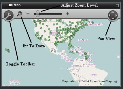
- Toggle Toolbar - Shows or hides the toolbar containing the map viewing options
- Fit To Data - When clicked, AppBoard will automatically zoom to the "best fit" zoom level based on the location of the data points
- Adjust Zoom Level - Increases or decreases the zoom level of the map
- Pan View - Adjusts the field of view of the map horizontally or vertically
Additional Information
- Importing Tilesets (for custom and offline tiles)
- Creating Custom Tiles from Images

