Appboard/2.4/builder/configure alternate widget: Difference between revisions
imported>Jason.nicholls No edit summary |
imported>David.moore mNo edit summary |
||
| Line 22: | Line 22: | ||
# Log in to the AppBoard Builder as an administrator. | # Log in to the AppBoard Builder as an administrator. | ||
# In the <b>Builder Modes</b> panel, click <b>Widgets</b>. The <b>Widgets | # In the <b>Builder Modes</b> panel, click <b>Widgets</b>. The <b>Widgets</b> panel is displayed. | ||
# Select a Widget and click <b>Edit</b>. The <b>Widget Wizard</b> is displayed. | # Select a Widget and click <b>Edit</b>. The <b>Widget Wizard</b> is displayed. | ||
# Click the <b>Configure</b> button under <b>Alternate Widget</b>. The alternate widget configuration screen is displayed, with a preview pane on the right and configuration settings panel on the left. | # Click the <b>Configure</b> button under <b>Alternate Widget</b>. The alternate widget configuration screen is displayed, with a preview pane on the right and configuration settings panel on the left. | ||
Latest revision as of 23:21, 24 December 2013
The AppBoard developer should not be expected to build multiple copies of each component (e.g. one for desktop, one for iOS, one for Android, and so on). So one of the core goals of AppBoard is to support the same suite of components across all devices.
However, certain types of Widgets provide displays that are too complex for consumption on a mobile device. In fact, if the user accesses certain standard AppBoard Widgets on a mobile device the device will display the message: "This widget is not supported on this device. Please contact your administrator to configure an alternative compatible widget". To address the specialized requirements of the mobile platform, many AppBoard Widgets provide a special configuration option called "Configure Alternate Widget".
For example, the standard Basic Table Widget is not supported in AppBoard Mobile. To present data from a Basic Table Widget on a mobile device, you can select a single column of the table and display that as a single-column list in AppBoard Mobile.
Although this Option is used primarily for presentation on mobile devices, it can also be used to configure an alternative display to be presented on the desktop.
Perform the following steps to configure alternate display settings for a Widget:
- Log in to the AppBoard Builder as an administrator.
- In the Builder Modes panel, click Widgets. The Widgets panel is displayed.
- Select a Widget and click Edit. The Widget Wizard is displayed.
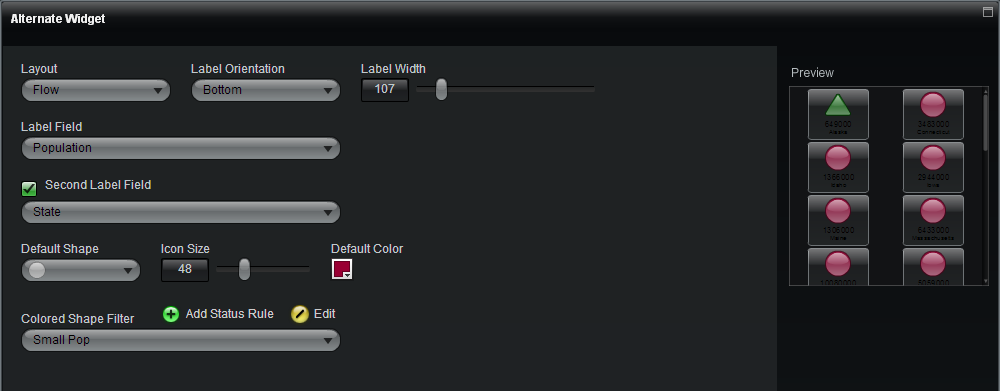
- Click the Configure button under Alternate Widget. The alternate widget configuration screen is displayed, with a preview pane on the right and configuration settings panel on the left.
- Select the appropriate items for the following fields:
- Layout - Select how the Widget should flow on the mobile device:
- Flow - Information is displayed in multiple vertical columns in the Widget.
- Vertical - Information runs from top to bottom in the Widget. This is the default option.
- Horizontal - Information runs from left to right in the Widget.
- Coverflow - Information is selected by visually flipping through animated snapshots.
- Label Orientation - Select where to display the label(s) with regard to the icon in each cell.
- Bottom - Label(s) will be displayed below their associated icon.
- Right - Label(s) will be displayed to the right of their associated icon.
- Label Field - Select the field whose value will be displayed as the label in each cell.
- Second Label Field - Check the box to select an optional second field whose value will be displayed as a second label in each cell.
- Default Shape - Select the shape of the icon to display in each cell (unless overridden by a Colored Shape Filter).
- Icon Size - Select the size of the icon to display in each cell.
- Default Color - Select the color of the icon to display in each cell (unless overridden by a Colored Shape Filter).
- Colored Shape Filter - [optional] Create rules to apply for controlling the color and shape of the icons for individual items. See Colored Shape Filter for more information.
- Layout - Select how the Widget should flow on the mobile device:
- Confirm that the preview pane displays the appropriate presentation for the alternate widget.
- Click Finish to save the changes.
- Load the Widget on the mobile device and confirm that it is displayed properly.
For more information on configuring AppBoard for mobile devices, see Appboard Mobile.

