Appboard/old/widgets/bullet chart: Difference between revisions
imported>Jason.nicholls No edit summary |
imported>Jason.nicholls |
||
| Line 17: | Line 17: | ||
* Click the "Data Collection" pulldown, then select from the list of available Data Collections. | * Click the "Data Collection" pulldown, then select from the list of available Data Collections. | ||
* If you're using the sample CSV data, select "Sample.Data.ChartData". | * If you're using the sample CSV data, select "Sample.Data.ChartData". | ||
* If there are no Data Collections available in the pulldown, then click here for instructions on how to bring in some [[Sample_Chart_Data|Sample Chart Data]], or refer to [[ | * If there are no Data Collections available in the pulldown, then click here for instructions on how to bring in some [[Sample_Chart_Data|Sample Chart Data]], or refer to [[appboard/old/data_collections|Add/Edit/Remove a Data Collection]]. | ||
=== Label Field === | === Label Field === | ||
Revision as of 03:59, 17 July 2014
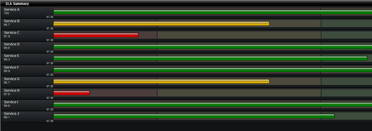
A Bullet Chart Widget is a graphical Widget that is a variation of a Bar Chart. Each bullet display provides multiple pieces of information, typically including the measured data, a comparative measure (target), and one or more meaningful thresholds.
How To Create a Bullet Chart Widget
For instructions on creating a Widget, see the general instructions in Adding Widgets. The Bullet Widget type is located under the Charts category on the Widget selection screen.
How To Configure a Bullet Chart Widget
Follow the instructions above to create the basic "Bullet Chart" Widget, and then perform the following steps to configure a Bullet Chart Widget:
Select a Data Collection
Select a Data Collection that contains the information you would like to use for this Widget.
- Click the "Data Collection" pulldown, then select from the list of available Data Collections.
- If you're using the sample CSV data, select "Sample.Data.ChartData".
- If there are no Data Collections available in the pulldown, then click here for instructions on how to bring in some Sample Chart Data, or refer to Add/Edit/Remove a Data Collection.
Label Field
Select the desired label to be used for each item in the data set.
- The "rows" of data from this column will make be used as the labels on the left hand side of each bar.
If you're using Sample.Data.ChartData, then select "Month" to be the Label Field.
Secondary Label (Optional)
Specifies the field in the Data Collection that will be used as the Secondary Label.
- The secondary label is usually used to show a textual representation of the 'Value Field'.
If you're using Sample.Data.ChartData, then select "Software" to be the Secondary Label Field.
Value Field (X-Axis)
Specifies the field in the Data Collection that determines the length of the colored bars in the bullet chart
If you're using Sample.Data.ChartData, then select "Software" as the Value field }}
Start from smallest derived value (Optional)
This option will crop the chart's X-Axis based upon the smallest value provided in the data set, rather than starting from zero.
- This option is useful when dealing with values that do not have much variation.
For Example, SLA calculations usually result in values clustered around 99%. If you start from zero, then the chart will show nearly identical bars. With "Start from smallest derived value" toggled on, the left side of the X-Axis becomes the smallest value in the data set, say 99.2% for our SLA example. This provides a more useful comparison across the dataset as a whole.
Comparative Measure
Comparative Measure is an optional decorator that can be shown for each value in the bullet chart.
- It is useful for showing a high water mark, or for showing how a historical average compares to the current value.
Fill Style
Fill style for the bullet chart is purely aesthetic, and effects how the Value Bars are rendered.
- The color for the value bar will be determined based on the defined thresholds.
- The available rendering styles are Solid, Gradient, and Cylinder
Thresholds (Color and Pattern)
Threshold values determine the color that the bars will be and/or the pattern applied to the bars. Click Add to set a threshold.
- Dynamic: Lets you derive threshold values from a column of data in your data collection. This is useful if the values being plotted are compared against different scales. Example uses:
- Projected vs. Actual: shows the variation in projections by region as well as the actual values for that region.
- SLA: Shows variation between service level agreements per customer as well as the actual SLA values.
- Static: Lets you manually enter a static threshold value to use across the data set. Example uses:
- Tickets: If there are more then 50 active tickets for any given location, the Value Bar should turn red.
- Events: When total number of critical events for a system exceeds 10, plot the Value bar as red.
If you are using Sample.Data.ChartData, then set Red to equal "Dynamic / Hardware", and Green to equal "Dynamic / Totals". This will turn the value bar green if software sales are greater then hardware. The value bar will turn red if hardware sales are greater the software.
Additional Configuration Steps
- Provide additional configuration, if needed, on the Options tab. For details on the available Options, see Options.
- Enter the following information on the Actions tab:
- Click Add Event Action to configure one or more Actions to be invoked when a user clicks on the Bullet Chart Widget. The action will apply to the current data record being displayed.
Sample Data
Instructions for bringing sample chart data into AppBoard can be found here: Sample Chart Data


