Appboard/old/widgets/topology: Difference between revisions
imported>Jason.nicholls No edit summary |
imported>Jason.nicholls No edit summary |
||
| Line 1: | Line 1: | ||
{{DISPLAYTITLE:Topology Widget}} | {{DISPLAYTITLE:Topology Widget}} | ||
[[Category:AppBoard old]] | [[Category:AppBoard old]] | ||
{{Note|This page documents the new Topology Widget provided in AppBoard versions 2.3 or higher. For documentation on the deprecated Topology Widget that was available in AppBoard versions prior to 2.3, see [[ | {{Note|This page documents the new Topology Widget provided in AppBoard versions 2.3 or higher. For documentation on the deprecated Topology Widget that was available in AppBoard versions prior to 2.3, see [[appboard/old/widgets/topology_2.2|Topology Widget 2.2]].}} | ||
Latest revision as of 11:45, 17 July 2014
The new Topology Widget was formally introduced to AppBoard in the 2.3 version release. Its purpose was to allow data with connectivity information to be rendered automatically as a graph of nodes. The data structure for the topology has an open architecture that allows many different methods of representing a topology in data. For instance, you can render a topology using a connectivity table that is associated to other tables, or a simple table that has a 1 to 1 reference to its parent data.
Overview
Before beginning to you use the Topology Widget, it is important to understand that there are three steps to using the Widget effectively:
- Associate the Data Sources on the Server - The data that is going to be represented in a topology needs to be associated on the server first. If you have resources that are related to a join table which is related to other resources, for example, you must create associations that walk that relationship.
- Create a Relationship Model that Defines the Relationships on the Client - A relationship model must be created on the client that describes the relationships that were created on the first step. This includes describing if the associations are parental or child like in relationship, how the data should be depicted when rendered (colors, icons, labels), and what portions of the relationships should be rendered. For instance, it is possible to have a relationship such as 'router associated with server', which is associated with an event, and then only show the router and the events.
- Create and Place a Topology Widget on a Board - When creating an instance of the Topology Widget on a Board, it is important to remember that the Widget will require seed data before it can render. Typically this would be a Data Collection that contains one to a few root nodes. The Relational Model that is attached to the Topology Widget will then interrogate the root nodes and follow the model looking for data that is connected. The beauty of it having a seed Data Collection is that AppBoard Actions can fire Data Collection filtering, causing the Topology to re-render with a new root node or set of nodes.
Using the Relational Model Editor
This section makes an assumption that the reader is already familiar with associating data on the server, as referred to in the first step. The second step in using a Topology Widget, however, is a new administration Action that has been added to the 2.3 version of AppBoard.
To create a new Relational Model, perform the following steps:
- Click Data Collections in the left panel.
- Click the Data Collections Type switch. This places the Data Collection admin page into the Relationship mode. Relationships are basically Data Collections that are relational in nature, such as hierarchies.
- Click the Add button to open a new dialog that allows you to create a new Relational Model.
- Give the model a name that describes what you will be displaying in the Topology Widget.
- Click the Add Source button to add a data source that you would like to render as root nodes in your topology display. This adds a data type node to the graphical view of your Relational Model. The top label is the data source and the bottom label is the Column or MetaClass that will be rendered. The green “+” button is used to add a relationship to the MetaClass. The yellow “/” button is used to add visual rules to the MetaClass, so that when it is rendered in a topology it knows what icon, label, and colors to use.
- Continue to add more sources and relationships to build a complex data model with multiple associations. Note that the Topology Widget can render relationships from any place in the relational model. You do not have to start with the data type on the farthest left.
- To configure the appearance of these data types, click the yellow “/” button.
- The first step of the Configure Appearance dialog allows you to setup a label rule for the data that gets rendered. Click on 1 or more tokens in the list below to have the client fill in values from the data object into the label. You can add prefixes and suffixes to these tokens.
- The next step Color lets you choose a default color and add rules to determine how to render the background of the node label.
- Next, Status Shape rules give the node renderers details about what status icon to display as additional visual feedback. This is helpful for displaying status to those who may have trouble distinguishing colors or are fully color blind.
- The final step, Icon, allows you to configure a similar set of rules to the previous two sections for what icons to display on the topology.
Creating a Topology Widget Instance
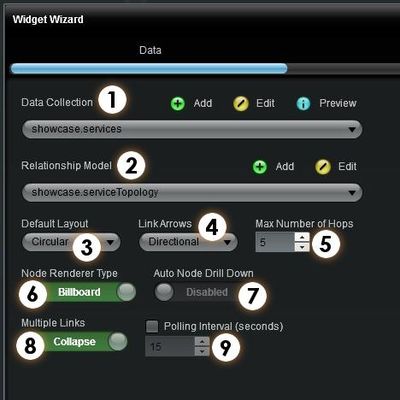
The configuration dialog for the Topology Widget has the following settings:
- Data Collection Picker – Choose the initial data collection that contains the root or set of root nodes that you want the Topology Widget to display relationships for.
- Relationship Model – Choose the Relationship Model that describes the relationships between the MetaClasses or Data Types in addition to the appearance configuration of each.
- Default Layout – Choose the layout you would like the Topology Widget to initially display the content.
- Link Arrows – Choose whether to have directional, bidirectional, or no link arrows.
- Max Number of Hops – This is an important performance settings that tells the Widget how far to traverse the relationships. This keeps cyclical topologies from locking up the relationship traversing code.
- Node Renderer Type – Choose between two rendering styles of the topology nodes.
- Auto Node Drill Down – This turns on automatic drill down navigation on nodes. Clicking the drill down icon on the nodes will focus on that node and show it’s children and/or parents. This produces an effect of navigating deeper into a topology. Setting the Max Number of Hops to a low number can help the performance and experience of this setting.
- Multiple Links – You can choose to collapse or show multiple links between nodes
- Polling Interval (seconds) – Choose to poll the data for changes, resulting in live updates of status.
Each Topology Widget has a special toolbar that can be toggled on/off by clicking the large wrench icon. This toolbar allows you to “fit the topology” within the view, zoom to 100%, refresh the data, and change the layout of the data.
Topology Widget Usage Example #1
The following is a step by step “hands on” example of using the Topology Widget:
Create a new Data Source
- Click the Data Sources toolbar option on the left.
- Click Add on the bottom right of the Administration Page.
- Give the Data Source the name of “Showcase” and choose the adapter type of File and then select CSV Directory .
- Click the Add Data Source button and you will be presented with a new Wizard.
- On the Connect wizard page use ${application.home}/data/showcase/CSV as the directory value and leave all the other configuration options alone.
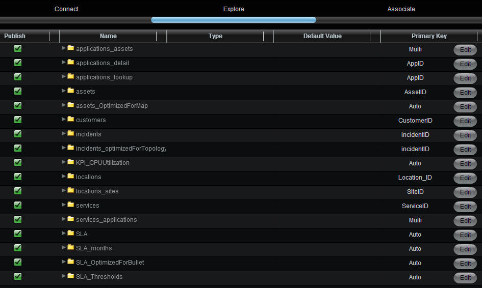
- Click Next and you will be shown all the CSV Tables that were found in that directory. Use the following screenshot to set the Primary Key for each table.
- The table application_assets needs a Multi Primary Key. Click Edit and select AppID and AssetID.
- The table services_applications also needs a Multi Primary Key. Click Edit and select ServiceID and AppID.
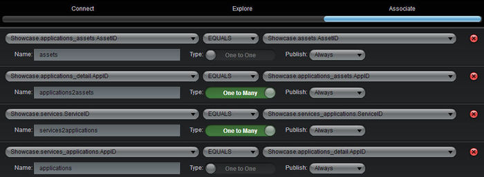
- On the Associate screen, click Add Association and configure the selections as shown in the screenshot below.
Create a new Relationship Model
- Navigate to the Data Collections page and switch to the Relationship mode using the Type switch.
- Click the Add button to launch the relationship model editor.
- For the Model Name, enter Service Model.
- First we need to add the “root” node type for our model. Click the Add Source button and pick showcase.services.
- Next we want to add relationships to this root node. Click the green “+” button on the services badge.
- For Relationship Target select services2applications.applications. For Relationship Type select Child. We are telling the relationship model editor that we want to get all the applications that are children of the service by following the association path through the join table.
- Now we tell the model editor about the relationship to assets. Click the green “+” on the applications_detail badge.
- For Relationship Target select application2assets.assets. For Relationship Type select Child. We want to see the assets connected to the applications by following the association through the application2assets join table.
- To describe the data with appearance rules, click the yellow “/” button on the Services Badge.
- Click the Name token in the list to make the label rule show the Service Name value as the label of the nodes rendered for this data type. In this sample data we don’t have status for services so we can skip to the Icon rule tab.
- Add an Icon Rule called Service Icon, click to add an Icon, and select Chevron Short from the library under Available Icons. In the two pull-downs, select Type and is not null. This creates a simple rule that as long as the Type of a service is not empty, we will show a Chevron Icon.
- Click X to close the Icon Rule Editor and select the Icon Rule called Service Icon from the drop-down list.
- Click Finish to close the dialog windows, and back in the Relation Model Editor click the yellow “/” on the Applications_detail badge.
- Select ApplicationName for the label.
- Under the Color tab, add a Color Filter rule called Criticality, and create four Color rules selecting a different color for each. Use Criticality, =, and enter the numbers 1-4 in the last boxes (1 for the first, 2 for second, etc.).
- Skip the Status Shape rules.
- For the Icon section, add an Icon rule called Application Icon, using the Application Icon from the library and selecting AppID and is not null for the rule.
- Click X to close the Icon Rule Editor and select the Icon Rule called Application Icon from the drop-down list.
- Click Finish to close the dialog windows, and back in the Relation Model Editor click the yellow “/” on the Assets badge.
- Use Name for the label.
- Add a Color Filter called Asset Colors, and click to add three Color rules selecting a different color for each. Use State, =, and enter the numbers 1-3 in the last boxes.
- Click X to close the Color Filter Rule Editor and select the Color Filter Rule called Asset Colors from the drop-down list.
- Go to the Icon section, add an Icon rule called Asset Icon,and select Rackmount01 as the Icon with Type and is not null as the rule.
- Close the dialog and click Finish in the Relationship Model Editor.
Create a new Topology Widget
- Click the Add Stack button in the left panel. Add a Stack called My Topology.
- Click the Add Widget button in the left panel.
- Provide a Widget name, select the My Topology Board, select the Topology Widget under Diagrams, and click Add Widget.
- Select the Data Collection showcase.services and Relationship Model Service Model.
- For Default Layout select Bi-Hierarchical.
- Enable Auto Node Drill Down. Keep all remaining default options.
- Click Next, Next, and Finish. View the completed Topology Widget in the Builder.
Observe that there are many services displayed, producing a diluted Topology. The final step is to filter the Data Collection to only show services that have children, which would provide meaningful information in a topology view.
Filter the Data in the Topology Widget
- Navigate to the Data Collections page and leave the Type switch on the default Flat Collection setting.
- Click the Add button to launch the Data Collections Wizard.
- For the Data Collection Name, enter "Services With Children".
- For the Data Source, select "Showcase.services"
- Click Next to go to the Client Side Filter tab.
- Click Add Rule to add a Rule of type "Simple Property Comparison"
- For the rule, enter Property services2applications.[] is not null.
- Click Finish
- Go to the Widgets Administration panel and edit the My Topology Widget.
- Change the Data Collection to "Service With Children" (the new filtered data set of services).
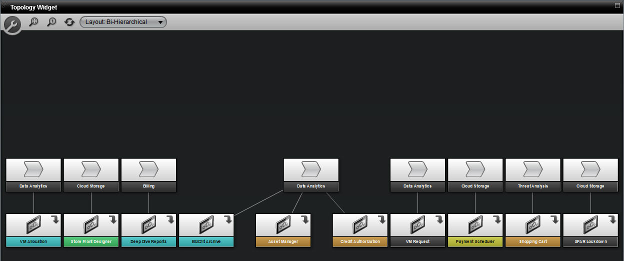
- Click Next, Next, and Finish. View the completed Topology Widget in the Builder. The finished product should look similar to the image at the beginning of this page.
- Drill down into some of the nodes by clicking the arrow image in the upper-right section of the node icon.


