Appboard/old/widgets/hilo chart
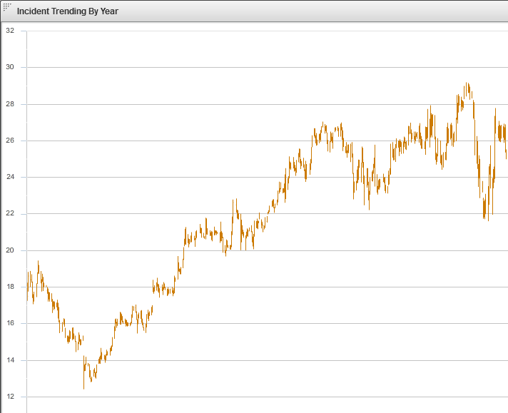
A Hi-Lo Open-Close Widget is a graphical chart that is typically used to illustrate the movement in an indicator over time, such as the price of a commodity or the number of incidents reported on a computer network. Each vertical line on the chart shows the full price range over one unit of time. By looking at a range of dates, one can see the range of prices on each date, as well as the trend of the daily ranges over time. The specific nature of the Hi-Lo Open-Close Widget requires that the underlying Data Collection contains fields for the High, Low, Open, and Close values.
How To Create a Hi-Lo Open-Close Widget
For instructions on creating a Widget, see the general instructions in Adding Widgets. The Hi-Lo Open-Close Widget type is located under the Charts category on the Widget selection screen.
How To Configure a Hi-Lo Open-Close Widget
Follow the instructions above to create the basic "Hi-Lo Open-Close Chart" Widget, and then perform the following steps to configure the Hi-Lo Open-Close Chart Widget:
Select a Data Collection
Select a Data Collection that contains the information you would like to use for this Widget.
- Click the "Data Collection" pulldown, then select from the list of available Data Collections.
- If you're using the sample CSV data, select "Sample.Data.ChartData3".
- If there are no Data Collections available in the pulldown, then click here for instructions on how to bring in some Sample Chart Data, or refer to Add/Edit/Remove a Data Collection.
Configuring the X-Axis
Select the desired X-Field to use for the X-Axis of the Chart.
- The "rows" of this column of data will make up the X-Axis.
If you're using Sample.Data.ChartData3, then select "Date" to be the X-Axis Field.
Type
Select an option for Type from the drop-down box. This will be used to determine how the data is translated by AppBoard into the labels that are shown along the x-axis:
- LinearAxis: x-axis values are determined as a linear progression between the lowest and highest values.
- LogAxis: x-axis values are determined as a logarithmic progression between the lowest and highest values. Labels on the logarithmic axis are even powers of 10.
- CategoryAxis: This is the default. The "rows" observed in the selected column of data will make up the X-Axis.
- DateTimeAxis: x-axis values are determined as time-based values such as hours, days, weeks, or years.
If you're using Sample.Data.ChartData3, then select "DateTimeAxis" to be the Type.
Configuring a Series (Y-Axis)
- Click the "Add" button in the button toolbar of the Series DataGrid.
- Repeat to add additional series.
- Series may be removed with the "Remove" button next to the "Add" button.
If you're using Sample.Data.ChartData, then select the following Y-fields:
* High
* Low
* Open
* Close
Chart Options
- Check or uncheck "Show Legend" as desired to include a legend of the line color for each Series (by Y-Field name).
- Enable the X-Axis title and enter value as desired.
- Enable the X-Axis labels and rotate them as desired.
- Enable the Y-Axis title and enter value as desired.
- Enable the Y-Axis labels and rotate them as desired.
Additional Configuration Steps
- Provide additional configuration, if needed, on the Options tab. For details on the available Options, see Options.
- Enter the following information on the Actions tab:
- Click Add Event Action to configure one or more Actions to be invoked when a user clicks on the Hi-Lo Open-Close Widget. The action will apply to the current data record being displayed.
Sample Data
Instructions for bringing sample chart data into AppBoard can be found here: Sample Chart Data

