Appboard/2.4/builder/widgets/table/sparkline renderer
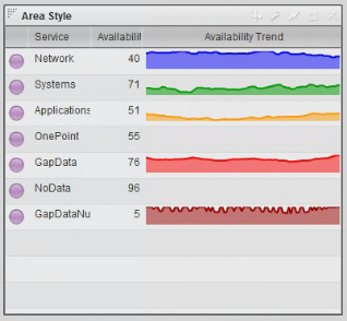
The Sparkline column renderer is a special option for presenting data in the column of a Basic Table Widget. It is available in AppBoard versions 2.4 and higher.
A Sparkline is a very small line chart, without axes or coordinates, that presents the general shape of variation in some measurement, such as temperature or stock market price, in a simple and highly condensed way. Using alternate methods, such as Actions to drill-down and provide details, or to update an on-screen Widget, may not provide the immediate context and ability to compare items within a table that can be achieved with a Sparkline.
The Sparkline option is only applicable for columns that have a one-to-many association where the “many” association represents the data points used in the sparkline.
How To Create a Sparkline
Perform the following steps to create a Sparkline column in a Table Widget:
- Log in to AppBoard as administrator.
- Create a Table Widget.
- Add one or more columns of data to the Widget.
- For a desired Data Field, select Sparkline as the Column Renderer.
- Click Customize to configure the Sparkline:
- Header Text - The name to be displayed for the column.
- Column Width - The default width for the display of the column in the table.
- Resizable - Check the box if you want the User to be permitted to change the width of the column.
- X Axis Field - Select the desired data field to use for the X-Axis of the Chart. For more details, see Area Chart Widget.
- X Axis Type - Select an option for Type from the drop-down box. This will be used to determine how the data is translated by AppBoard into the labels that are shown along the x-axis. For more details, see Area Chart Widget.
- Y Axis Field - Select the desired data field to use for determining the height for that series. For more details, see Area Chart Widget.
- Minimum Value - Select the lowest Y Axis value to display, for purposes of controlling which portion of the results to display.
- Maximum Value - Select the highest Y Axis value to display, for purposes of controlling which portion of the results to display.
- Chart Type - Select "Area" for an area-based Sparkline or "Line" for a line-based Sparkline. This controls whether there is shading of the region beneath the displayed values. The "Area" option will include shading.
- Chart Color Rules - Configure conditions that modify the color of the Sparklines, based on evaluation of fields in the underlying data.
Sample Data
Perform the following steps to create a Sparkline column in a Table Widget using sample data:
- Create a Data Source called sparkline, using the CSV data directory in /pkg/appboard/tutorial/sparkline
- For "Header Meta Delimiter", make sure "Asterisk" is selected.
- Add the following association on the Associate panel of the Data Source Wizard:
- sparkline.sparkline_services.Service - EQUALS - sparkline.sparkline_svc_history.Service
- Name: "history"
- Type: "One To Many"
- Publish: "Always"
- Create a Basic Table Widget and place it on a Stack.
- Select "sparkline.sparkline_services" as the Data Collection for the Widget.
- Configure the following columns for the Basic Table Widget:
- Service: Status Shape
- Service: Text
- Availability: Text
- history: Sparkline
- Click Customize and configure the Sparkline as follows:
- Header Text - Service History
- Column Width - 150
- X Axis Field - Datetime
- X Axis Type - DateTimeAxis
- Y Axis Field - Availability
- Minimum Value - 0
- Maximum Value - 100
- Chart Type - Area
- Chart Color Rules - [None]
- Default Chart Color - Select a color.
- [optional] Add a Chart Color Rule that is red when Availability <= 90 and green when Availability > 90.
- Click Save Changes, Next, and Finish.
- Observe that the Table Widget in the builder display has a Sparkline Column labeled "Service History".

