Appboard/old/widgets/vector map/trouble bubble
Revision as of 14:54, 10 July 2012 by imported>Cmace (copied from internal)
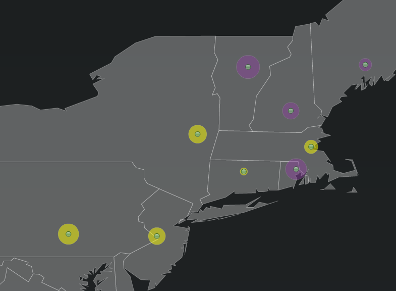
Trouble Bubble is a configuration screen that is available for certain AppBoard map Widgets, including the Vector Map and Vector Heat Map. It adds to the presentation of the Widget by providing a colored circular display around each node of the map. The size of the circle is driven by a data element for that node. For example, there could be a column called "Severity" and the greater the severity value in that column, the larger the circle is that will be drawn.
Configure the following fields on the Trouble Bubble tab:
- Show Trouble Bubbles - Click the toggle button to turn this to "On"
- Bubble Radius Field - Select a field from the Data Collection that is driving the Widget. The magnitude of the values in this field will drive the size of the radius in the Trouble Bubble.
- Bubble Properties - It is recommended to start with the default values, and then adjust the following settings individually until the desired Trouble Bubble display is achieved:
- Minimum Bubble Size - The diameter of the bubble, in pixels, to use for the smallest value in the data
- Maximum Bubble Size - The diameter of the bubble, in pixels, to use for the largest value in the data
- Color Alpha - Controls the opacity of the Trouble Bubble. A value of 100 is completely opaque, with nothing visible behind the bubble; a value of 10 is almost completely transparent.
- Bubble Color Rule - Select, Add, or Edit rule sets for determining what color bubbles to use for data that meet certain conditions.

