Appboard/2.4/builder/widgets/tile map
Revision as of 14:30, 9 July 2013 by imported>Mike.berman (created page)
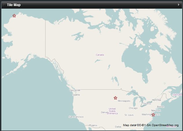
The Tile Map Widget can display tile based maps from a server that conforms to the Open Street Maps architecture.

How To Create a Tile Map Widget
For instructions on creating a Widget, see the general instructions in Adding Widgets. The Tile Map type is located under the Maps category on the Widget selection screen.
How To Configure a Tile Map Widget
- Follow the instructions above to create the basic Tile Map Widget.
- Enter the following information on the Data tab:
- Data Collection - Select the name of the Data Collection that will provide the data to be displayed in the Tile Map.
- Note: For convenience, buttons are provided for Adding, Editing, or Previewing a Data Collection.
- If you are using the AppBoard Sample Data, select the sample.Data.Airport Data Collection.
- Data Collection - Select the name of the Data Collection that will provide the data to be displayed in the Tile Map.
- Enter the following information on the Visualization tab:
- Map Tiles - Select the tile style or server that you wish to use.
- Latitude Field - Select the column of data that represents latitude.
- Longitude Field - Select the column of data that represents longitude.
- Marker Type - Toggle this switch to choose between a simple status shape (colored shape) or an icon with a status shape in the top left corner as markers on the map.
- Default Shape Size - Adjust the size of the default status shape, by dragging the slider bar.
- Pan Controls - Toggle the visibility of the onscreen pan controls
- Zoom Controls - Toggle the visibility of the onscreen zoom controls
- Default Color - The default color to apply to the shape when a status filter is not available or if it doesn't match a given rule within the filter.
- [Optional] Colored Filter - Select the name of the filter you would like to use or click "Add" to create a new filter. A Color Filter allows you to set rules for displaying different colors for the markers on the map where certain conditions are met in the corresponding data. For more information, see Color Filter
- Default Shape - The default shape to use when a shape filter is not available or if it doesn't match a given rule within the filter.
- [Optional] Shape Filter - Select the name of the filter you would like to use or click "Add" to create a new filter. A Shape Filter allows you to set rules for displaying different shapes for the markers on the map where certain conditions are met in the corresponding data. For more information, see Shape Filter
- [If Using Icon] Default Icon - Select the icon to use when an Icon Filter does not exist or a rule within the filter does not match.
- [If Using Icon - Optional] Icon Filter - Select the name of the filter you would like to use or click "Add" to create a new filter. An Icon Filter allows you to set rules for displaying different icons for the markers on the map where certain conditions are met in the corresponding data. For more information, see Icon Filter
- Preview - This section provides a small preview of the Tile Map.
- Click Next to proceed to the Options tab.
- Provide additional configuration on the Options tab. For details on the available Options, see Options.
- Click Next to proceed to the Actions tab.
- Click Add Event Action to configure one or more Actions to be invoked when a user clicks on the Tile Map Widget. The action will apply to the current data record being displayed.
- Click Finish.
- In the Builder Modes panel, select Builder and navigate to the appropriate Board to observe the new Tile Map Widget.
