Appboard/2.4/builder/widgets/vector heat map
Revision as of 17:25, 4 September 2013 by imported>Jason.nicholls (Created page with '{{DISPLAYTITLE:Vector Heat Map Widget}} The Vector Heat Map is a graphical representation of data where individual data values are represented as colors. Different shadings of t…')
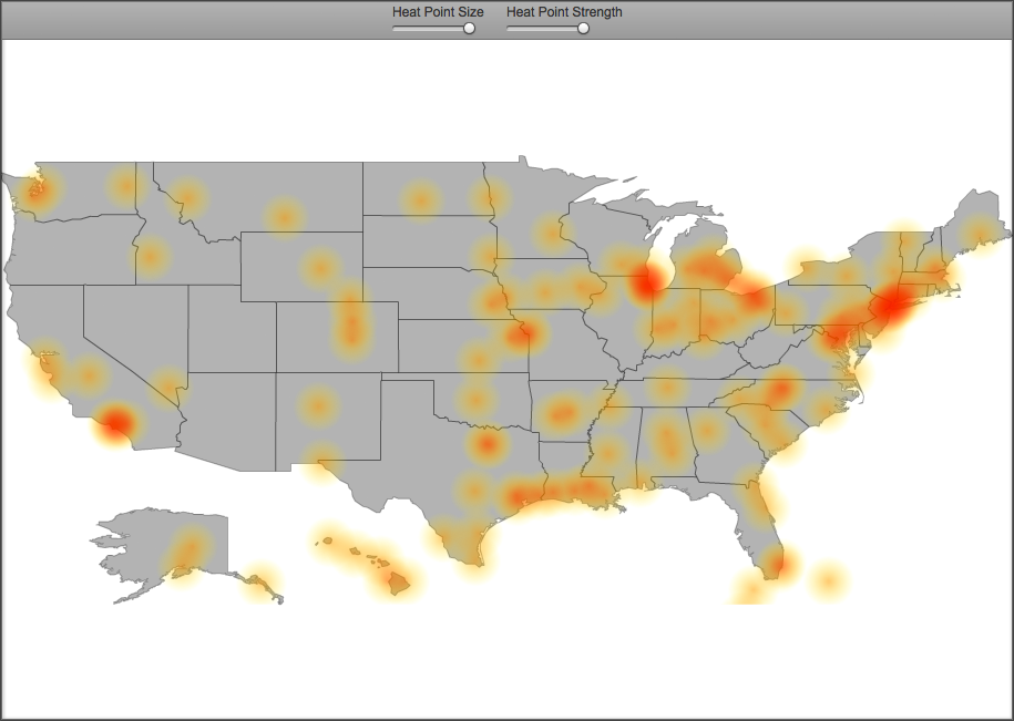
The Vector Heat Map is a graphical representation of data where individual data values are represented as colors. Different shadings of the color represent higher or lower concentrations of some data element in that location on the map.
How To Create a Vector Heat Map Widget
For instructions on creating a Widget, see the general instructions in Adding Widgets. The Vector Heat Map Widget type is located under the Maps category on the Widget selection screen.
How To Configure a Vector Heat Map Widget
- Follow the instructions above to create the basic "Vector Heat Map" Widget.
- Enter the following information on the Data tab:
- Data collection: Select the name of the Data Collection that will provide the data to be displayed in the Vector Heat Map.
- Note: For convenience, buttons are provided for Adding, Editing, or Previewing a Data Collection.
- If you are using the AppBoard Sample Data, select the sample.Data.Airport Data Collection.
- Map Type: Select specific geographic region to use as a map.
- Heat Type:Toggle how the size of the heat points is determined.
- 'Density' uses the proximity of points on the map to generate heat on the map.
- 'Valued' allows values from the 'Value Field' to act as a weight for each point on the map. It uses this weight in addition to the proximity of points to calculate overall heat on the map.
- Latitude Field: Select the column of data that represents latitude.
- Longitude Field: Select the column of data that represents longitude.
- Heat Point Size: Adjust the slider to alter the size of the points plotted on the heat map.
- Heat Point Strength: Adjust the slider to change the opacity of the heat map.
- Value Field: If you've selected the Heat Type of "Valued", then use this pull down to select the column that act as a weight for the individual heat points.
- Heat Map Gradient : Select the range of colors and alphas to use on the map
- The far right values represent the most dense locations.
- The far left values represent the least dense locations.
- Click Next to proceed to the Options tab.
- Provide additional configuration on the Options tab. For details on the available Options, see Options.
- Click Next to proceed to the Actions tab.
- Click Add Event Action to configure one or more Actions to be invoked when a user clicks on the Vector Heat Map Widget. The action will apply to the current data record being displayed.
- Click Finish.
- In the Builder Modes panel, select Builder and navigate to the appropriate Board to observe the new Vector Heat Map Widget.
Sample Data
Perform the following steps to create a Vector Heat Map Widget using sample data provided with Appboard:
- Follow the instruction on the Sample Chart Data page to create sample Data Collections.
- Select Airports to use as the Data Collection for the Vector Heat Map Widget. The proximity of airports to a location will generate heat.

