Appboard/2.4/builder/themes/editor categories
Overview
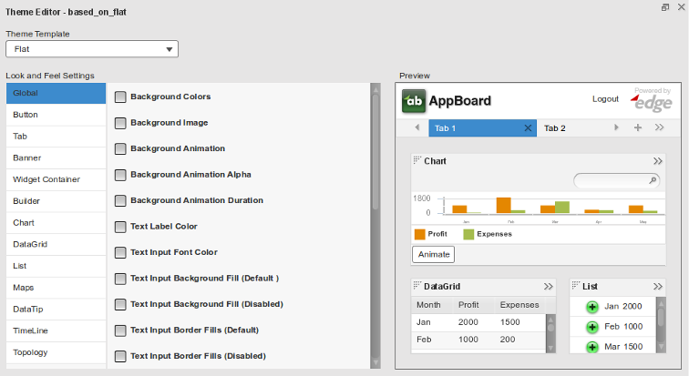
When editing or creating a new theme, the configurable options are grouped into a number of categories. This is to help navigate through the large number of options available.
Theme Categories
Global
Global settings are appearance options applying to items found in all facets of AppBoard (e.g. background animation, text input font color, search input background fill, etc.).
Background Animation: Select the filename of the .MOV, .WMV, .MP4, or .FLV file containing the animation, relative to the path [INSTALL_HOME]\server\webapps\enportal\visualizer\, that contains the desired background animation. Note: background animations have been seen to cause performance issues on the server in many cases. Testing is recommended before implementation in any live environment.
Background Animation Alpha – Setting for the transparency of the Background Animation.
Background Animation Duration – “Once” or “Forever” indicator for whether the animation should repeat.
Modal Popup Overlay Alpha – Determines the opacity of the background behind modal pop-ups.
Modal Popup Overlay Color – Determines the color of the background behind modal pop-ups.
Modal Popup Overlay Duration – Without a duration, the alpha/color is applied immediately when a dialog appears; with a duration, the alpha/color is blended with the background over the duration period which by default is 100ms. To see any effect, it is recommended to increase the duration to at least 2 seconds (2000). The duration also affects the speed at which the alpha/color is removed after the dialog is closed.
Button
Button settings are options that configure the appearance of buttons found throughout AppBoard (e.g. wizard button colors, dropdown list background color, button reflector colors, etc.).
Tab
Tab settings configure the appearance of the Stack tabs in the Builder (e.g. tab corner radius, tab border colors, tab text colors, etc.).
Banner
The Banner settings control the appearance the banners found at the top of AppBoard (e.g. inner background color, outer border color, logo path, etc.).
Banner Role Label: If set to 0.0, the Role name for the current user will only be shown in the banner when the current User has more than one Role. If set to 1.0, the Role name for the current user will always be shown, regardless of how many Roles the User has. A Role chooser is always provided for Users with more than one Role. The default value for Banner Role Label is 0.
Widget Container
Widget Container configuration options control the appearance of the Widget containers found in the Builder (e.g. inner background colors, titlebar text color, background padding, etc.).
Builder
Builder settings configure the appearance of items found in the Builder section of AppBoard (e.g. toolbar background colors, panel alpha, panel reflection colors, etc.).
Chart
Chart settings allow the user to configure the appearance of Chart Widget items exclusively (e.g. axis stroke color, drop shadow distance, legend label color, etc.).
Data Grid
The Data Grid settings control the appearance of Table Widget items exclusively (e.g. row colors, horizontal grid line color, header background color, etc.).
List
List options configure the appearance of List Widget items exclusively (e.g. list item highlight colors, primary label color, list border color, etc.).
Maps
The Map settings allow users to configure the appearance of items pertaining only to Map Widgets (e.g. territory color, default border color, text background color, etc.).
Data Tip
Data Tip settings control the appearance of Data Tips in AppBoard (e.g. font color, line height, corner radius, etc.).
TimeLine
TimeLine settings configure the appearance of TimeLine Widget items exclusively (e.g. top axis background fills, node reflection alphas, tick color, etc.).
Topology
Define the link, label, and selection colors for the Topology Widget.

