Appboard/2.5/builder/widgets/actions
Overview
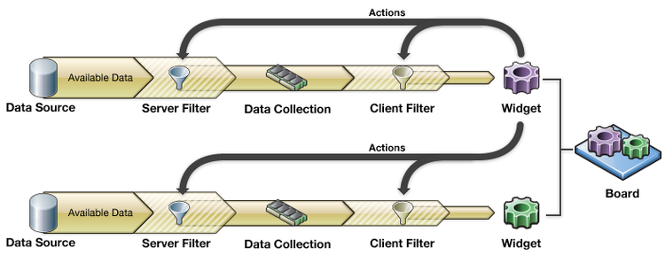
In addition to visualizing data, Widgets allow you to configure "Actions". For example, you can contextually Filter one widget based on a selection in another, or you can Drill Down into a child board that shows details based on an item selected in the parent. The key is knowing that when you click on a Widget, you are actually clicking on the piece of data that is being represented by the Widget. Actions allow you to use this piece of data as context to alter client or server side filters for any Data Collection inside AppBoard. This flexibility allows for extremely powerful interactions.
This section lists the Actions that you can configure in a Widget, with links to additional information on the individual Actions.
AppBoard Actions
AppBoard provides Actions that can be triggered either by Mouse Click or Mouse Hover. The following Actions are available:
On Mouse Click
| Action | Description |
|---|---|
| Do Nothing | Do not perform any Actions. |
| Apply a Filter to a Data Collection | Apply a Filter to a Data Collection. |
| Apply a Server Side Filter to a Data Collection | Apply a Server Side Filter to a Data Collection. |
| Bundled Actions | Implement multiple Actions as a result of a single User request. |
| Change Diagram Context | Change a Diagrammer Widget to use a specified Diagram Model. |
| Clear Sort | Clear a user's client-side sorting on a widget and revert to the sort order of the data collection or the widget configuration. |
| Copy to Clipboard | Copies context specific information into the system clipboard. |
| Focus on Widget | Change the focus of the application to a specific Widget. |
| Launch URL | Load and display a pre-configured piece of web content. |
| Refresh a Data Collection | Update a Data Collection to the latest data in the server cache. |
| Set Widget Selection | Set the selected item in a Widget based on an event or selection in another Widget. |
| Show Actions Menu | Provide a list of Actions for the User to choose from. |
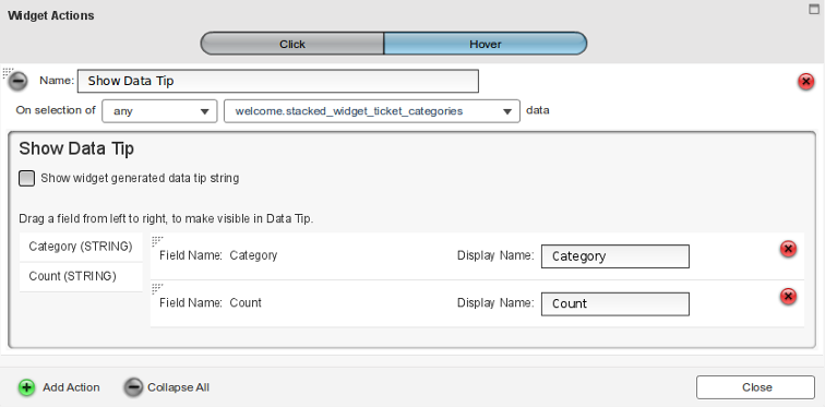
| Show Data Tip | Display a pop-up that lists selected fields and values for a record. |
| Show Record Details Window | Display a window that lists every field and value for a selected record. |
| Show Widget | Display a specific Widget inside of a Stacked Widget container. |
| Switch to a Board | Drill down the display to show a different Board. |
| Topology Drill Down | Click in one Widget and then invoke a drill down operation in another (Topology) Widget. |
| Write Static Value | Write a value for a specific field back to the data on the AppBoard server. |
On Mouse Hover
| Action | Description |
|---|---|
| Set Widget Selection | Set the selected item in a Widget based on an event or selection in another Widget. |
| Show Data Tip | Display a pop-up that lists selected fields and values for a record. |
Managing Actions
Accessing the actions associated with a widget can be performed in two ways:
- In the Builder by selecting the Actions icon (lightning bolt) in the widget title bar.
- Using the Widgets Builder Mode, selecting a widget, and clicking the Actions button.
With the Widget Actions dialog open you can:
- use the Click or Hover buttons to manage mouse-click or mouse-hover actions.
- use the Add Action button to add a new action
- edit action configuration for existing actions
- The Name field is information only, please set to something descriptive.
- For details on configuring individual actions refer to the tables above.
- For details on configuring action filtering see the section below.
- delete an existing action using the red X icon associated with that action.
Action Filtering
In addition to performing actions in context, the context itself can be used to determine whether the action should fire at all. The information available to action filtering includes the data from the row a user has selected, and depending on the widget type, may also include the attribute selected. This provides a powerful mechanism to do different things depending on what the user selects.
For example, take a visualization which presents regional locations, main offices, and data centers all on the same map. If the location type information is available within the data collection then this can be used to drive visualization filters to visually indicate the difference between locations, and an administrator can configure actions to fire based on the location type too. Such as each location type taking the end-user to a different drill-down board based on that type.
Another example, a table includes a column with an icon representing an external link. It's possible with attribute selection to create a Launch URL action that will only fire when the user selects this column specifically.
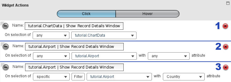
The following descriptions apply to the screenshot above:
- This shows the default action filtering for a widget that only supports filtering on the selected row data. In the default case any user selection will result in the action firing.
- For widgets that support attribute filtering there is an additional section with [any] attribute. Again by default any user selection will result in the action firing. If the attribute has been configured, then in order to reset to the [any] state use CTRL+click on the selected item to un-select it.
- This filter rule has been configured with a specific Filter and with an attribute. Clicking the Filter button will bring up the Filter Editor. This editor is just as with the Icon, Color, and Status Shape filters and allows a set of conditions to be constructed which will be tested against data from the selected row.
If multiple actions need to fire using the same conditions it can become cumbersome to set up action filters on each action. Instead, use Bundled Actions. That way just the bundle action itself needs to have an action filter configured and all actions within the bundle will fire.


