Appboard/2.5/builder/widgets/diagrammer/tutorial
Overview
The Diagrammer Widget is used to provide custom layouts with data driven nodes and links. Refer to the Diagrammer Widget page for complete documentation.
This tutorial runs through the basics for setting up a diagrammer widget and creating your first data driven diagram.
Exercise
Exercise Summary
In this tutorial the focus is on the Diagrammer widget, but overall we will need to setup some other pieces to get this going:
- Logging in to AppBoard as an administrator
- Setting up a Data Source
- Creating a Stack
- Adding a Diagrammer Widget
Log in to AppBoard
The first step is to log in to AppBoard as an administrator. If using a clean install on your local system then the default access and credentials are as follows:
- URL: http://localhost:8080
- User Name: administrator
- Password: administrator
- Domain: System
Create Data Source
As mentioned above and on the main Diagrammer widget documentation, we will need a data source with a primary key defined for use by the widget. Let's set this up now:
- Select the Data Sources builder mode.
- Click the Add button to create a new data source:
- Name: training
- Select an adapter type: File -> CSV Directory
- Click the Add Data Source button.
- The Data Source Wizard will now display the Connect step, complete the following fields:
- Directory: click the magnifying glass and select /examples/training.
- Header Meta Delimiter: Asterisk
- Click the Next button.
- The Explore step should now be shown. We are interested in the NetworkNodes entity. Confirm the Primary Key is set to UID, and expand the entry to view all fields and their types. Click the Next button.
- Nothing needs to be configured on the Associate step, just click Finish to complete the wizard and save the new data source.
Create Stack
We'll need a place for the Diagrammer widget so let's create a new Stack, which automatically creates and a top-level board:
- Select the Builder builder mode
- Click the Add Stack quick action:
- Title: Diagrammer Tutorial
- Click the Add Stack button to create the new stack.
- Since we're in the builder mode, the new stack should automatically become visible as a tab at the top. For now there is no content.
Create Diagrammer Widget
We're now ready to add a Diagrammer widget and create a diagram. The Diagrammer widget behaves a little different to other widgets in AppBoard in that it's a placeholder for a specific diagram to be shown. Which diagram is shown depends on the widget configuration (the default shown), or can be set via widget actions.
Perform the following steps to create a Diagrammer widget and an empty diagram:
- Select the Builder builder mode, and the Diagrammer Tutorial stack.
- Click the Add Widget quick action:
- The Add Widget Wizard should launch on the Data step:
- Widget Type: Diagrams -> Diagrammer
- Widget Name: Network Topology
- Click the Next button.
- On the Visualization step:
- Diagram Model: Click the Add button, set Name to Network Topology and click the Save button.
- Click the Next button.
- No need to do anything on the Options step, just click Finish to complete the wizard.
- The Add Widget Wizard should launch on the Data step:
- Select the Builder builder mode. You should now see a Diagrammer widget showing our empty diagram.
Creating Nodes
Before we can place nodes onto the diagram we have to define one or more Node Types. These basically tie a visual element to a data source which can be used to drive changes in the appearance of the node. For example using a status to change an icon red if something is wrong.
Once one or more Node Types are defined then you can drag and place nodes on the diagram. Think of this as an instance of a particular type, and at this point a specific row from the data set must be selected to drive the node instance.
- In the Network Topology widget click the green + (Add) button at the bottom of the Node Types palette.
- The Add/Edit Palette Item dialog will be shown on the Properties step:
- Palette Label: Network Node
- Palette Icon: <pick anything> (we will later configure an Icon filter)
- Data Source: training.NetworkNodes
- Click the Label step:
- Label: click the Name value from the Available Tokens.
- Click the Color step:
- Default Color: <pick anything>
- Color Filter: click the Add button. We will create a color filter to drive the color based on the Status field:
- Name: NetworkNodeColors
- Use the Add Color button to add the following rules:
- Color: green, Property: Status, Comparator: =, Value: 0
- Color: yellow, Property: Status, Comparator: =, Value: 1
- Color: orange, Property: Status, Comparator: =, Value: 2
- Color: red, Property: Status, Comparator: =, Value: 3
- Click the Close button to close the filter editor
- Color Filter: select the new NetworkNodeColors filter in the drop-down selection.
- Click the Icon step:
- Icon Filter: click the Add button. We will create an icon filter to drive the icon based on the Type field:
- Name: NetworkNodeIcons
- Use the Add button to add the following rules:
- Available Icons: Router, Property: Type, Comparator: =, Value: Router
- Available Icons: Rackmount01, Property: Type, Comparator: =, Value: Server
- Available Icons: Monitor, Property: Type, Comparator: =, Value: Workstation
- Click the Close button to close the filter editor
- Icon Filter: select the new NetworkNodeIcons filter in the drop-down selection.
- Icon Filter: click the Add button. We will create an icon filter to drive the icon based on the Type field:
- Click the Close button to exit the palette item editor.
With the above steps complete there should now be an entry in the Node Types palette for Network Node. Let's create some instances in our diagram, follow these steps:
- Click and drag the Network Node item from the palette onto the diagram canvas (the big empty space).
- An Edit Data Source dialog will pop up, select one of the records and click the Select Record button. Take note of the Type and Status
- The dialog should go away and a new icon for the selected record should now appear in the diagram. The icon and color should reflect the rules as configured when setting up the Network Node palette item.
- Repeat this process making sure to pick a variety of types and statuses.
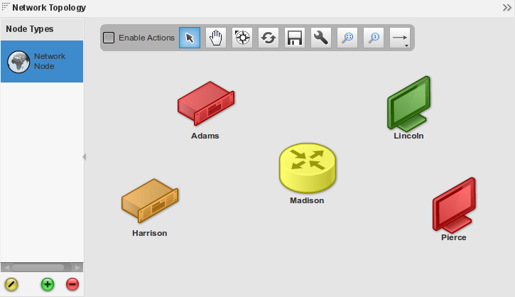
Placement of nodes in the Diagrammer widget is manual, so click and drag the nodes around to arrange them to suit your preference.
The end result should be something similar to the following screenshot:
Creating Links
Links are the way to show connectivity in the Diagrammer widget, they can also be data driven to show status. In this example we will use basic links (not data driven) and connect our nodes together.
Links must connect one node to another. When placing links start on a node and end on a node, clicks in between are used to create extra segments which allow the line to be routed along a particular path.
- Click the Link creation tool in the diagrammer palette (right-most icon). You can click-and-hold to present a drop-down list of line styles such as solid or dashed.
- With this mode enabled an additional icon is now available on the right to select the link shape (segment style) such as 90-degree sharp corners, 90-degree rounded corners, free-form angles, or curved.
- Select the Basic Link from the Link Types palette on the left side.
- Now click on a node to start a link.
- Click on another node to complete the link. (This is the minimum number of segments. You can optionally click in the empty space between the nodes while drawing the segment, to create advanced links using the link shape).
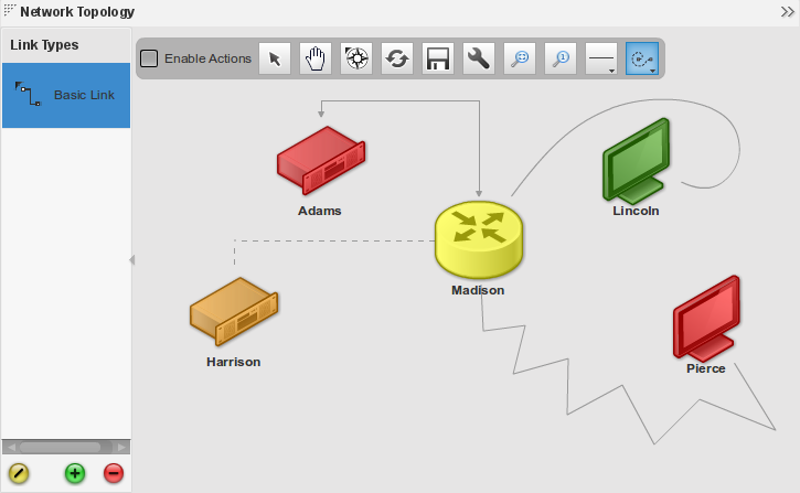
- Repeat the above using different line styles and segment styles, and connect up different nodes.
To create data driven links you would need to create a new Link Type in a similar process to creating Node Types. No icons apply but the default color can be set along with a Color Filter to drive the colors based on data.
The following screenshot is an example with a number of line styles and segment styles:
Conclusion
That's it, you should now have your first diagram and Diagrammer Widget! Although this is intended as a basic tutorial the process of creating more complex diagrams is a matter of repeating the steps, i.e. creating appropriate data sources, node types, link types, filters, and placing things onto the diagram.
Some additional exercises are recommended to become more familiar with this widget:
- Create your own data driven Link Type
- Create some widget Actions to show mouse-over (hover) data-tips
- Create multiple diagrams and switch them using widget Actions


