Appboard/2.6/builder/widgets/area chart
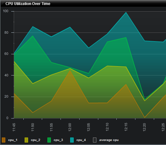
An Area Chart Widget is a graphical Widget that is comprised of one or more overlaid line charts, where the region between the x-axis and each line is highlighted in a different color. This format allows data from multiple sources, over time, to be displayed simultaneously in the same chart.
How To Create an Area Chart Widget
For instructions on creating a Widget, see the general instructions in Adding Widgets. The Area Widget type is located under the Charts category on the Widget selection screen.
How To Configure an Area Chart Widget
Follow the instructions above to create the basic "Area Chart" Widget, and then perform the following steps to configure an Area Chart Widget:
Select a Data Collection
Select a Data Collection that contains the information you would like to use for this Widget.
- Click the "Data Collection" pulldown, then select from the list of available Data Collections.
- If you're using the sample CSV data, select "Sample.Data.ChartData".
- If there are no Data Collections available in the pulldown, then click here for instructions on how to bring in some Sample Chart Data, or refer to Add/Edit/Remove a Data Collection.
Configuring the X-Axis
Select the desired X-Field to use for the X-Axis of the Chart.
- The "rows" of this column of data will make up the X-Axis.
If you're using Sample.Data.ChartData, then select "Month" to be the X-Field.
Type
Select an option for Type from the drop-down box. This will be used to determine how the data is translated by AppBoard into the labels that are shown along the x-axis:
- LinearAxis: x-axis values are determined as a linear progression between the lowest and highest values.
- LogAxis: x-axis values are determined as a logarithmic progression between the lowest and highest values. Labels on the logarithmic axis are even powers of 10.
- CategoryAxis: This is the default. The "rows" observed in the selected column of data will make up the X-Axis.
- DateTimeAxis: x-axis values are determined as time-based values such as hours, days, weeks, or years. This value can be chosen or "auto" can be used to let the widget decide the best value to use. An option to change the date-time format is also available.
Configuring a Series (Y-Axis)
- Click the "Add" button in the button toolbar of the Series DataGrid.
- Repeat to add additional series.
- Series may be removed with the "Remove" button next to the "Add" button.
- Series may be reordered in the Series DataGrid by clicking the upper-right corner of a row and dragging the Series up or down the grid.
Y-field
- Values contained within the "Y-field" will determine the height for that series.
If you're using Sample.Data.ChartData, then select "Software" and "Hardware" as the Y-fields.
Form
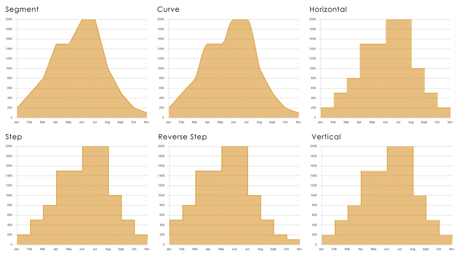
Specifies the way in which the data series is shown in the chart. The following values are valid:
- segment Draws lines as connected segments that are angled to connect at each data point in the series. This is the default.
- step Draws lines as horizontal and vertical segments. At the first data point the chart draws a horizontal line, and then a vertical line to the second point. The chart repeats this action for each data point.
- reverseStep Draws lines as horizontal and vertical segments. At the first data point the chart draws a vertical line, and then a horizontal line to the second point. The chart repeats this action for each data point.
- vertical Draws only the vertical line from the y-coordinate of the first point to the y-coordinate of the second point at the x-coordinate of the second point. Repeats this action for each data point.
- horizontal Draws only the horizontal line from the x-coordinate of the first point to the x-coordinate of the second point at the y-coordinate of the first point. Repeats this action for each data point.
- curve Draws curves between data points.
Fill Style
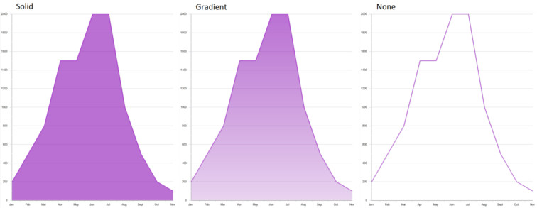
- Fill style is purely aesthetic, and sets the rendering style that will be used for the series.
- The available rendering styles are Solid, Gradient, and None.
Color
- Color will work in conjunction with Fill Style to distinguish one series from another.
- You can select color by clicking on the color swatches in the color picker, or you can manually enter a hexadecimal color value.
Pattern
- In addition to Color, different Pattern options will help users distinguish one series from another
- Click on the Pattern button to view and select from numerous pattern options.
Alpha
- Alpha sets the opacity of the series and can be adjusted for both Color and Pattern.
- Reducing the Alpha lets you see grid lines show through the columns.
Series Type
To select a different Series Type, click the pulldown in the bottom toolbar of the Series Data Grid.
- overlaid: Chart elements for each series are rendered directly on top of each other, with the element corresponding to the last series on top. This is the default value for AreaChart controls.
- stacked: Chart elements for each series are stacked cumulatively above each other. Each element represents the cumulative value of the elements beneath it.
- 100%: Chart elements are stacked cumulatively above each other, adding up to 100%. Each chart element represents the percentage that the value contributes to the sum of the values for that category.
Additional Area Chart Options
- Check or uncheck "Show Legend" as desired to include a legend of the line color for each Series (by Y-Field name).
- Enable the X-Axis title and enter value as desired.
- Enable the X-Axis labels and rotate them as desired.
- Enable the Y-Axis title and enter value as desired.
- Enable the Y-Axis labels and rotate them as desired.
Additional Configuration Steps
- Provide additional configuration, if needed, on the Options tab. For details on the available Options, see Options.
- Enter the following information on the Actions tab:
- Click Add Event Action to configure one or more Actions to be invoked when a user clicks on the Area Chart Widget. The action will apply to the current data record being displayed.
Sample Data
Instructions for bringing sample chart data into AppBoard can be found here: Sample Chart Data


