Appboard/2.6/builder/widgets/google map
The Google Map Widget displays a Google Map in AppBoard, including many of the Google Map features and controls. Google Maps allow users to display geographical locations in AppBoard, along with associated data and Actions.
Use of the Google Map Widget requires that the end user has a connection to the internet.
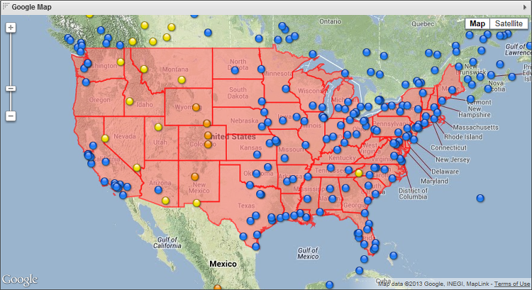
Sample Google Map widget showing KML overlay highlighting US states.
How To Create a Google Map Widget
For instructions on creating a Widget, see the general instructions in Adding Widgets. The Google Map Widget type is located under the Maps category on the Widget selection screen.
How To Configure a Google Map Widget
- Follow the instructions above to create the basic Google Map Widget.
- In the Map section of the Widget Wizard, edit the following options:
- Google API Key (optional) - if you have one, enter the unique identification key that is provided when registering with the Google Maps service. An API key is not currently required by Google. However, because Google's policies are subject to change, you should verify Google's current licensing requirements for your intended use of the Widget.
- Map Layer Options
- Show Traffic Layer - provides an overlay on the map displaying major highways and roads, which are color coded to represent current traffic conditions.
- Show Weather Layer - provides an overlay on the map displaying the current weather conditions in the regions shown on the map.
- Show Cloud Layer - provides an overlay on the map displaying cloud cover imagery in the regions shown on the map.
- Map Control Options
- Use Forty Five Degree View - gives users the option of viewing certain locations on the map at a 45 degree angle while in the Satellite map type. These locations are generally found at high zoom levels.
- Show Zoom Control - adds the slider bar to the map that allows the user to zoom in and out from areas on the map.
- Show Street View Control - adds a button with a human icon that can be dragged and dropped into available points on the map to view the area at street level.
- Show Scale Control (when space available) - controls whether the scale bar in the bottom left corner of the map is displayed, showing how far relative distances are portrayed on the map at the current zoom level.
- Show Map Type Control - adds a control to the map that allows the user to switch between Map and Satellite views and select or deselect the associated sub-options.
- Show Pan Control - adds a circular button with arrows pointing in each direction that allows the user to pan across the map by clicking.
- Show Overview Control - adds a small arrow button in the bottom right corner of the map that can be expanded to display a mini-map with a box in its center. This box can be dragged and dropped onto a new area on the mini-map which will then be displayed in the large Google Map.
- Zoom Options
- Fit To View - Sets the default zoom level and centering to display all of the data points centered in the display.
- Preview - this section displays a preview of the Google Map Widget that will be created with the options chosen. Use this section to help you determine which layers you would find useful and the controls you would like to see on your map.
- Adjust the preview map zoom and location on this page to set the zoom and location at which the map will default.
- The Google Map preview does not use auto-fit, since the map needs a default view. Whatever is in the preview is the default starting zoom and center of the Widget (but the Widget will show much more unless it is extremely small), and the max zoom allowed for fit-to-view will be 4 zoom levels higher than the default zoom level.
- Click Next to continue on with the wizard.
- In the Data section of the Widget Wizard, edit the following options:
- Data Collection - select a Data Collection you wish to have displayed on the Google Map Widget. You can use the buttons provided to Add, Edit, or Preview Data Collections here as well. The Data Collection must contain fields with longitude and latitude data.
- Adornment Label Field - select the column of data from the Data Collection that you want displayed when there is a mouseover on a node in the map.
- Latitude Field - select the column of data that represents latitude.
- Longitude Field - select the column of data that represents longitude.
- Default Icon - select the default icon to be used for the locations being displayed. The initial default icon is Small Status Ball Blue.
- Icon Filter - select the name of the filter you would like to use. An Icon Filter allows you to set rules for displaying different appearances for nodes on the map where certain conditions are met in the corresponding data. You may also want to Add or Edit a filter using the buttons provided. Upon clicking these buttons, the following options are provided in a new window:
- Name - give the Icon Filter a name, or change the current name.
- Add - add a new rule to the set. Each new rule provides the following options:
- Icon Location - keep it on From Library to choose from the icons provided with AppBoard.
- Available Icons - select from the list of available icons.
- Data Field (green pulldown) - select a column of data that the rule/comparison will be using.
- Operator (gray pulldown) - select from the list of operators that can be used for the rule (>, =, starts with, etc.).
- Value (text box) - enter a value to be compared against that is compatible with the selected Data Field and Operator.
- Advanced - Once checked, it replaces the rule options with an Advanced Filter button. Upon clicking the new button, a window comes up that allows you to create a more advanced rule. Here you can use different filter types: Match Regular Expression, Widget Interaction Comparison, and Simple Property Comparison. The Conjunction Type is offered as well, which allows you to restrict or expand the items that make it through the filter. You can also create multiple sub-rules that all act together as one Icon Filter rule.
- Rules can be reordered by clicking the upper-right corner of a row and dragging the rule up or down in the list.
- Close the Icon Filter Rules window to return to the Widget Wizard.
- Default Color - set the default color for the icons.
- Color Filter - this section is similar to the Icon Filter section, except that instead of using different icons, different colors are used to represent the data.
- Use the Preview area again to verify that the changes made in the Data section are correct.
- Click Next to continue.
- In the KML section of the Widget Wizard, edit the following options:
- Add KML Feed - click to add a KML feed to the Google Maps Widget. This is used to display geographical data in the widget. In the new window, edit the following:
- Name - provide a name for the KML feed you are adding to the widget.
- KML URL - provide the URL for the specific KML files you wish to use. The map compositing is done on the Google servers, so they have to be able to get the the URL. This means that the server running at Google needs to be able to address the “KML URL” entered by the AppBoard administrator in the Widget’s “KML Feeds” configuration via public access over the internet.
- Auto Refresh (Minutes) - interval to refresh the KML layer, by default this is set to zero (do not refresh).
- Disable Clicks - disables the user's ability to click on the KML feed.
- Disable Dialog - disables the user from accessing any KML dialog windows.
- After creating a KML Feed, you can Edit or Delete the feed using the buttons displayed next to it in the KML Feeds list.
- Add KML Feed - click to add a KML feed to the Google Maps Widget. This is used to display geographical data in the widget. In the new window, edit the following:
- Click Next to move on in the Widget Wizard.
- Provide additional configuration on the Options tab. For details on the available Options, see Options.
- Click Next to proceed to the Actions tab.
- Click Add Event Action to configure one or more Actions to be invoked when a user clicks on the Google Map Widget. The action will apply to the current data record being displayed.
- Click Finish.
- In the Builder Modes panel, select Builder and navigate to the appropriate Board to observe the new Google Map Widget.
