Appboard/2.6/builder/widgets/hloc chart
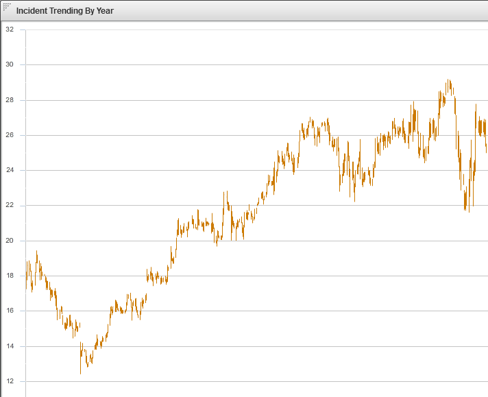
A High-Low Open-Close Widget is a graphical chart that is typically used to illustrate the movement in an indicator over time, such as the price of a commodity or the number of incidents reported on a computer network. Each vertical line on the chart shows the full price range over one unit of time. By looking at a range of dates, one can see the range of prices on each date, as well as the trend of the daily ranges over time. The specific nature of the High-Low Open-Close Widget requires that the underlying Data Collection contains fields for the High, Low, Open, and Close values.
How To Create a High-Low Open-Close Widget
For instructions on creating a Widget, see the general instructions in Adding Widgets. The Hi-Lo Open-Close Widget type is located under the Charts category on the Widget selection screen.
How To Configure a High-Low Open-Close Widget
Follow the instructions above to create the basic "Hi-Lo Open-Close Chart" Widget, and then perform the following steps to configure the Hi-Lo Open-Close Chart Widget:
Select a Data Collection
Select a Data Collection that contains the information you would like to use for this Widget.
- Click the "Data Collection" pulldown, then select from the list of available Data Collections.
- If you're using the sample CSV data, select "Sample.Data.ChartData3".
- If there are no Data Collections available in the pulldown, then click here for instructions on how to bring in some Sample Chart Data, or refer to Add/Edit/Remove a Data Collection.
Configuring the X-Axis
Select the desired X-Field to use for the X-Axis of the Chart.
- The "rows" of this column of data will make up the X-Axis.
If you're using Sample.Data.ChartData3, then select "Date" to be the X-Axis Field.
Type
Select an option for Type from the drop-down box. This will be used to determine how the data is translated by AppBoard into the labels that are shown along the x-axis:
- LinearAxis: x-axis values are determined as a linear progression between the lowest and highest values.
- LogAxis: x-axis values are determined as a logarithmic progression between the lowest and highest values. Labels on the logarithmic axis are even powers of 10.
- CategoryAxis: This is the default. The "rows" observed in the selected column of data will make up the X-Axis.
- DateTimeAxis: x-axis values are determined as time-based values such as hours, days, weeks, or years. This value can be chosen or "auto" can be used to let the widget decide the best value to use. An option to change the date-time format is also available.
If you're using Sample.Data.ChartData3, then select "DateTimeAxis" to be the Type.
Configuring a Series (Y-Axis)
- Click the "Add" button in the button toolbar of the Series DataGrid.
- Repeat to add additional series.
- Series may be removed with the "Remove" button next to the "Add" button.
- Series may be reordered in the Series DataGrid by clicking the upper-right corner of a row and dragging the Series up or down the grid.
If you're using Sample.Data.ChartData, then select the following Y-fields:
* High
* Low
* Open
* Close
Chart Options
- Check or uncheck "Show Legend" as desired to include a legend of the line color for each Series (by Y-Field name).
- Enable the X-Axis title and enter value as desired.
- Enable the X-Axis labels and rotate them as desired.
- Enable the Y-Axis title and enter value as desired.
- Enable the Y-Axis labels and rotate them as desired.
Additional Configuration Steps
- Provide additional configuration, if needed, on the Options tab. For details on the available Options, see Options.
- Enter the following information on the Actions tab:
- Click Add Event Action to configure one or more Actions to be invoked when a user clicks on the Hi-Lo Open-Close Widget. The action will apply to the current data record being displayed.
Sample Data
Instructions for bringing sample chart data into AppBoard can be found here: Sample Chart Data

