Appboard/2.6/builder/widgets/html widget/tree view widget
Overview
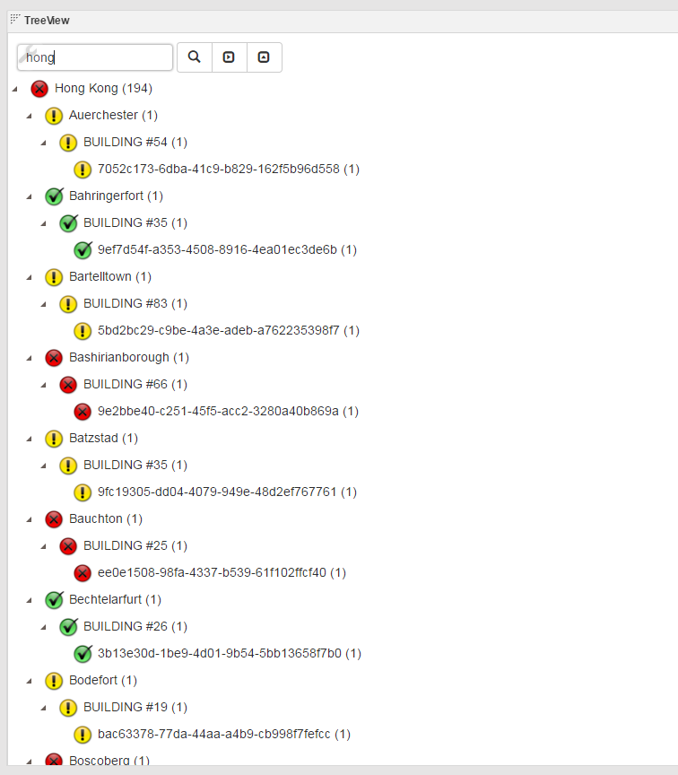
The Tree View widget is based on the Kendo UI TreeView Javascript library ( http://demos.telerik.com/kendo-ui/treeview/index ). It summarizes data in tabular format into a tree structure, and then visualizes it. It provides status roll-up and count information on nodes. Each node can be shown with status icon based on the status roll-up, count, and the row data where this node was contained in the original tabular data.
Configuration
To access the widget configuration you must be logged in with the portalAdministration role and in the Builder. Click on the wrench icon in the top-left of the widget.
This widget expects a typical data collection in tabular format. The configuration basically consists of two parts:
- Decide what columns to be shown in the widget.
- Decide how this widget should function.
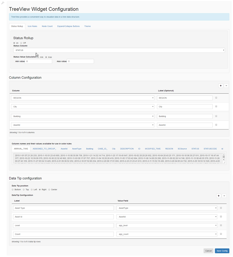
1) Decide what columns to be shown in the widget. Each column is corresponding to the level of a tree node. The column level can be re-arranged using the drag and drop in the Column Configuration table. Use the "+" sign on the top right to add column to be shown. Click on "Column" dropdown to pick the column. Additionally attributes to be configured for this column
- Label: Optionally set the Label name to display for the column. Currently this field is not being used.
2) Decide how this widget should function
- Status Rollup: Configuring how status is computed for a node.
- on : Enable status rollup in the tree
- off : No status rollup in the tree
- Status Column : Choose the field in the tabular data that is indicating a status. Currently, it has to be a numeric field. For instance, a status field has such discrete values, 0, 1, 2,.. 5
- Status Value Calculation :
- min : Show the minimum agregrate status in a tree on the top level node
- max : Show the maximum agregrate status in a tree on the top level node
- min value : Set the minimun status value in the possible values in the Status Column field
- max value : Set the maximum status value in the possible values in the Status Column field
- Icon Rules: This icon rules configuration page can be brought up by clicking on the "wrench" icon. This page is used to set how a status is represented by a particular icon. The rule library is implemented by Filtrex javascript library (https://github.com/joewalnes/filtrex/blob/master/README.md)
       Here are the list of sample rules:
       STATUS == 1
       STATUS > 2
       STATUS != 3
- Node Count: Configuring whether Node count is show or not
- Distinct Count : Counts represent how may leafs are found within that segment of the tree.
- Aggregate Count : Counts show the tally of the leafs in the tree; where the leaf has a count of how many items in the data are indexed by that leaf entry.
- Off : No node count displaying in the tree node.
- Expand/Collapse buttons : Configuring whether Expand/Collapse buttons is shown or not
- on : Show Expand/Collapse buttons only when total node count is less than 1000 in the whole tree
- off : Do not show Expand/Collapse buttons
- Theme: Set the theme for the widget.


