Appboard/old/widgets/circular gauge
Sample Data
Instructions for bringing sample chart data into AppBoard can be found here: Sample Chart Data
Adding a Circular Gauge Widget
- Click "Add Widget" in the tool palette on the left.
- If "Add Widget" is disabled, see Adding a Stack.
- For a general overview of adding a "Widget" see Add/Edit/Remove a Widget.
- Perform the following steps to select the Gauge Widget from the Add Widget dialog.
- Select the "Gauge" tab
- Select "Circular Gauge"
- (Optional) Enter a name for the Widget, such as "Sample Gauge". AppBoard will default to "Untitled" if no name is provided.
- (Optional) Select the Board on which you would like to place the Widget. AppBoard assumes the current board by default.
- Click the "Add Widget" button in the bottom toolbar.
Select a Data Collection
Select a Data Collection that contains the information to use for this widget.
- Click the "Data Collection" pulldown, then select from the list of available Data Collections.
- If you are using the sample CSV data, select "Sample.Data.ChartData".
- If there are no Data Collections available in the pulldown, then see Sample Chart Data, or Add/Edit/Remove a Data Collection.
Label Field
Select a field that contains the desired label to be used for each item in the data set.
- The "rows" of data from this field (column) will be used as the label for each gauge.
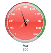
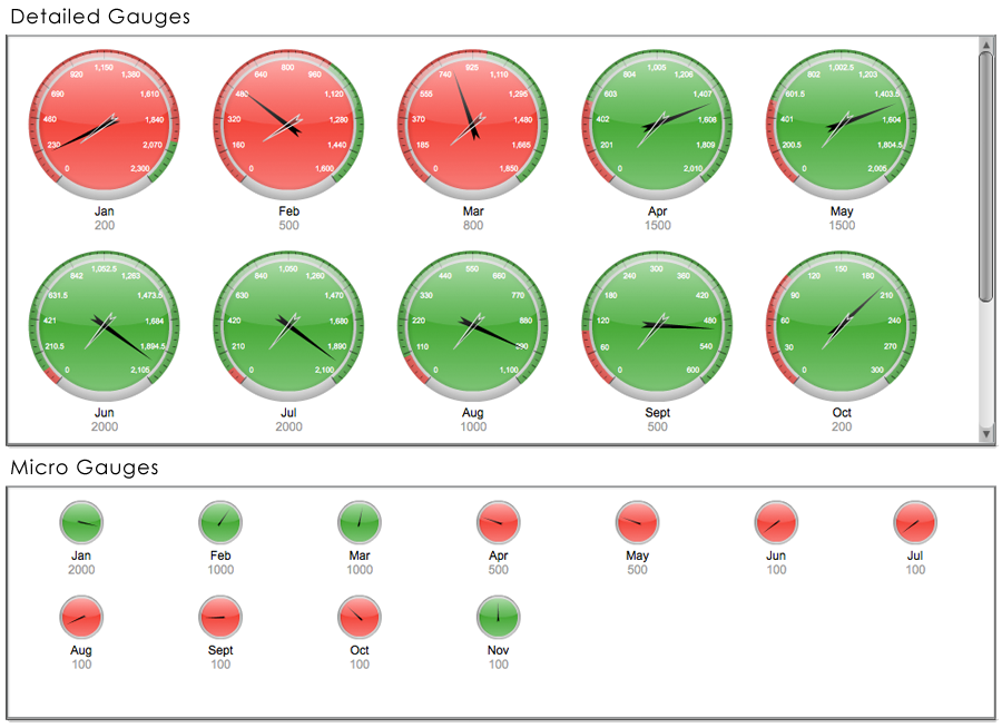
If you are using Sample.Data.ChartData, select "Month" to be the Label Field. This will produce 11 gauges, since there are 11 rows of data in the sample file. Each will have a different Month name as their label.
Second Label Field
The Second Label Field is available in AppBoard versions 2.3.17 or higher.
Select a field that contains the desired secondary label to be used for each item in the data set.
- The "rows" of data from this field (column) will be used as the secondary label for each gauge. directly below the Label Field, beneath the gauge.
If you are using Sample.Data.ChartData, select "Planning" to be the Label Field. This will produce 11 gauges, since there are 11 rows of data in the sample file. Each will have a different Month name as their label.
Value Field
The "Value Field" is what determines the placement of the needle inside the Gauge component.
If you're using Sample.Data.ChartData, select "Software" as the Value Field.
Start Value
This option will crop the range of values used to determine the rotation of the needle. This option is useful when dealing with values that do not have much variation. For Example, SLA calculations usually result in values clustered around 99%. If you start from zero, then the gauge will show nearly identical needles. With a "Start Value" set at .095, the needles will show more variation, providing a more useful comparison across the data set as a whole.
Comparative Measure
Comparative Measure is an optional secondary (shorter) needle that can be shown on each gauge. It can be useful for showing a high water mark, or deviations from an historical average.
- Select a field that contains the desired value to use in placing the needle to show the comparative measure.
Thresholds (Color)
Setting thresholds is an important element in configuring the Gauge Widget. Threshold values determine the colors displayed in the gauge, as well as the numeric labels that are displayed around the gauge.
- Dynamic: Select one or more fields in the Value column, and AppBoard will derive threshold values from the data that is currently displayed in the Widget. This is useful if the values being plotted are compared against different scales. AppBoard will find the highest value of all the selected Value fields, and then automatically determine the 10 breakpoints to display, based on interpolating between (a) the greater of the lowest data value or "Start Value", and (b) the highest data value. Examples can include:
- Projected vs. Actual: Shows the variation in projections by region as well as the actual values for that region.
- SLA: Shows variation between service level agreements per customer as well as the actual SLA values.
- Static: Lets you manually enter a static threshold value(s) to use across the data set. AppBoard will find the highest value of all the entered "Static" Value fields, and then automatically determine the 10 breakpoints to display, based on interpolating between (a) the greater of the lowest data value or "Start Value", and (b) the highest data value. The coloration of the gauge will also be determined by comparing the Value Field against the "Static" Value fields.
- Tickets: If there are more than 50 active tickets for any given location, the gauge background should turn red. Create a single Threshold, entering "50" for the "Static" value and select the red color.
- Events: When total number of critical events for a system exceeds 10, the gauge background should turn red (if "Tint Gauge with Threshold Color" option is selected).
If you are using Sample.Data.ChartData, then set Red to "Dynamic" "Hardware", and Green to "Dynamic" "Totals".
Gauge Options
The gauge widget has several unique rendering options.
- Show Scale in Gauge: This option shows numerical labels inside the gauge.
- Show Thresholds in Gauge: This option shows threshold colors on the outside edge of the gauge when enabled.
- Tint Gauge with Threshold Color: This option will tint the face of the gauge with the appropriate threshold color when enabled.
- Comparitive Measure Field: See section above.
Gauge Size
The Gauge Size slider affects how large the gauges are, which will impact the number of gauges that can be displayed in a particular Widget.


