Appboard/2.6/builder/widgets/line chart: Difference between revisions
imported>Jason.nicholls |
imported>Jason.nicholls m (1 revision) |
(No difference)
| |
Latest revision as of 10:59, 30 April 2015
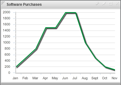
A Line Chart Widget displays information as a series of data points connected by line segments. It is similar to an Area Chart, but without the color and texture between the axes and the line.
How To Create a Line Chart Widget
For instructions on creating a Widget, see the general instructions in Adding Widgets. The Line Widget type is located under the Charts category on the Widget selection screen.
How To Configure a Line Chart Widget
Follow the instructions above to create the basic "Line Chart" Widget, and then perform the following steps to configure a Line Chart Widget:
Select a Data Collection
Select a Data Collection that contains the information you would like to use for this Widget.
- Click the "Data Collection" pulldown, then select from the list of available Data Collections.
- If you're using the sample CSV data, select "Sample.Data.ChartData".
- If there are no Data Collections available in the pulldown, then click here for instructions on how to bring in some Sample Chart Data, or refer to Add/Edit/Remove a Data Collection.
Configure the X-Axis
Select the desired Field to use for the X-Axis of the Chart.
- The "rows" of this column of data will make up the X-Axis.
If you're using Sample.Data.ChartData, then select "Month" to be the Field.
Type
Select an option for Type from the drop-down box. This will be used to determine how the data is translated by AppBoard into the labels that are shown along the x-axis:
- LinearAxis: x-axis values are determined as a linear progression between the lowest and highest values.
- LogAxis: x-axis values are determined as a logarithmic progression between the lowest and highest values. Labels on the logarithmic axis are even powers of 10.
- CategoryAxis: This is the default. The "rows" observed in the selected column of data will make up the X-Axis.
- DateTimeAxis: x-axis values are determined as time-based values such as hours, days, weeks, or years. This value can be chosen or "auto" can be used to let the widget decide the best value to use. An option to change the date-time format is also available.
If you're using Sample.Data.ChartData, then select "CategoryAxis" to be the Type.
Configure a Series (Y-Axis)
- Click the "Add" button in the button toolbar of the Series DataGrid.
- Repeat to add additional series.
- Series may be removed with the "Remove" button next to the "Add" button.
- Series may be reordered in the Series DataGrid by clicking the upper-right corner of a row and dragging the Series up or down the grid.
Y-Field
- Values contained within the "Y-field" will determine the height for that series.
- If you're using Sample.Data.ChartData, then select "Software" as the Y-field.
Form
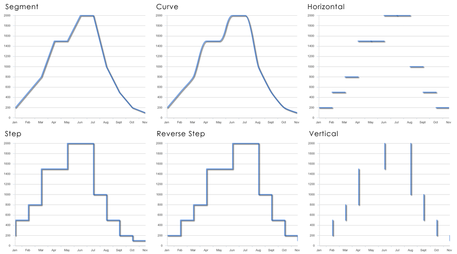
Specifies the way in which the data series is shown in the chart. The following options are provided:
- segment - Draws lines as connected segments that are angled to connect at each data point in the series. This is the default.
- curve - Draws curves between data points.
- horizontal - Draws only the horizontal line from the x-coordinate of the first point to the x-coordinate of the second point at the y-coordinate of the first point. Repeats this action for each data point.
- reverseStep - Draws lines as horizontal and vertical segments. At the first data point, draws a vertical line, and then a horizontal line to the second point. Repeats this action for each data point.
- step - Draws lines as horizontal and vertical segments. At the first data point, draws a horizontal line, and then a vertical line to the second point. Repeats this action for each data point.
- vertical - Draws only the vertical line from the y-coordinate of the first point to the y-coordinate of the second point at the x-coordinate of the second point. Repeats this action for each data point.
Line Style
- Solid - The default line style, a simple solid line that traces the data points in the line chart.
- Dashed - This style uses a series of dashes instead of a solid line to trace the data points.
- None - This style provides no line for the chart and is usually used in conjunction with selecting a shape for the data points.
Shape
This option allows you to add a shape to represent the exact data point for each record in the series. The Color option applies to the shape chosen as well as the line color.
Color
- Color will work in conjunction with Fill Style to distinguish one series from another.
- You can select color by clicking on the color swatches in the color picker, or you can manually enter a hexadecimal color value.
Alpha
- Alpha sets the opacity of the series.
- Reducing the Alpha lets you see grid lines show through the columns.
Weight
- Weight refers to how thick the line on the line chart will be.
- Larger numbers equate to the thicker lines.
Additional Area Chart Options
- Show Legend
- Toggles chart legend on/off.
- X-Axis title
- Allows you to enter a custom title for the X-Axis, which can be toggled on/off.
- X-Axis labels
- Allows you to rotate the X-Axis labels. You can also toggle the X-Axis labels on/off.
- Y-Axis title
- Allows you to enter a custom title for the Y-Axis, which can be toggled on/off.
- Y-Axis labels
- Allows you to rotate the Y-Axis labels. You can also toggle the Y-Axis labels on/off.
- Show Mouse-Over Data Tips
- This option enables data tips to appear when mousing over the vertices of a line chart.
- Use Custom Mouse-Over Data Tips
- This option enables you to customize the data tips that appear when mousing over the vertices of a line chart.
Additional Configuration Steps
- Provide additional configuration, if needed, on the Options tab. For details on the available Options, see Options.
- Enter the following information on the Actions tab:
- Click Add Event Action to configure one or more Actions to be invoked when a user clicks on the Line Chart Widget. The action will apply to the current data record being displayed.
Sample Data
Instructions for bringing sample chart data into AppBoard can be found here: Sample Chart Data


