Appboard/2.4/builder/filtering: Difference between revisions
imported>Jason.nicholls No edit summary |
imported>Jason.nicholls No edit summary |
||
| Line 13: | Line 13: | ||
** '''Colored Shape''': combination color and status shape filter | ** '''Colored Shape''': combination color and status shape filter | ||
** Widget Options Filter or '''Quick Filter''': either an ''Icon'' or ''Colored Shape'' filter that adds a button bar to the bottom of a widget to allow for quick filtering by the end-user. | ** Widget Options Filter or '''Quick Filter''': either an ''Icon'' or ''Colored Shape'' filter that adds a button bar to the bottom of a widget to allow for quick filtering by the end-user. | ||
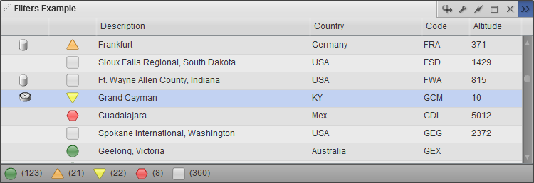
[[File:appboard-2.4-visual-filters.png|frame|Example visual filters: icon, colored shape, and colored shape quick filter]] | |||
Revision as of 08:28, 3 February 2014
AppBoard features a common concept throughout the product around filters and filtering. These are configured to reduce down data collections and to drive indicators in visualizations:
- Server Side Filters (SSF): reduce the size of a data collection on the server side, i.e. client received only the reduced set of data. Server side filters are also used to drive SHIM query parameters.
- Client Side Filters (CSF): performed on the client to reduce the size of a data collection. The full data collection is received by the client from the server.
- Action Filter: determines whether an action should be triggered based on what was clicked by the end-user.
- Visualization Filters:
- Icon: determine icon to display based on filter conditions
- Status Shape: determine status shape to display based on filter conditions
- Color: determine color to show based on filter conditions
- Colored Shape: combination color and status shape filter
- Widget Options Filter or Quick Filter: either an Icon or Colored Shape filter that adds a button bar to the bottom of a widget to allow for quick filtering by the end-user.

