Appboard/2.4/builder/widgets/diagrammer
The Diagrammer Widget allows for the diagramming of nodes and links in custom layouts that are directly referencing data from adapters. The referenced data can be run through filters or rules that provide icons, status icons, colors, and labels.
The Diagrammer Widget is a unique widget in that it does not use Data Collections to display data. It accesses data directly from configured adapters. By accessing the data directly from the adapters the widget can ensure that it gets the exact reference to a row of data that is unaffected by client side sorting, filtering, or grouping.
The Diagrammer widget records the unique key of the data that it is using so that it can request updates from the server for that specific piece of data. For this reason, only Data Source entities that have primary keys defined can be used as sources.
This page is designed to answer any questions you may have about the Diagrammer Widget. For a detailed tutorial that can help guide you through the basics, check out our Diagrammer Widget Tutorial page.
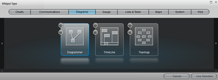
Create a Diagrammer Widget
To add a Diagrammer Widget to a stack, use the shortcut “Add Widget” button on the Quick Actions menu. Complete the new widget dialog and select the Diagrammer widget located in the Diagrams category.
Configure a Diagrammer Widget
After adding the widget to the board, you are presented with a widget configuration wizard. If this is your first time using the Diagrammer Widget you will have no existing diagrams to choose from. However, had you edited several diagrams prior to dropping this widget, you could actually choose from the list of previous used diagram models. This allows you to use the same diagram in multiple Diagrammer widgets and multiple stacks. The fact that the widget’s model can be chosen also allows the widget to programmatically change its model via actions which will be covered later.
Click the “Add” button and let’s create a new empty Diagram Model to edit. Note that here you can also Clone, Delete, Edit, and Manage Diagram Models. The Edit Diagram window will come up where you can name the Diagram Model. You will want to name your diagrams descriptively so they can be easily identified later. Click "Save" to continue.
The Diagram Background and Polling Interval configuration settings are covered in the Advanced Configuration section.
Click through the rest of the wizard by clicking the “Next” button. The “Options” panel is not needed for this wizard, and we will cover the “Actions” panel later.
Overview of Diagram Editor Mode
Editor Mode is the administrator mode that allows for the diagrams to be edited. When the Diagrammer Widget is viewed in Viewer Mode, the nodes and links cannot be moved, created, or deleted. Therefore the editing features will disappear in Viewer Mode. While in Editor Mode, polling (see Polling Interval below) is disabled, but can be re-enabled by selecting Enable Actions; a one-time refresh can be effected by clicking the Refresh button.

Here is a list of important items in Editor Mode:
- Enable Actions --> By checking this feature you temporarily place the editor into VIEWER mode so that you can test selection actions. While editing nodes and links, actions should be disabled so that they do not fire and potentially take you to another child or stack.
- Selection Mode (mouse pointer button) --> Used to select/move/create nodes. With this mode active you can drag new nodes to the diagram or reposition existing nodes.
- Pan Mode (hand button) --> Turn this mode on to click and pan the diagram.
- Shortest Route Tool (button that looks like a compass) --> This mode allows you to select two nodes and visibly see the shortest path between the nodes, assuming that there is a path between them with connected links.
- Refresh (button with two arrows forming circle) --- Sometimes after making several changes to Node and/or Link Types it is necessary to manually refresh the diagram view to get the changes.
- Save (floppy disk button) --> Click this to save the changes you have made to the Diagrammer Widget.
- Reconfigure (wrench button) --> Reconfigure Node/Link to point to a specific row of data of the assigned Data Source Adapter.
- Fit To View (button with magnifying glass with square inside) --> Pressing this button zooms and pans the diagram so that the entire diagram can be seen within the widget.
- Zoom To 1:1 (button with magnifying glass with 1 inside) --> Pressing this button zooms the diagram to 100% zoom level. This gives you the best contrast and picture quality.
- Link Creation Mode (straight horizontal arrow button) --> Changing to this mode allows you to create new links between existing nodes. The section under "Node Types" will change to show the Link Types.
- Node/Link Types (black box section to the left) --> This area will list all the configured nodes or link types that can be used when diagramming.
- Edit Node/Link Type (button with diagonal line or slash in Node/Link Types section) --> Edit a selected Node/Link Type in section.
- Add Node/Link Type (button with plus sign in Node/Link Types section) --> Add a new Node/Link Type in section.
- Delete Node/Link Type (button with minus sign in Node/Link Types section) --> Delete a Node/Link Type in section.
Creating Nodes
The first step to building a diagram is actually creating the Data Source adapters that will provide your diagram with the information it will need to display status, icons, or colors. The most productive way to build a diagram is to have a data source that provides enough information to key icons off of a rule.
Once you have the DataSource created you can begin creating Node Types. With the Selection Mode enabled, you can click the “Add new Node Type” button.
You can give your Node Type a label and icon to display in the Palette. The last option is to pick the DataSource that you created earlier. Click the Label tab to advance to setup the label or click the Close button to finish.
You can create a rule for the label to display when dropping new nodes onto the diagram. You can type your own text for prefixes and suffixes, and insert Tokens that will take values out of the data source row to display. For instance, if you had a Token ${ResourceName}, you could say MyName:${ResourceName} and every time you drop a new node it would have fill in the value for ResourceName after your "My Name:" prefix as the label. Click the Color tab to configure the color rule or click the Close button to finish.
A color rule allows for the node to be tinted a color when a rule is matched. Most often this is used to show status. Click the "Add" button next to Color Filter, a new Color Filter Rules window appears. Provide a name for the new set of rules. Here when you click "Add Color" you can create rules to show status in the Diagram. For example, if you wanted to display visually the differences in county populations in Virginia, you could create a rule selecting "Population" and ">" from the drop-down menus and enter a valid population number to use in the comparison. Close the window when you are finished and notice that the new set of rules is selected in the drop-down box below. You may decide create multiple sets of rules to choose from, and they will all be stored and provided in this box. Click the Icon tab to configure the icon rule or click the Close button to finish.
Icons are designed to represent specific subsets of data in the diagram. Click on the "Add" button to bring up the Icon Filter Rules window. Start with naming the Icon Rules at the top. Click the "Add" button to add new rules. Now, you get to choose from an array of icon options. The different icon images help organize the data for the user differentiate between subsets. For each icon you select a data key, an operator, and enter a value (example: Last Name, starts with, M). When we drop a node from the data source, it should use the appropriate icon that represents the value of the specified data key. Close the window and notice the rules you created are selected in the drop-down box below. This box will provide all of the Icon Rule sets available.
That’s the last configuration item for a node type. You can create multiple node types that can use any configured DataSource. This allows you to have diagrams that show information from multiple sources of data.
Now you are ready to create your first Node in the diagram. Drag an instance of the node type you just created from the palette to the Diagram center.
Upon dropping the new node you will be prompted with a dialog to choose the row in your DataSource that you would like to depict in the graph. Select one and click "Select Record". Note that if you click "Cancel" or the X at the top of the dialog, the newly added node will be removed from the diagram. If editing a node at a later point in time and the selected record is changed, clicking "Cancel" or the X will cause the node to revert to the previously selected record.

Notice how the newly dropped node filled in its label, icon, and status automatically. Now if this row is changed on the server, the Node will automatically apply the needed updates to its visuals based on the rules that were written. This will happen automatically if another DataCollection using this data refreshes, or you can turn on data polling on the Diagrammer Widget Configuration page we saw earlier.
Creating Links
You can draw links with or without associated data. In fact, a Basic Link type is already available for use if you just want to draw connections between nodes without showing labels or status. To use basic links, just click the Link Creation Mode button  and then choose a link type using the new link type button that appears to the right. After that, select the Basic Link in the Node/Link Type section and click on a node to start drawing a link from that node to another node.

In addition, just like Nodes, you can create a new link type that will auto fill labels and status color. To do so, you must first create a DataSource Adapter that will provide the information you need to create filter rules for the label and status.
With the Editor still in Link Creation Mode, we can add a new Link Type pressing the Add Node/Link Type button. This process is very similar to node creation.
Just like node types, you give the link a name and assign it to the proper data source.
Just like node types, you can create a custom label rule that will populate based on column values.
Again, just like node types, a link type can have a color filter rule that can tint the color of the link based on rules against the data.
After creating the new link type you can now connect nodes with the new link type selected to get links that auto generate labels and status colors.
Editing Links
By placing the diagrammer back into Edit Mode  you can modify the visual structure of links. You can move/add/delete vertices of links, remove and reattach them to new nodes, or delete them all together.
Editing Vertices of Links
Selecting a link enables grapples on all vertices on a link. You can move existing vertices just by dragging them with a mouse. You can delete vertices by clicking on them and pressing the "Delete" key. To add new vertices just click anywhere on the link and drag.
Changing the Source or Target Node of a Link
Selecting a link enables grapples on the endpoints of a link. You can drag them to new nodes to change the connectivity of your diagram.
Deleting Links
Select a link without clicking on a vertice and press the "Delete" key to delete an entire link.
Adding Actions to Diagrams
On a Diagram Widget you can click the “Edit Actions” toolbar button on the window (a lightning bolt in the top right corner). This will open the Widget Configuration Wizard in the Actions page.
To add an action, you click the "Add Event Action" button, which then provides you with a drop-down menu of actions to choose from. The most common actions for a diagram are: Do Nothing, Change Diagram Context, Switch To Board, Apply a Filter to a Data Collection.
Actions are better covered in other help documents, but we will quickly demonstrate how you could navigate to another board when clicking on a diagram node. For this example, we will select the "Switch to a Board" rule.
Provide a name for the action or stick with the default. Next to "On selection of" select any, if not already chosen. From the next drop-down menu, select an option that represents icons you have in your diagram (example: diagram.resources.Resources). Since we don’t have a child board created yet, we can use the “Add Board” button to create a child board that we want to navigate to upon selecting a node.
We will create a new child board named “MyChildBoard”, and you can select from any stack you have created for this example. We can chose to pass some context of what was selected by checking the “Context Data Type” and selecting our DataSource Adapter.
Now, if we check Enable Actions in the editor we can test this new switch to board action. After clicking on the any applicable node we can see a blank child board. You can click on the “My Stack” label in the Breadcrumb above to navigate back.
Changing Diagram Models from Widget Actions
Other widgets can fire an action to change the Diagram model of a Diagrammer Widget. This allows you to show different diagrams based on selections within another widget.
We’ll begin this example by adding a “Change Diagram Context” event action to the Status List. On selection of a “specific” item such as test.test.stateCapitals for this example, we want to change from our previous Diagrammer Widget to one called "New Diagram". We will click the Filter button and add our specific filter. By entering that if a property "State" "=" the Value "Texas", when any item in the status list which represents a capital city in Texas it will change the diagram model of the MyCoolDiagram widget to the “New Diagram” model.
Advanced Widget Configuration
To add Background Images to the drop down for Diagrammer Widget configurations, you can copy images into Appboard\server\webapps\enportal\visualizer\assets\images\backgrounds and edit Appboard\server\webapps\enportal\visualizer\assets\backgroundregistry.xml.
You need to leave the None value in the list of backgrounds, but you can add as many backgrounds as you want to the list.
The Polling Interval is an option that will tell the Diagrammer Widget to auto request new data from adapters that are connected to the diagram. This is useful if the data you are displaying aren’t also in a Data Collection that is auto refreshing. This option is subject to change in future versions of the AppBoard product when server data pushes are implemented.
