Appboard/2.4/builder/widgets/diagrammer/tutorial
The Diagrammer Widget is a powerful tool that allows for the diagramming of nodes and links in custom layouts that are directly referencing data from adapters. The referenced data can be run through filters or rules that provide icons, status icons, colors, and labels. The Diagrammer Widget does not use Data Collections to display data. Instead, it accesses data directly from configured adapters. By accessing the data directly from the adapters the widget can ensure that it gets the exact reference to a row of data that is unaffected by client side sorting, filtering, or grouping.
The Diagrammer widget records the unique key of the data that it is using so that it can request updates from the server for that specific piece of data. For this reason, only Data Source Adapters that have primary keys defined can be used as sources.
Now that we have an idea of what a Diagrammer Widget is and why we would use one, let's try to create and use one.
Creating a Data Source
Before we actually create the Diagrammer Widget, there are some steps we must follow to make it possible. For starters, we cannot create a Diagrammer Widget without data to display.
There are many different types of data sources that are supported by AppBoard. You can also write your own custom data adapters, if needed. For more information on data sources, check out the Add/Edit/Remove a Data Source page. In this exercise, a sample CSV (comma separated value) file will be used as a data source.
- Go to the AppBoard Builder URL and log in if prompted: http://localhost:8080/enportal/ab/home
- Username: administrator
- Password: administrator
- Domain: System
- Click on the “Data Sources” builder mode icon.
- Click the Add button. Observe the various categories and types of Data Adapters that are available.
- In the “Name” box, enter “sample.USA_States”.
- For the adapter type, select “File”.
- Under the file type, select “CSV File”.
- Click the “Add Data Source” button. The “Connect” screen will be displayed.
- Under “filePath”, enter “${application.home}/data/pkg/appboard/test/stateCapitals.csv”
Confirm that the "Data Delimiter" option is set to "Comma", the "Contains Header Line" option is set to "Yes", and the "String Boundaries" option is set to ".
- Click Next. The “Explore” screen will be displayed with a list of data files found.
- Under “Primary Key” for the stateCapitals folder, click Edit and select “StateID”. Click Ok to proceed.
- Click the arrow next to the stateCapitals folder and change the data types as follows:
- StateID: Int
- StateLabel: String
- State: String
- Capital: String
- Longitude: Number
- Latitude: Number
- Population: Int
- Click Next. The “Associate” screen will be displayed.
- Click Finish. On the Main Menu, click Data Sources again to display the Data Source Administration panel and confirm that the Data Source “sample.USA_States” is now listed.
Creating a Stack and a Board
Another thing we must create before we get to the Diagrammer Widget is a Stack. A "Stack" is a is a collection of Boards that contain related information. For example, a Stack named "Airports" might have two boards, one that details all of the Airports in the US and another Board that shows only the details of a single Airport. Stacks are generally used for drill-down purposes. So clicking on an Airport in the US level Board would reveal the details of that airport in the single airport details Board.
We will also be creating a Board in the process. Boards contain the widgets that display useful information to the end user. So in order for us to create this Diagrammer Widget, we need a Board to put it in. Every board will be part of a stack, which is a collection of one or more boards.
Let's begin:
- In the left panel, under “Quick Actions”, click the “Add Stack” item.
- For “Top-Level Board Title”, enter “USA_States_Stack”.
- Click the "Add Stack" button.
- Click the "Stacks & Boards" icon under "Builder Modes" in the left panel. Confirm that the Stack “USA_States_Stack” is now listed in the Stacks and Boards Administration panel.
- In the left panel, click the “Builder” icon to display the empty Stack.
Creating a Diagrammer Widget
We have now reached the point where we finally start to create and configure our Diagrammer Widget. A "Widget" is a visual element that can be placed on a Board. In this section, we will create a Diagrammer Widget that will display basic information about state capitals.
- Click "Widgets" under "Builder Modes" to display the Widgets Administration panel.
- Click the “Add” button to create a new Widget.
- In the “Name” box, enter “US_States_Diagram”.
- For “Board”, select “USA_States_Stack”. Observe the various widget types and widgets that are available.
- Select the widget type “Diagrammer” and select “Diagrammer”.
- Click “Add Widget”.
- Perform the following on the “Configure” panel to configure the widget:
- Click "Manage Diagrams".
- On the Manage Diagrams Dialog click the "New" button.
- A new row is appended to the table with a label of “New Diagram”, double click the row and give the diagram a new name of “MyCoolDiagram”.
- With “MyCoolDiagram” still highlighted, click the Use Selected button to close the dialog.
- Click Next.
- Click Next.
- Click Finish.
- Click Builder and observe that the board now shows a diagrammer widget.
Creating a New Node Type
Nodes are a very important aspect of the Diagrammer Widget. Nodes are specific pieces of data pulled from your data source that, in the Diagrammer Widget, are represented by icons and colors to display data in a visually appealing way for organization and comparison.
In this section we will create a new Node Type and drop a new node on the diagram.
- In the Builder, click the Add New Node Type button (Green + sign beneath the Node Types Palette).
- Type “State Node” in the Palette Label field.
- Choose any icon to represent the node.
- Choose sample.USA_States.stateCapitals as the DataSource to use.
- Click Next.
- Observe the "Available Tokens" section. Put “${Capital}” in the label field.
- Click Next.
- Press “Add” button next to "Color Filter".
- In the "Color Filter Rules" window, name the rule set "Population Color Rules".
- Click the "Add Color" button twice.
- On the first color rule, pick a red color, pick Population in the green drop down, the greater than symbol ‘>’ in the grey drop down, and type 3000000 as the value.
- On the second color rule, pick a green color, pick Population in the green drop down, use the less than ‘<’ symbol in the grey drop down, and type 3000000.
- Close the window. Confirm that the "Population Color Rules" set is selected under "Color Filter".
- Click Next.
- Press “Add” button next to "Icon Filter".
- Now in the "Icon Filter Rules" window, name the new rule set "Latitude Icon Rules".
- Click the "Add" button twice.
- Choose Router under "Available Icons", Latitude in the green drop down, > for the operator, and 36 for the value.
- Choose Server 1 under "Available Icons", Latitude property in the green drop down, < for the operator, and 36 for the value.
- Close the window. Confirm that the "Latitude Icon Rules" set is selected under "Icon Filter".
- Click Finish.
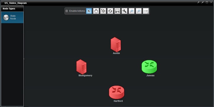
- Drag and drop the “State Node” type to the blank diagram.
- Choose Montgomery as the item you would like to drop in the popup table.
- Repeat for Austin, Hartford, Juneau until you get a diagram displaying four nodes with different icons and colors.
Creating Link Types
Links are another important part of the Diagrammer Widget. Links are a way of comparing nodes and displaying data. Basic Links are very simple: they do not have labels or show up in different colors based on a predetermined status rule, they are just arrows you can use to link data and display a visual connection. Custom Links, just like nodes, can be created to display labels and different colors to represent status.
In this section we will learn to use Basic Links and Custom Type Links.
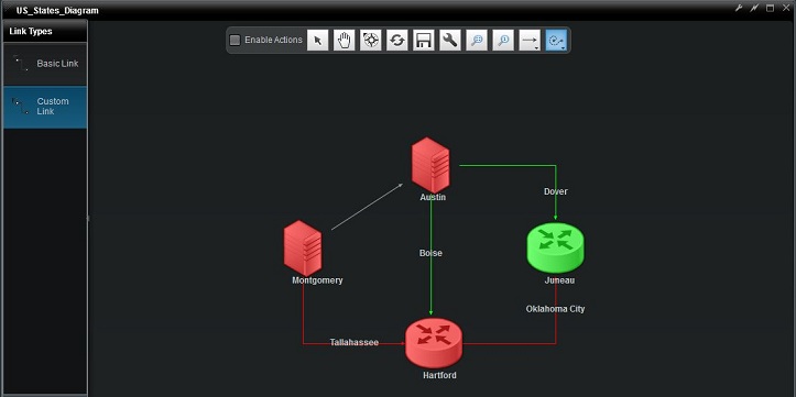
- Click the Create Link button (the horizontal arrow) on the Toolbar, and choose a link style from the button that appears to the right.
- Click on the Montgomery node to begin drawing the link, then click on Austin node to complete the link.
- Create a New Link Type by clicking the green + button.
- Give the link type a Palette Label of "Custom Link".
- Choose sample.USA_States.stateCapitals as the DataSource to use.
- Click Next.
- Put “${Capital}” in the label field.
- Click Next.
- Select the "Population Color Rules" rule set we created in the previous exercise. This will apply the same rules to our link colors.
- Click Finish.
- With the Custom Link type selected, click any node and click another node to connect the two with a custom link.
- Choose any row in the DataSource to associate with the link and you will see the label and color of the link change.
Hopefully you have just completed the walk-through without issue, and feel comfortable using the Diagrammer Widget. For more information and specifics on the Diagrammer Widget, visit the Diagrammer Widget page.


