Appboard/2.6/builder/widgets/topology
The new Topology Widget was formally introduced to AppBoard in the 2.3 version release. Its purpose was to allow data with connectivity information to be rendered automatically as a graph of nodes. The data structure for the topology has an open architecture that allows many different methods of representing a topology in data. For instance, you can render a topology using a connectivity table that is associated to other tables, or a simple table that has a 1 to 1 reference to its parent data.
Overview
Before beginning to you use the Topology Widget, it is important to understand that there are three steps to using the Widget effectively:
- Associate the Data Sources on the Server - The data that is going to be represented in a topology needs to be associated on the server first. If you have resources that are related to a join table which is related to other resources, for example, you must create associations that walk that relationship.
- Create a Relationship Model that Defines the Relationships on the Client - A relationship model must be created on the client that describes the relationships that were created on the first step. This includes describing if the associations are parental or child like in relationship, how the data should be depicted when rendered (colors, icons, labels), and what portions of the relationships should be rendered. For instance, it is possible to have a relationship such as 'router associated with server', which is associated with an event, and then only show the router and the events.
- Create and Place a Topology Widget on a Board - When creating an instance of the Topology Widget on a Board, it is important to remember that the Widget will require seed data before it can render. Typically this would be a Data Collection that contains one to a few root nodes. The Relational Model that is attached to the Topology Widget will then interrogate the root nodes and follow the model looking for data that is connected. The beauty of it having a seed Data Collection is that AppBoard Actions can fire Data Collection filtering, causing the Topology to re-render with a new root node or set of nodes.
Using the Relational Model Editor
This section makes an assumption that the reader is already familiar with associating data on the server, as referred to in the first step. The second step in using a Topology Widget, however, is a new administration Action that has been added to the 2.3 version of AppBoard.
To create a new Relational Model, perform the following steps:
- Click Data Collections in the left panel.
- Click the Data Collections Type switch. This places the Data Collection admin page into the Relationship mode. Relationships are basically Data Collections that are relational in nature, such as hierarchies.
- Click the Add button to open a new dialog that allows you to create a new Relational Model.
- Give the model a name that describes what you will be displaying in the Topology Widget.
- Click the Add Source button to add a data source that you would like to render as root nodes in your topology display. This adds a data type node to the graphical view of your Relational Model. The top label is the data source and the bottom label is the Column or MetaClass that will be rendered. The green “+” button is used to add a relationship to the MetaClass. The yellow “/” button is used to add visual rules to the MetaClass, so that when it is rendered in a topology it knows what icon, label, and colors to use.
- Continue to add more sources and relationships to build a complex data model with multiple associations. Note that the Topology Widget can render relationships from any place in the relational model. You do not have to start with the data type on the farthest left.
- To configure the appearance of these data types, click the yellow “/” button.
- The first step of the Configure Appearance dialog allows you to setup a label rule for the data that gets rendered. Click on 1 or more tokens in the list below to have the client fill in values from the data object into the label. You can add prefixes and suffixes to these tokens.
- The next step Color lets you choose a default color and add rules to determine how to render the background of the node label.
- Next, Status Shape rules give the node renderers details about what status icon to display as additional visual feedback. This is helpful for displaying status to those who may have trouble distinguishing colors or are fully color blind.
- The final step, Icon, allows you to configure a similar set of rules to the previous two sections for what icons to display on the topology.
Creating a Topology Widget Instance
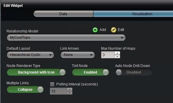
The configuration dialog for the Topology Widget has the following settings:
- Relationship Model – Choose the Relationship Model that describes the relationships and appearance configuration of the underlying data.
- Default Layout – Choose the layout you would like the Topology Widget to initially use for displaying the relationships.
- Link Arrows – Choose whether to have directional, bidirectional, or no link arrows for the lines connecting the nodes.
- Max Number of Hops – Increasing this number will display more topology layers on the screen at a time, without requiring that the user drill down to the deeper layers. This is an important performance setting that tells the Widget how far to traverse the relationships. Limiting this number keeps cyclical topologies from locking up the relationship traversal code.
- Node Renderer Type – Choose between two rendering styles of the topology nodes:
- Background with Icon - Displays the icon inside of a white box.
- Icon Only - Displays only the icon for each node, floating on the Widget's background with no box.
- Tint Node – This turns on tinting of the node using the status color.
- Auto Node Drill Down – This turns on automatic drill down navigation on nodes. Clicking the drill down icon on a node will focus on that node and show its children and/or parents. This produces an effect of navigating deeper into a topology. Setting the Max Number of Hops to a low number can help the performance and experience of this setting.
- Multiple Links – You can choose to collapse or show multiple links between nodes.
- Polling Interval (seconds) – Check the box to enable polling for changes in the relationship model. This is separate from the polling setting on the Data Collection that determines how frequently the underlying data is updated.
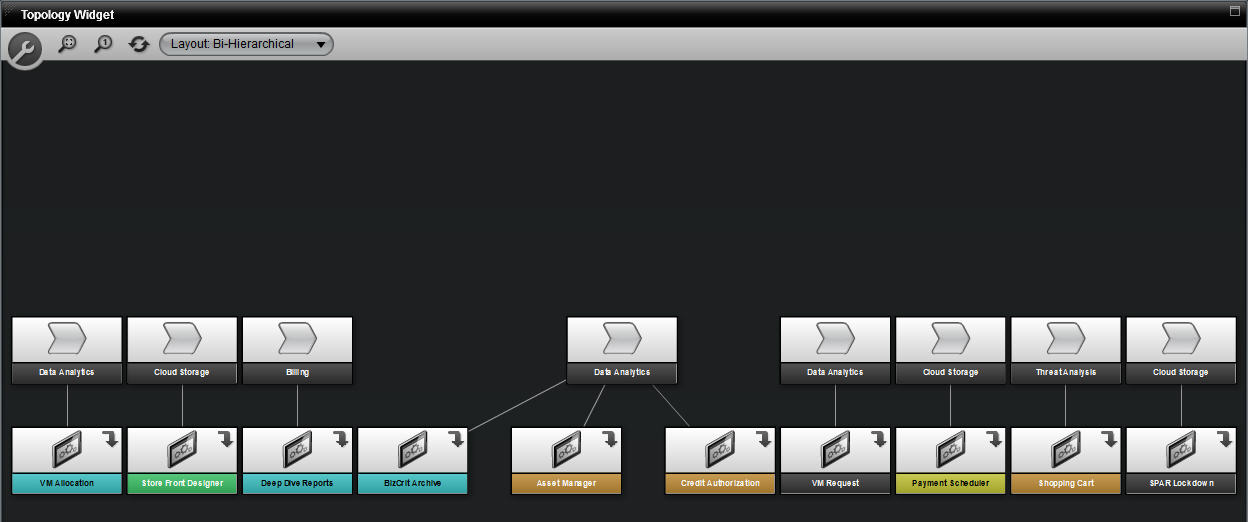
Each Topology Widget has a special toolbar that the end user can toggle by clicking the large wrench icon. This toolbar allows the user to “fit the topology” within the view, zoom to 100%, refresh the data, and change the layout of the data.
Topology Widget Usage Examples
For examples of using the Topology Widget, please see the Basic Example and the Self-Referential Example.


