Appboard/2.5/builder/widgets/advanced status list: Difference between revisions
imported>David.moore |
imported>Jason.nicholls m (1 revision) |
(No difference)
| |
Revision as of 15:52, 26 June 2014
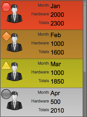
The Advanced Status List widget expands upon Status List and Icon List, which are optimized for mobile devices. These options include:
- Ability to configure more the two List Items Values (Note: Configuring too many values per List Item can impact performance on mobile devices)
- Ability to add labels to values as either a prefix or suffix
- Ability to tint the background of the List Item, as well as add a status shape and icon.
How To Create an Advanced Status List
For instructions on creating a Widget, see the general instructions in Adding Widgets. The Advanced Status List Widget type is located under the Lists & Tables category on the Widget selection screen.
How To Configure an Advanced Status List Widget
- Follow the instructions above to create the basic "Advanced Status List" Widget.
- Enter the following information on the Data tab:
- Data collection: Select the name of the Data Collection that will provide the data to be displayed in the Advanced Status List.
- If you are using the sample data, select Sample.Data.ChartData
- Note: For convenience, buttons are provided for Adding, Editing, or Previewing a Data Collection.
- List Items: Add the fields from the Data Collection that you want displayed in each List Item.
- If you are using the sample data, add "Month", "Hardware", and "Totals".
- Label Type: Select whether a label will appear as either a Prefix (to the left of) or Suffix (to the right of) each value.
- Note: Think of a Data Collection as a table of data, and List Items as columns of data within that table. AppBoard will use the Header of the column as the label for each value in the column.
- Word Wrap: This option allows long text strings to wrap inside each list item.
- Label Font Size: Controls the font size of the label, if it has been enabled as a Prefix or Suffix.
- Label Font Color: Controls the color of the label, if it has been enabled as a Prefix or Suffix.
- Value Font Size: Controls the font size of the values that appear in each List Item.
- Value Font Color: Controls the font color of the values that appear in each List Item.
- Note: The font color for the list items is stored in the config of the Widget. If the look and feel of the list itself is adjusted in the Theme Editor, or if Background Color Rules are configured, you may need to adjust these font colors to ensure that the text is readable.
- Click Next to proceed to the Options tab.
- Optionally configure status rules available on Status tab:
- Background Color: Enabling this option lets you set up rules that allow the data to determine the background color of each item in the list.
- Icon: Enabling this option lets you set up rules that allow the data to determine the icon used for each item in the list.
- Status Shape: Enabling this option lets you set up rules that allow the data to determine a status shape and color for each item in the list.
- Note: None of items are required for the Advanced Status List to function.
- Click Next and provide additional configuration, if needed, on the Options tab. For details on the available Options, see Options.
- Click Next to proceed to the Actions tab.
- Click Add Event Action to configure one or more Actions to be invoked when a user clicks on the Advanced Status List Widget. The action will apply to the current data record being displayed.
- Click Finish.
- In the Builder Modes panel, select Builder and navigate to the appropriate Board to observe the new Advanced Status List Widget.
Sample Data
Instructions for bringing sample chart data into AppBoard can be found here: Sample Chart Data

