Appboard/2.5/builder/widgets
Overview
Widgets are used to present data in different ways, and are also the primary mechanism to interact with data through the use of Actions. Widgets are arranged onto Boards that control layout, and Boards are organized into Stacks that are used as the primary navigation element and also tied to provisioning content.
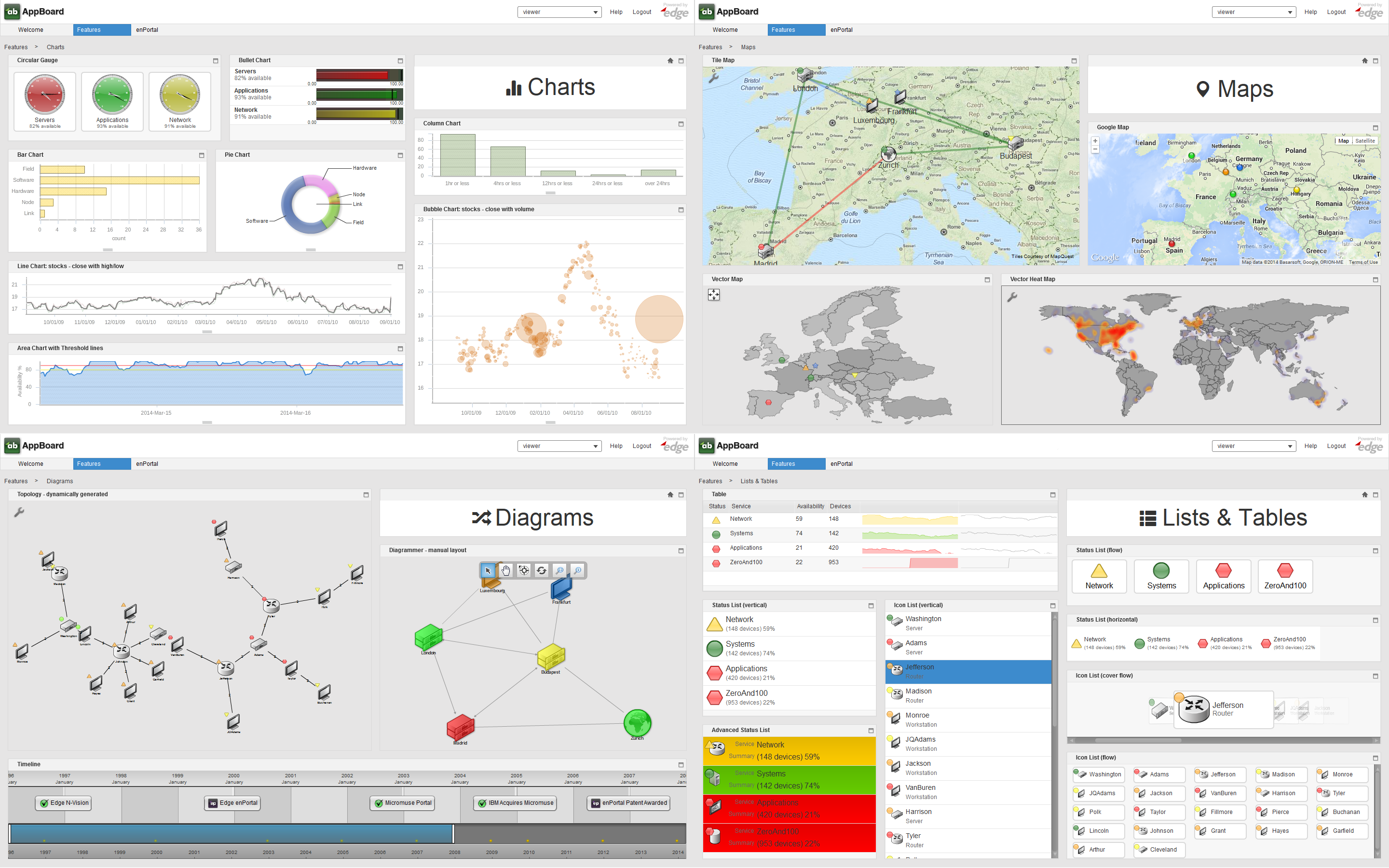
AppBoard offers a wide variety of widgets along with an API to write custom HTML widgets, and the ability to bring in external web content through enPortal. The screenshot below shows a broad cross section of widgets shipped with AppBoard:
Widget Anatomy
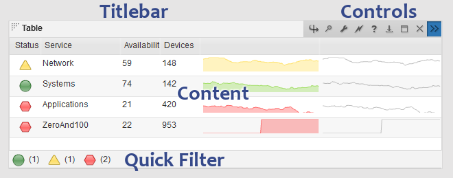
A widget consists of the visible components, the frame, titlebar, controls, the actual content, and optionally a status-bar which allows for quick data filtering called a Quick Filter as shown in the screenshot below. The controls for a widget differ depending whether using the Viewer or Builder, the type of widget, and if any widget Options are enabled.
The layout and size of widgets is controlled by the layout manager which is part of the Board the widget is on. The spacing between widgets and the general look of widgets is controlled by the Theme manager. Finally the widget itself usually provides some configuration on the presentation of the data, such as colors for bars in a bar chart.
Refer to the following pages for more detailed information on:
- General Configuration: see the Managing Widgets section below.
- Widget Types: Comprehensive list and details for each widget type
- Widget Options: These are common to most widgets and are part of the widget configuration.
- Widget Actions: Although not immediately obvious from looking at a widget, actions are configured for mouse-click or mouse-hover events. This is where real interactivity can be built into the dashboards with in-context drill-downs, filtering, and cross-over to related proxied web applications via enPortal.
Available Controls
- flip: (builder only) switch between the regular widget visualization and a table displaying the raw data.
- magnifying glass / search: (option) toggle text search on/off.
- wrench / edit: (builder only) edit the widget configuration
- lightning bolt / actions: (builder only) edit the widget actions
- question mark / help: (option) widget help
- download: (option) download Data Collection.
- maximize / minimize: toggle a widget to maximize and fill the entire board and back to it's original size.
- X / delete: (builder only) delete the widget.
- >> / toggle controls: (builder only) show/hide controls
- home: This is not shown in the screenshot above but the home icon is present with Web Widgets only.
Managing Widgets
The Builder offers a Widgets mode for general widget management. From this page it's possible to view all widgets in the system, modify configuration, modify actions, move widgets from one board to another, copy, and add and delete widgets. Often however it's easier to manage widgets from the Builder mode directly on the Board. Existing widgets can be modified or deleted using the widget Controls, and new widgets added using the Add Widget quick action. The advantage of using the Builder mode is widgets can also be arranged on the board, the layout tweaked, and immediately viewing the widget after making changes.
Adding / Editing Widgets
Use the Add Widget button when in the Builder mode to add a widget onto the current board, or the Add button when in the Widgets mode.
Editing existing widgets can be done by clicking the wrench control of a widget, or using the Edit button with a selected widget in the Widgets mode.
The Add wizard, and Edit dialog are basically the same except that the Add operation can be cancelled, while changes to existing widgets are immediate (no cancel).
Widget configuration is split into three main sections, although depending on the widget type there may be additional sections:
- Data: This step defines:
- Widget Type: Sets or changes the type of this widget. Refer to the Widget Types documentation information on each widget type.
- Widget Name: By default this name is used internally in the Builder as well as in the widget titlebar. However, if the Display Name is configured, then that is used in the widget titlebar instead. It is recommended to use unique and descriptive widget names. If these aren't appropriate for the widget titlebar then also set the Display Name.
- Display Name: optional and as described above.
- Data Collection: Set the data collection used to drive the widget. The presence of this option depends on the Widget Type as not all widgets have a directly associated data collection.
- Visualization / ...: Depending on the widget type at least the Visualization step will be present and optionally other steps such as Presentation etc... These steps all have to do with the specific widget type configuration. Refer to the Widget Types documentation for detailed information on each type.
- Options: Options allow for text searching, quick filters, data collection downloads, and setting widget help text. Refer to the Widget Options documentation for more information.
Actions
Refer to the Widget Actions page.
Deleting Widgets
Deleting widgets can be performed by using the widget X control in the Builder mode, or using the Delete button with a selected widget in the Widgets mode.
Moving Widgets
This refers to moving widgets from one Board to another. For actual placement of a widget on a board then refer to the Board Layout documentation.
To move a widget you must be in the Widgets mode. Clicking in the Board column for a particular widget will allow the Board to be changed via a drop-down selection. After moving a widget it is recommended to visit both the original and target boards in the Builder mode to adjust the layout to suit.
Copying Widgets
Copying a widget will copy the widget, all actions, and optionally the Data Collection used by the widget. Use the Copy button with a widget selected when in the Widgets mode to perform a copy. The following fields are presented:
- Name: defaults to the existing name, can be modified
- Board: where the copy should reside
- Use Existing Data Collection / New Data Collection: toggle to determine whether copies of the data collection should also be made.
- Names Alterations: these options are only available if New Data Collection is selected above. It allows for either a prefix and/or a suffix to be added to the data collection name.
Certain configuration remains global and shared even if a copy is performed, in particular:
- Icon, Color, Shape, and Colored Shape Filters
- Diagrams: Diagrams themselves are global, the Diagrammer widget is used to show and modify diagrams.
- Relationship Models


