Appboard/2.5/builder/widgets/pie chart
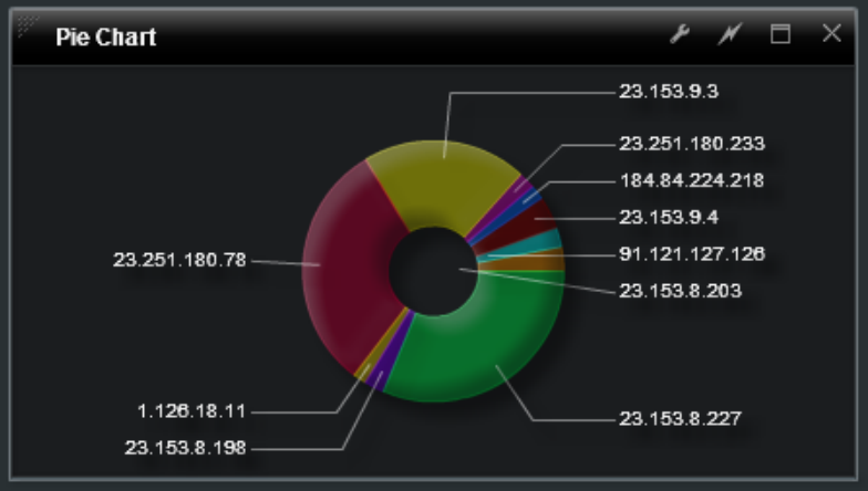
An Area Chart Widget is a graphical Widget that displays a circular image, divided into segments representing proportions in the underlying data.
How To Create a Pie Chart Widget
For instructions on creating a Widget, see the general instructions in Adding Widgets. The Pie Widget type is located under the Charts category on the Widget selection screen.
How To Configure a Pie Chart Widget
Follow the instructions above to create the basic "Area Chart" Widget, and then perform the following steps to configure a Pie Chart Widget:
Select a Data Collection
Select a Data Collection that contains the information you would like to use for this Widget.
- Click the "Data Collection" pulldown, then select from the list of available Data Collections.
- If you're using the sample CSV data, select "Sample.Data.ChartData2".
- If there are no Data Collections available in the pulldown, then click here for instructions on how to bring in some Sample Chart Data, or refer to Add/Edit/Remove a Data Collection.
Name Field
Specifies the field of the Data Collection to use as the name for the wedge. This is the value that will be used for the Legend and DataTips.
- Click "Name Field" pulldown, and then select an item from the list.
If you are using Sample.Data.ChartData2, then select "Task" for the Name Field.
Value Field
Specifies the field of the Data Collection that determines the data for each wedge of the pie chart.
- Click the "Value Field" pulldown, and then select an item from the list.
If you are using Sample.Data.ChartData2, then Select "Feb", as the Value Field.
Color Selection
Use the color chooser to set the Color and Pattern of each pie slice. The Alpha of each option determines the opacity of the options for the field.
Labels
Click the "Label" pulldown, and then select an item from the list.
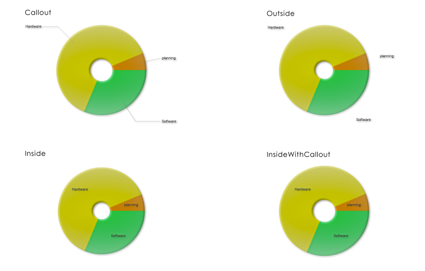
- None: Does not draw labels. This is the default value.
- Callout: Draws labels in two vertical stacks on either side of the PieChart control. Shrinks the PieChart if necessary to make room for the labels. Draws key lines from each label to the associated wedge. Shrinks labels as necessary to fit the space provided.
- Inside: Draws labels inside the chart. Shrinks labels to ensure that they do not overlap each other. Any label that must be drawn too small is hidden from view.
- InsideWithCallout: Draws labels inside the pie, but if labels are shrunk below a legible size, Flex converts them to callout labels.
- Outside: Draws labels around the boundary of the PieChart control.
Legend
Click the "Show Legend" option to indicate whether a legend is shown or not.
Inner Radius
Click the "Inner Radius" option to take a circle out of the middle of the pie chart, expand or minimize using the bar provided.
Additional Configuration Steps
- Provide additional configuration, if needed, on the Options tab. For details on the available Options, see Options.
- Enter the following information on the Actions tab:
- Click Add Event Action to configure one or more Actions to be invoked when a user clicks on the Pie Chart Widget. The action will apply to the current data record being displayed.
Sample Data
Instructions for bringing sample chart data into AppBoard can be found here: Sample Chart Data


