Appboard/2.5/builder/widgets
Overview
Widgets are used to present data in different ways, and are also the primary mechanism to interact with data through the use of Actions. Widgets are arranged onto Boards that control layout, and Boards are organized into Stacks that are used as the primary navigation element and also tied to provisioning content.
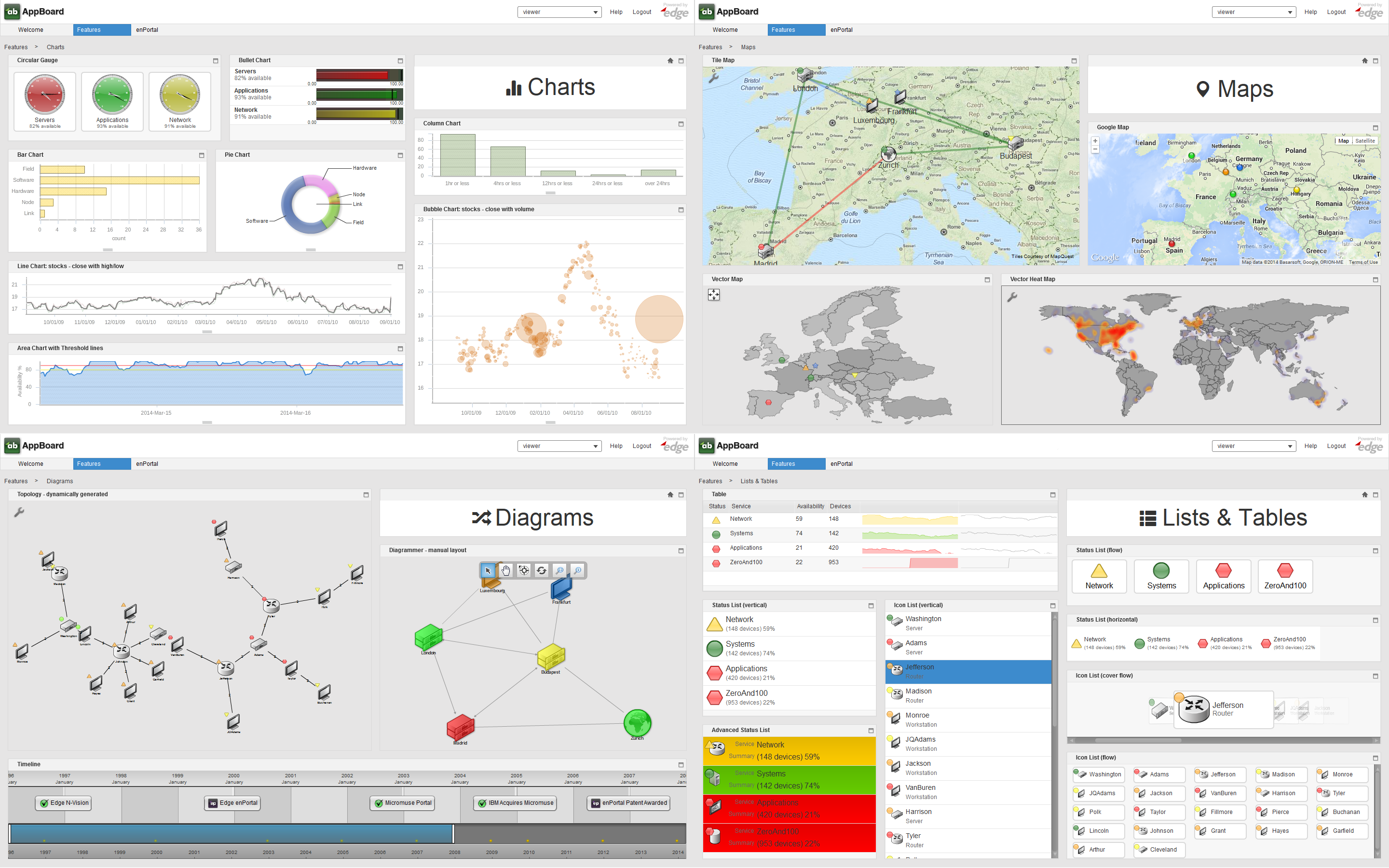
AppBoard offers a wide variety of widgets along with an API to write custom HTML widgets, and the ability to bring in external web content through enPortal. The screenshot below shows a broad cross section of widgets shipped with AppBoard:
Widget Anatomy
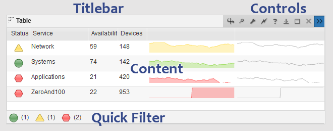
A widget consists of the visible components, the frame, titlebar, controls, the actual content, and optionally a status-bar which allows for quick data filtering called a Quick Filter as shown in the screenshot below. The controls for a widget differ depending whether using the Viewer or Builder, the type of widget, and what widget Options are enabled.
The layout and size of widgets is controlled by the layout manager which is part of the Board the widget is on. The spacing between widgets and the general look of widgets is controlled by the Theme manager. Finally the widget itself usually provides some configuration on the presentation of the data, such as colors for bars in a bar chart.
Widget Types
AppBoard provides many different types of widgets, refer to the Widget Types page for a comprehensive list and details on each one.
Widget Configuration
Refer to the Managing Widgets section below.


