Appboard/2.6/builder/widgets/tile map
Overview
The Tile Map Widget displays tile-based maps from a server that conforms to the Open Street Maps architecture.
Tile based mapping allows users to zoom through different levels of detail and pan quickly without having to load excessive amounts of data. Each zoom level is served by a different set of tiles of fixed size and the tiles are loaded on demand for performance reasons. Google Maps is a well known tile-based map tool and AppBoard supports the use of Google Maps through the Google Map widget.
The advantages to AppBoard users with the OpenStreetMap based Tile Map widget is:
- Native Adobe Flex based widget which better fits into the AppBoard framework providing flexible marker configuration, full access to widget actions, and better performance.
- Can plot link lines in addition to markers.
- Choice of tile set providers, or create your own tiles and overlays.
- Ability to serve up tilesets from AppBoard itself, avoiding the need for clients or the server having external Internet access.
- Avoid commercial licensing requirements of using Google Maps. Note that depending on the tile provider that other licensing arrangements may need to be made.
AppBoard also includes a Vector Map widget that uses internal maps so external Internet access is not required. This widget continues to be available but in many cases it is recommended to switch or use the Tile Map instead thanks to greater marker flexibility and map detail.
As with all other AppBoard geographic mapping widgets the data collection driving the widget must include latitude and longitude co-ordinates in order to plot markers on the map.
Tile Map widget using CartoDB tiles with atmospheric pressure overlay from OpenWeatherMap and icon markers with status indicators. The toolbar is also shown (hidden by default).
Creating Tile Map Widgets
For instructions on creating a Widget, see the general instructions in Adding Widgets. The Tile Map type is located under the Maps category on the Widget Type selection screen.
Tile Map Widget Configuration
- Follow the instructions above to create the basic Tile Map Widget.
- Enter the following information on the Data tab:
- Data Collection - Select the name of the Data Collection that will provide the data to be displayed in the Tile Map.
- For convenience, buttons are provided for Adding or Editing a Data Collection.
- If you are using the AppBoard Sample Chart Data, select the sample.Data.Airport Data Collection.
- The selected Data Collection must contain two separate fields with geographical coordinates representing the Latitude and Longitude of each node to be drawn on the map.
- Widget Name - Enter the name to display for the Widget in the Widget Title Bar.
- [Optional] Configure an Alternate Widget to be displayed on mobile devices, since this Widget is only supported for display in the desktop AppBoard Viewer.
- Data Collection - Select the name of the Data Collection that will provide the data to be displayed in the Tile Map.
- Enter the following information on the Visualization tab:
- Map Tiles - Select the tile style or server that you wish to use from the list of available tilesets. Refer to the Additional Information section for more information on managing this list.
- Latitude Field - Select the column of data that provides latitude coordinates.
- Longitude Field - Select the column of data that provides longitude coordinates.
- Marker Type - Toggle this switch to choose the type of image to draw for each node on the map:
- Status Shape - Display a colored shape for each node on the map
- Icon - Display an icon with a status shape in the top left corner for each node on the map.
- Auto Zoom - Toggle the automatic zoom controls:
- Off - The full map is displayed when the Widget is invoked on the Board.
- Fit To Data - AppBoard will automatically zoom to the "best fit" zoom level when the Widget is invoked on the Board.
- Default Shape - The default shape to use when the "Status Shape" Marker Type is selected (see above).
- Default Color - The default color to apply to the shape when the "Status Shape" Marker Type is selected (see above).
- Default Shape Size - The default size to use for the shape when the "Status Shape" Marker Type is selected (see above).
- [Optional] Colored Shape Filter - Select the name of the filter you would like to use or click "Add" to create a new filter. A Color Filter allows you to set rules for displaying different colors for the markers on the map where certain conditions are met in the corresponding data. For more information, see Colored Shape Filter
- [Optional] Default Icon - When the "Icon" Marker Type is selected (see above), this item selects the icon to display for each node.
- [Optional] Icon Size - When the "Icon" Marker Type is selected (see above), this item determines the size of each icon.
- [Optional] Icon Badge Filter - When the "Icon" Marker Type is selected (see above), this allows for different icons to be displayed conditionally based on the attributes of each individual node on the map. See Icon Filter for more information on configuring an Icon Filter.
- [Optional] Enable Map Labels - checkbox to enable/disable map labels. If enabled these labels are always visible (versus mouse-hover data-tips). End users can toggle these off if desired via the toolbar. When enabled some additional configuration options are presented to select the Label Field, the Label Color, and the Label Size.
- Preview - This section provides a small preview of the Tile Map.
- The Links tab is used to enable and configure link lines:
- Enable Node Link Connections - enable this checkbox to enable link lines. Enabling this option reveals the link line configuration.
- Link Data Collection - Links require their own data collection which includes source and destination pairs. This can be wholly contained within the data collection, or associations can be used if the co-ordinates for each location are already available elsewhere.
- Source / Destination Latitude / Longitude - configure the source and destination coordinate fields.
- Default Link Color - The default link line color if no Link Color Filter defined, or there is no match with the filter.
- Link Alpha - Set the link line transparency.
- Link Thickness - Set the link line thickness.
- Link Color Filter - Set a color filter to drive the line line color. Use the Add or Edit buttons to create a new filter, or edit an existing filter.
- Enter the following information on the Overlays tab:
- [Optional] Add a tile overlay from the registered Overlays by pressing the "Add" button. Choose the overlay tile type, alpha value, and the refresh time for the overlay. (A value of 0 minutes turns off refresh). Refer to the Additional Information section for more information on managing this list.
- Provide additional configuration on the Options tab. For details on the available Options, see Options.
- Click Close.
- In the Builder Modes panel, select Builder and navigate to the appropriate Board to observe the new Tile Map Widget.
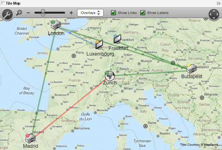
The Toolbar
The Tile Map toolbar is available to users within the Builder or Viewer and changes made are only temporary for the session. On reloading the client the configured defaults will be used. The following controls are provided:
- Toggle Toolbar: click the wrench icon to show or hide the toolbar.
- Fit to Data: use the magnifying glass icon to force the widget to zoom and center on the current dataset. This is actually a toggle button and if left selected (or configured by the administrator by default) the map will always zoom to fit on any changes to the data collection.
- Adjust Zoom Level - The - and + buttons and slider indicate the current zoom level and allow changes by clicking the symbols or dragging the slider.
- Overlays - This button allows the user to disable or enable overlays. Only overlays configured by the administrator are visible in this list.
- Show Links - toggle visibility of link lines - if this feature is configured.
- Show Labels - toggle visibility of marker labels - if this feature is configured.
- Pan View - The circle with four arrows icon can be used to pan the map horizontally or vertically.
Included Tile Set Configuration
AppBoard includes configuration to access the following OpenStreetMap tile sets.
| Tile Set | Provider |
|---|---|
| OpenStreetMap | http://www.openstreetmap.org/ |
| CartoDB OpenStreetMap | http://cartodb.com/ |
| Watercolor OpenStreetMap | http://maps.stamen.com/watercolor/ |
| Toner OpenStreetMap | http://maps.stamen.com/toner/ |
Additional Information
- Registering Additional Tilesets: for making existing tilesets served remotely available within AppBoard.
- Importing Tilesets: for serving up tilesets locally with AppBoard.
- Creating Custom Tiles from Images
